The most visually striking games of the last generation
Every color of the rainbow (so long as it's brown)
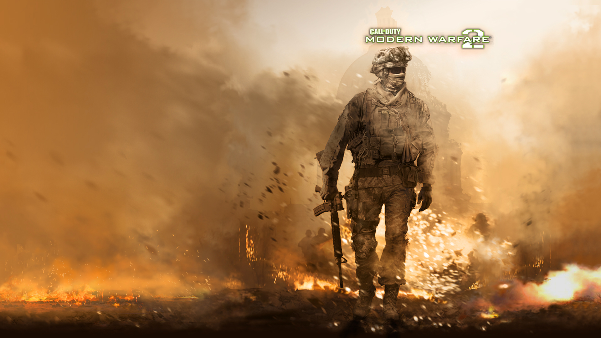
The current console generation is winding down, making this the perfect time to reflect on the history of 360, PS3, and Wii. Each expanded gaming in their own way, but it seems like many will remember the HD visuals of this era as an excessively sandy, rock-strewn brown and yellow expanse. But that narrow viewpoint ignores many gorgeous games that never settled for such a limited color palette.
Call of Duty, Gears of War, and Fallout may have made bombed out, brown levels famous, and that limited collection of hues was certainly adopted by countless imitators. Still, there were many games that took advantage of the entire crayon box, creating some the most diverse stages wed ever seen. Take a look at the many games that kept color alive over the last generation, starting with
El Shaddai: Ascension of the Metatron
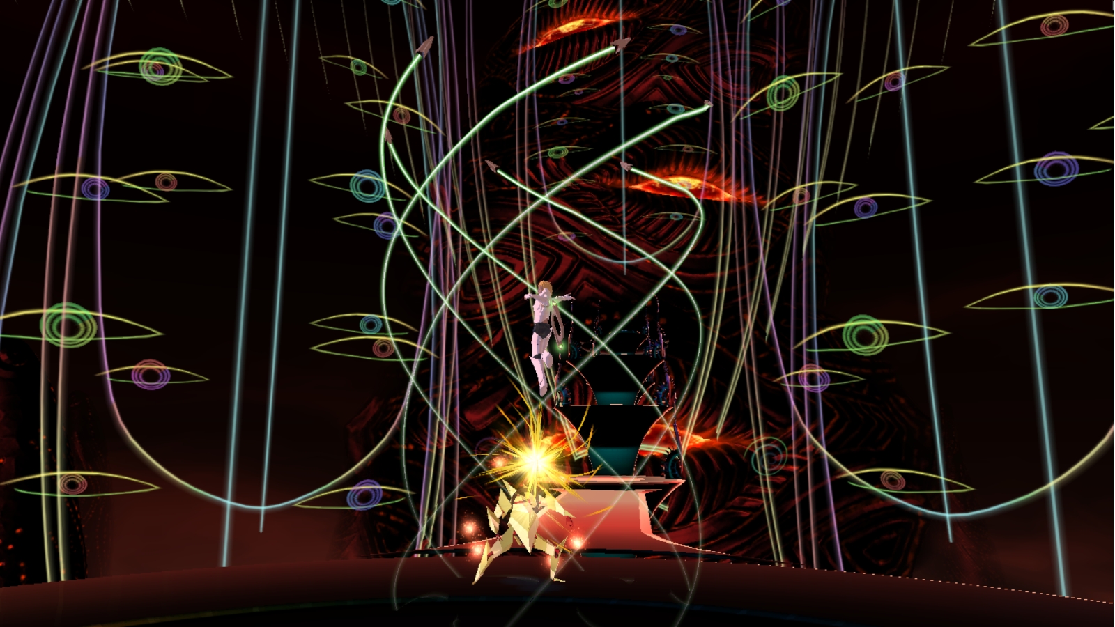
After one look at El Shaddai: Ascension of the Metatron, you wont be shocked to learn that the games lead developer was once one of Capcoms top artists. Head developer Takeyasu Sawaki took the skills he used when designing Devil May Cry and Okami and created one of the most aesthetically stunning games of the generation. Each stage was a different work of art, sometimes looking like a colorful childrens book, and other a neon world filled with dozens of staring eyes.
Every level had a clear artistic direction distinct from the last, taking pains to fill the corners of each world with deep purples, reds, and greens. The gameplay wasnt always equal to the advanced visuals, but no matter how frustrating the 3D platforming could get, wed be entranced by the creativity on display in strange areas, like the underwater dance club and futuristic cityscapes, that kept popping up during the brief narrative.
DmC

The recent reboot DmC was one our big inspirations for creating this list. Early sections of the game hint at some of the creative use of color it has in store, as the subdued real world is overtaken by demonic, crimson hues. But thats just the start. Two of the later levels, particularly the boss fights, gave the art team a real chance to shine.
Spoilers if youve yet to play it, but the dance club thats home to the big bads special lady is full of electric oranges and blues, and those vibrant colors are even more memorable due to them directly affecting what kinds of attacks you can pull off. Meanwhile, when you jump into a TV to confront a murderous, faux-Fox News anchor, bright blues and reds fill the screen, reflecting the patriotic facade of the network. Both stages proved the developers were in in the mood for more than the oranges and reds of Hell.
Super Mario Galaxy
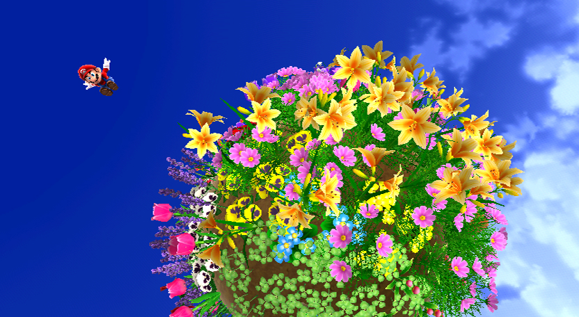
You can safely expect any Mario game to be a colorful adventure. The characters cartoony world lends itself to the type of visuals seen in Super Mario Sunshine and Yoshis Island. Still, Super Mario Galaxy gave the developers the opportunity to create a game for the Wii that not only kept up with its HD competition graphically, but also pushed the artists to express classic Mario designs in diverse, imaginative ways.
Weekly digests, tales from the communities you love, and more
Each planetoid was a new chance to splash buckets of digital paint all over the screen. The world where flowers bloomed behind Marios every step, the planet where bright red fire and blue-tinted ice existed on the same sphere, and hang gliding with a bird through a tropical paradise are just a handful of the polychromatic levels the game had to offer. Even with less graphical horsepower, the Galaxy games proved the Wii could at least surpass its HD competition in the color department.
Ultimate Marvel vs Capcom 3
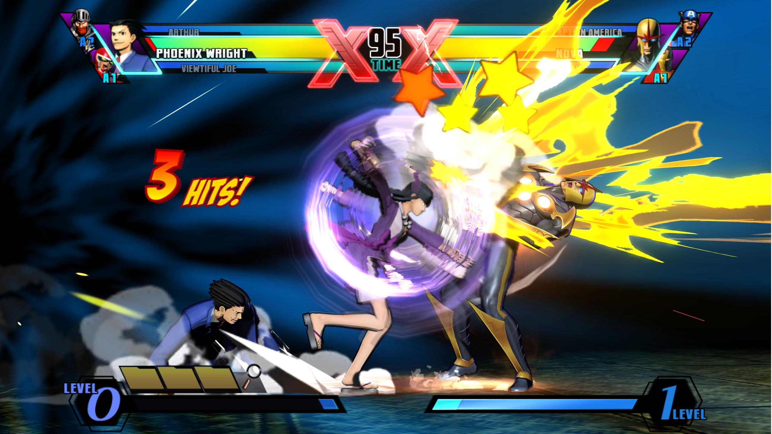
Street Fighter IV legitimized 2D fighting games for a whole new generation, and it did it with a colorful cast of new and old characters. But that game was just a taste of the eye-searing visuals that Capcom would bring to the long-awaited comic book crossover, Marvel vs Capcom 3.
The game, and its expanded Ultimate edition, had a bit of help in the color department, thanks to the flashy costumes of the Marvel characters. But even without masked men in bright reds, blues, and yellows, the glowing energy emitted by every characters special attacks fill the screen with pulsing color every few seconds. The added layer of shadows on every character might make MvC3 look murky at first glance, but its much different once the action gets started.
Mirror's Edge
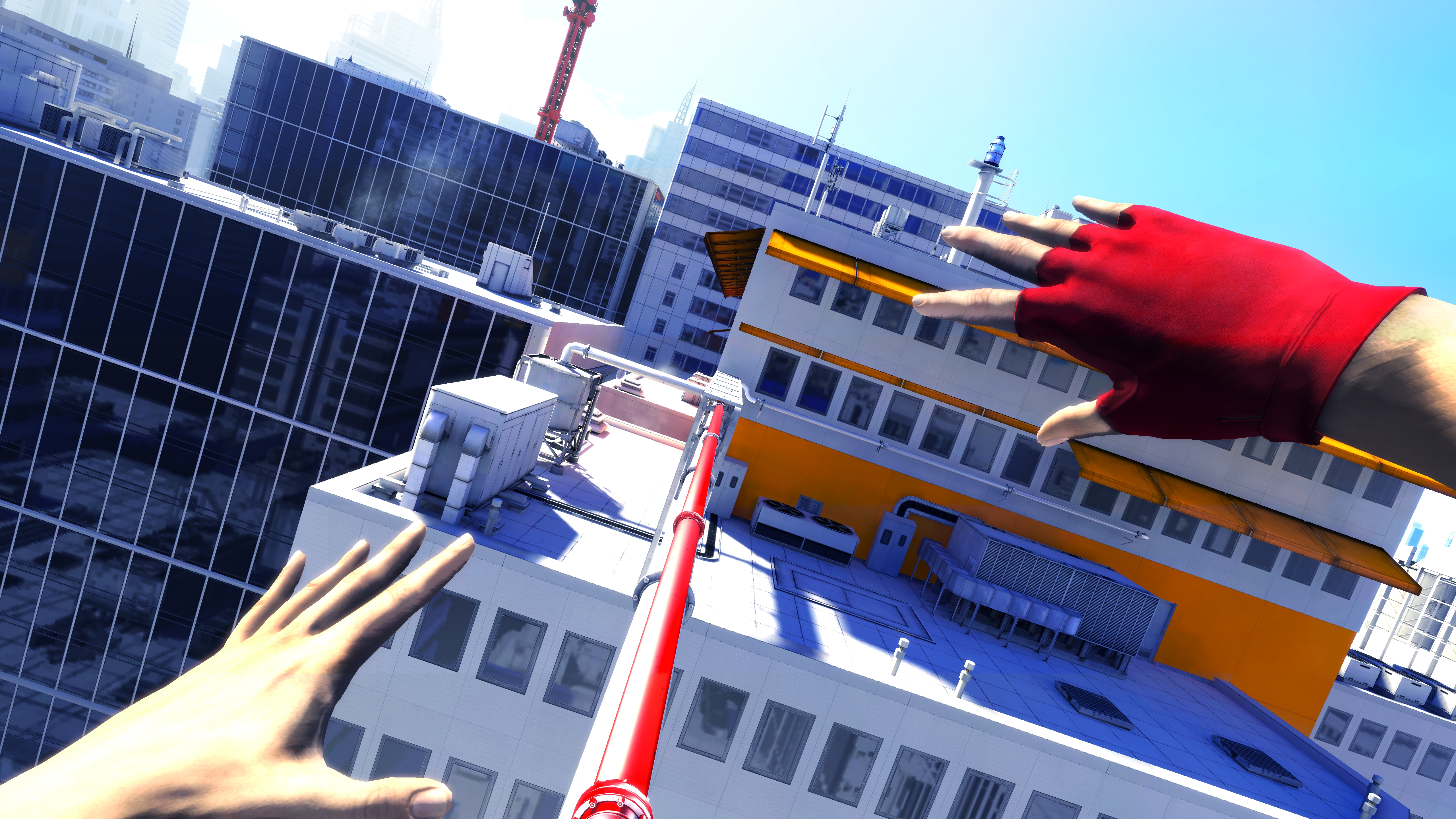
Developer DICE was celebrated for its Battlefield games, which took first-person shooting to new levels of multiplayer excitement, but it seems the team wanted to keep the decidedly solo Mirrors Edge separate from its marquee franchise. MEs free-running gameplay that deemphasized gunplay made a big difference in making it distinct, but so did replacing war-ravaged settings with a bluntly colored vision of the future.
The stage design got a lot of mileage out of contrasting white walls with bright reds, blues, and greens, but the eye-catching art also had an impact on the gameplay. The different colors were used to direct players in the direction they needed to go, pushing them away from the boring white buildings around them and towards their next goal. Mirrors Edge was at its best when it made players feel the fluid motion of its protagonist, and the gaudy visuals revealed the quickest route to that sensation.
Geometry Wars
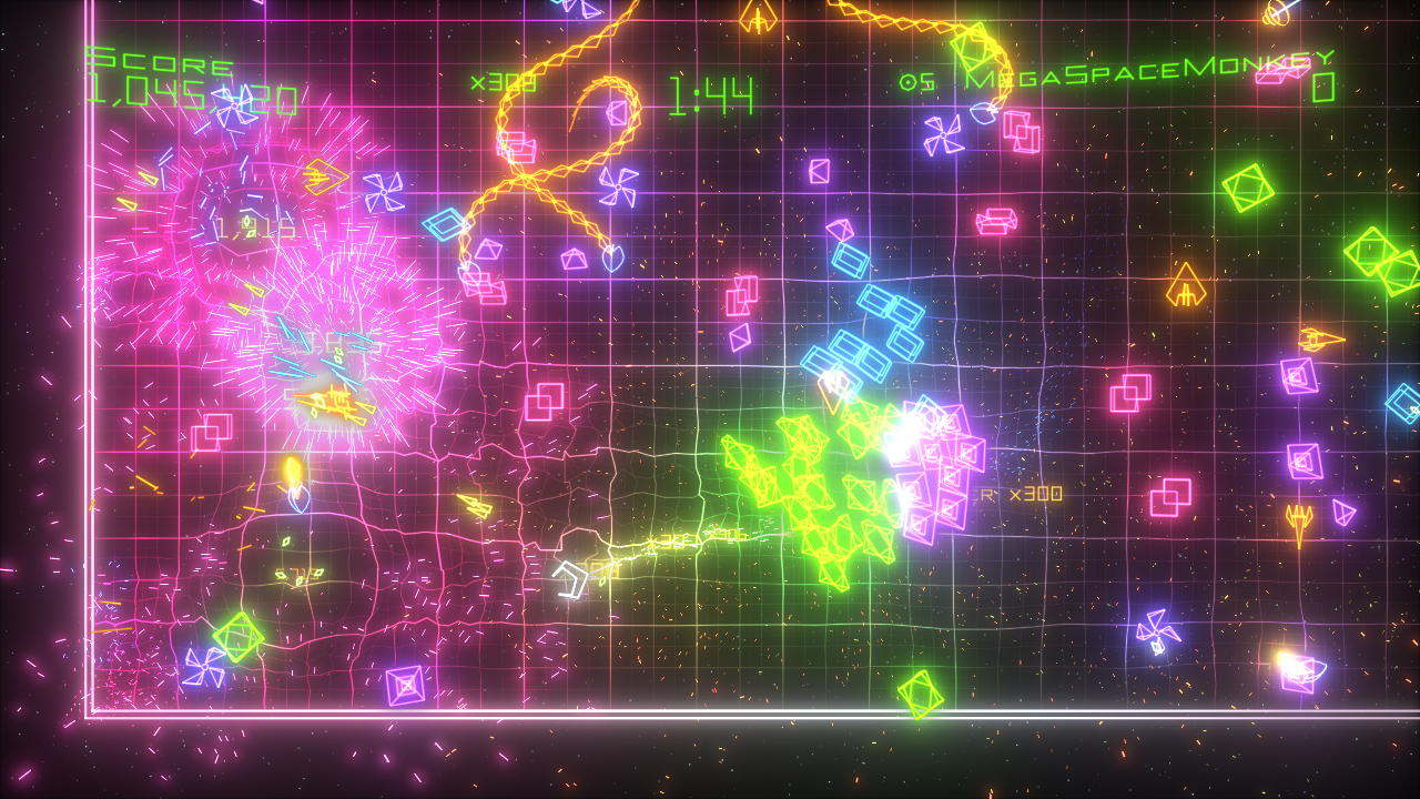
This list wont feature many downloadable games of this generation, mostly because XBLA/PSN releases had the advantage of smaller budgets and niche appeal that allowed them to get more experimental with the art. That made vibrant visuals pretty standard for those titles. Still, Geometry Wars was such a trailblazer of console downloadables that it deserves a space here. And as addicting as its twin-stick action was, its neon graphics deserve almost as much credit for its success.
The line art on the ships and the graph paper backgrounds might have looked simple, but they pulled people in immediately. The stark art design really stood out from the drab appearance of 360 launch games like Gun and Call of Duty 2, making the $5 release the killer app for all those looking to soak in the fresh HD visuals. The games early success influenced so many downloadables, but the original Geometry Wars strong artistic design remains burned into the memories of all that played it.
Viva Piata
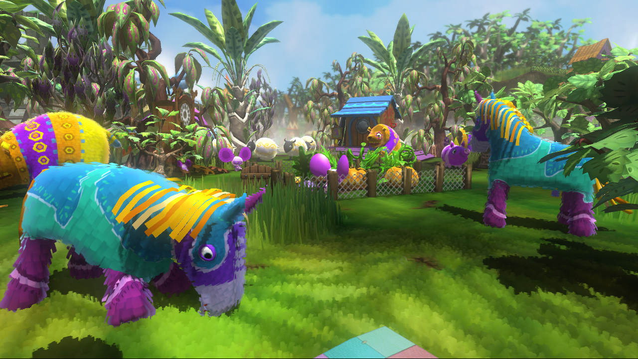
Developer Rare made a name for itself on the N64 by crafting colorful worlds for its many mascots, but the team currently uses its diverse collection of digital paint to make trifles like Kinect Sports. But before that transition, Rare took a stab at creating an animal collecting franchise. Viva Piata might never have been the huge success it deserved to be, but the cheeky, all-ages adventure at least stood out from pack of major 360 exclusives.
We loved caring for the pun-laden piatas like Pretztail and Horstachio, and they were all so well-realized in purposefully gaudy paper mache. The characters were adorned with blazing primaries that were usually restrained to a childs birthday party, and they all frolicked together in a sunny field of your choosing. Better yet, the colors were made even more enjoyable thanks to the surprisingly deep sim gameplay that hid underneath. The kiddie look might've prevented VP from being the hit it deserved to be, but wed hate to see it look any other way.
Prince of Persia (2008)
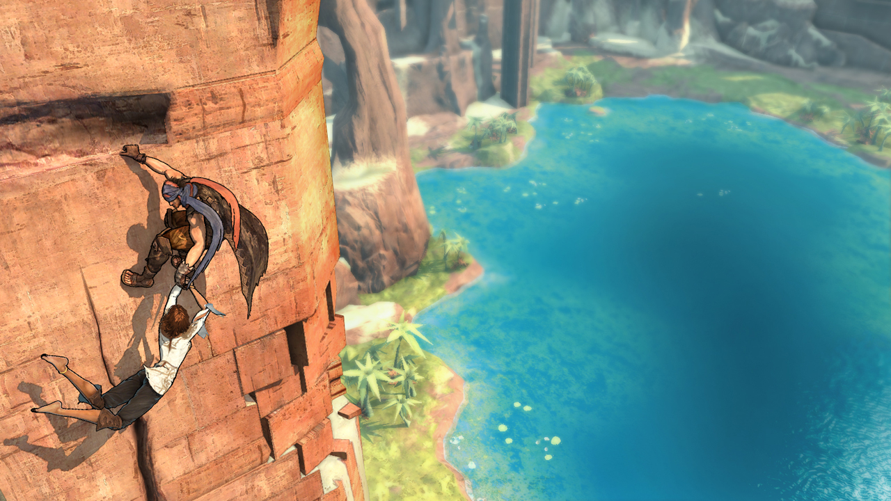
Given the Arabian Nights feel of Prince of Persias desert setting, youd expect the series to end up with the bland color palette that this generation is infamous for. Perhaps done to offset such expectations, the would-be series reboot, 2008s Prince of Persia, went with a cel-shaded style that emphasized cooling tones of green and blue set against the earthen coloring of the area.
Each area of the open world was distinct, from the floating platforms in the bright blue skies to the watery, underground puzzles. Additionally, every stage was dotted with glowing blue orbs that stood out from the world almost as much as the striking main characters. Oily evil may have coated every stage, but that only made the areas look even more gorgeous once Elica purified the land Okami-style.
Enslaved: Odyssey to the West
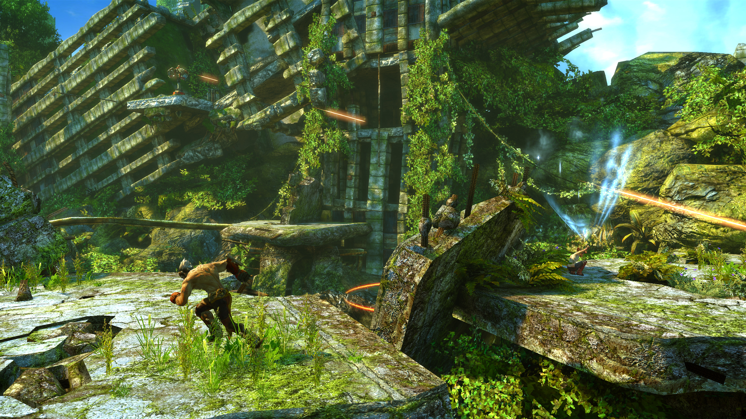
Most games that envisioned a post-apocalyptic world usually went with washed out vistas and barren landscapes, so we welcomed the approach to a ruined Earth taken by Ninja Theorys Enslaved: Odyssey to the West. Set centuries after the fall of man, the world of Enslaved may have destroyed buildings and scrap metal as far as the eye can see, but its all underneath the vegetation thats been slowly taking back the now-empty cities, making for the greenest wasteland weve ever seen.
Its a unique choice, and one that beautifully illustrates that, even after humanity dies out, the world will find a way to keep on going. Later stages found similarly vibrant approaches to the tribal cities that sprung up around the remains of humanity, along with giant piles of trash that somehow made for a gorgeous mountain view. Enslaveds green apocalypse seems to have inspired the similarly gorgeous The Last of Us, though that isnt surprising, since the games both credit Mark Richard Davies as lead designer.

Henry Gilbert is a former GamesRadar+ Editor, having spent seven years at the site helping to navigate our readers through the PS3 and Xbox 360 generation. Henry is now following another passion of his besides video games, working as the producer and podcast cohost of the popular Talking Simpsons and What a Cartoon podcasts.
