Valve gave the Steam store a new look, and oh no, I hate it
Et tu, Valve?

Weekly digests, tales from the communities you love, and more
You are now subscribed
Your newsletter sign-up was successful
Want to add more newsletters?
Every Friday
GamesRadar+
Your weekly update on everything you could ever want to know about the games you already love, games we know you're going to love in the near future, and tales from the communities that surround them.

Every Thursday
GTA 6 O'clock
Our special GTA 6 newsletter, with breaking news, insider info, and rumor analysis from the award-winning GTA 6 O'clock experts.
Every Friday
Knowledge
From the creators of Edge: A weekly videogame industry newsletter with analysis from expert writers, guidance from professionals, and insight into what's on the horizon.

Every Thursday
The Setup
Hardware nerds unite, sign up to our free tech newsletter for a weekly digest of the hottest new tech, the latest gadgets on the test bench, and much more.
Every Wednesday
Switch 2 Spotlight
Sign up to our new Switch 2 newsletter, where we bring you the latest talking points on Nintendo's new console each week, bring you up to date on the news, and recommend what games to play.

Every Saturday
The Watchlist
Subscribe for a weekly digest of the movie and TV news that matters, direct to your inbox. From first-look trailers, interviews, reviews and explainers, we've got you covered.

Once a month
SFX
Get sneak previews, exclusive competitions and details of special events each month!
A new Steam update has given Valve's PC gaming emporium a fresh coat of paint, with a particular emphasis on refreshing the bars and tabs at the top of the main store interface. Parts of it actually look quite nice – or maybe that's just the Slime Rancher 2 1.0 banner art being cute and colorful – but I winced when a great UX nemesis reared its ugly head: panels.
The new store has a main bar with a few tabs: Browse, Recommendations, Categories, Hardware, Ways to Play, and More, alongside the search bar and wishlist. If you click any of them, your eyes are assaulted by blocky buttons pushing a list of cleaner text options to the far right.
Widening the store feels like a good call, but I've got my hater helmet strapped on tight. Nothing has changed since Windows 8: panels remain hideously inefficient. If I click Browse, a pink Top Sellers panel and green Discounts & Events panel pop out alongside smaller, duller panels for New Releases, Your Wishlist, Free To Play, and Demos.
This is probably the least offensive member of the new Steam bar, but it's either missing or burying – again, in that offset text list – a few useful entries that were previously featured front-and-center in nice, readable text under the New & Noteworthy tab you could just mouse over. This gets to the heart of the panel problem: we've made a huge, screen-consuming box that mutes the rest of the page and contains equal or less information than the older, smaller interface.
The recommendations tab feels a bit strange because Steam still has the big Featured & Recommended marquee at the top of the scrolling store itself. When I click this new tab, I just see three games prepared by the algorithm gods alongside an enormous panel for Your Discovery Queue. Here again, Your Discovery Queue is also in the store scroll. And somehow none of the games recommended in my tab are in the scrolling widget. (I just refreshed the page while writing this and those three recommended games changed once again.)
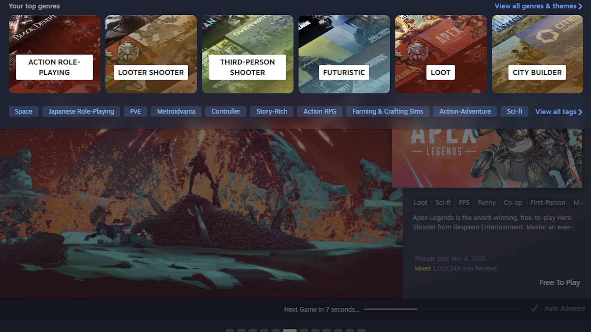
But the most painful blow, by far, is the categories tab. Previously, you could see a huge list of genres and themes in one place. Action, RPG, action RPG, JRPG, roguelike, turn-based, shmup, platformer, anime, horror, open-world, whatever you wanted. It was a bit of a shotgun blast of words and I can see how people would find it overwhelming, but as someone who regularly scours genre pages for trending games, I used and liked this quite a lot.
Now? Now the Categories tab has panels for six genres plucked from "Your top genres." For me, those are currently: action role-playing, looter shooter, third-person shooter, futuristic, city builder, and loot. Loot! I rarely play city builders, I don't know what futuristic means here, and I'm not sure why both looter shooter and loot are coming up, or indeed what a loot game really is. Nioh 3? Borderlands 4? Apparently it's Monster Hunter Stories and Raid Shadow Legends.
Weekly digests, tales from the communities you love, and more
Below these genre panels, a horizontal list of tags tries its best to make up for lost options, but the whole design inevitably herds me toward the damning "view all" buttons on the right side. We didn't need these buttons before because we could just view everything at once. It was a lot, but it was all right there.
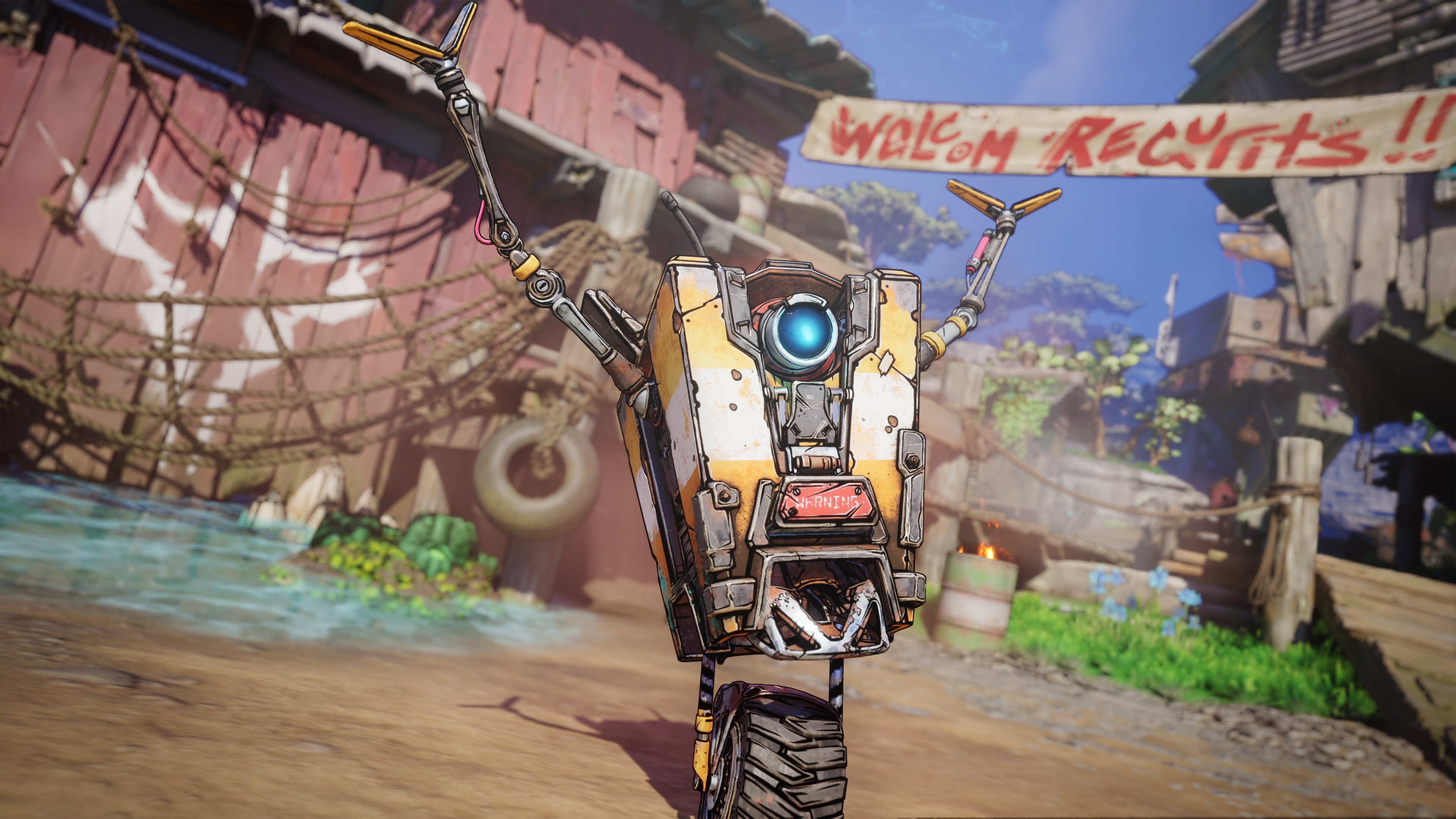
The hardware tab is kind of hilarious because it's just two panels – the Steam Deck and the Steam Deck dock – while Valve toils away in the lab on its next hardware thing. The tab for More stuff is arguably the worst one not just because it throws out the spacing and formatting of all the other tabs, but because it has two hanger-on text lists with different centering.
I pulled up an archived version of the pre-update Steam store just to make sure I'm not losing it here. Maybe (read: demonstrably) I am just averse to changes outside my control made to things I've gotten comfortable with, but I'm struggling to see big upsides here, unless Valve had a contract with the Panel Department that was coming due under threat of leg breaking.
It isn't awful or unusable, and aesthetically I'll admit it is prettier if a bit mobile-y, but it feels like accessing several things I enjoyed before now involves extra steps. It looks good, but when I go to use it, my muscle memory betrays me and my mind recoils with the sort of sour horror that only UX can produce. Plenty of people obviously like it, and I'm sure I'll come to like it more, but at least for today I'm holding onto my stubborn, neurotic critique.

Austin has been a game journalist for 12 years, having freelanced for the likes of PC Gamer, Eurogamer, IGN, Sports Illustrated, and more while finishing his journalism degree. He's been with GamesRadar+ since 2019. They've yet to realize his position is a cover for his career-spanning Destiny column, and he's kept the ruse going with a lot of news and the occasional feature, all while playing as many roguelikes as possible.
You must confirm your public display name before commenting
Please logout and then login again, you will then be prompted to enter your display name.
