 Join The Community


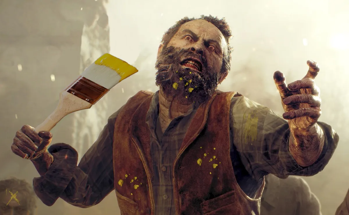
Another year, another controversy over yellow paint in video games – something so regular at this point that games media is forced to report on it every few months, like an ancient lich that won’t quite stay dead.
Every now and again a subset of gamers erupt in disdain for the use of eye-catching yellow paint to highlight climbable or interactive objects, like a ladder in the Resident Evil 4 Remake, or signposting measures like a line on the floor pointing the way through an abandoned building.
This time, people are mad at the use of the high-contrast color in the demo for Final Fantasy 7 Rebirth, with a post of Cloud climbing a yellow-dappled wall so that players can easily identify the handholds used to climb up. The argument goes something like this: gamers aren’t that dumb, or if they are, they should be left to scramble.
THE YELLOW PAINT VIRUS HAS INFECTED FF7 pic.twitter.com/calN0dqHf4February 8, 2024
I have little patience for this in a game that is not exactly known for its visual subtlety, led by a protagonist with possibly the swordiest sword in video games (it’s taller than he his) and a haircut so distinctly haircut as to be instantly recognisable. Why does yellow paint break the immersion, but nothing else about the production or character design does?
The comments on this post in particular devolve into debates on whether red, explosive barrels are different from yellow markings on cliffs – in either case, the highlight is used to differentiate these objects from others. So you know that these barrels are flammable, and those barrels aren’t; this wall is climbable, that one is a dead end.
Being instantly recognisable is really the point here. Yellow is a high contrast color, and often used in environments where something needs to be immediately visible: a hi-vis jacket, a hardhat, yellow kerb lines. It’s a color often used in real life to mark out objects more clearly, and people rarely complain about its use in those contexts.
From an accessibility standpoint, it’s a smart inclusion for people with vision impairments, and also enables players without impairments to focus on traversal or interaction instead of hunting around for the object or exit route that they need.
Game guides
"Why does yellow paint break the immersion, but nothing else about the production or character design does?"
Video games these days can contain a dizzying number of environmental details and objects; long gone are the days where a house would contain one pot with a single rupee. The growth in visual detail is astonishing, and a technical marvel, but it means there’s now a lot to look at. Real, or realistic environments can be hard to traverse: have you ever tried escaping a large supermarket? There’s a reason many of those spaces will ensure there are arrows on the floor.
Modern, 3D, hyper-realistic game environments can be incredibly busy, and that requires more visual aides to help sort through the clutter, so the developers can successfully point you towards the aspects of the environment that are of immediate concern to you. Otherwise you can find yourself walking in a circle, failing to click on every crate that might let you climb on top of it. I can’t count the number of times I’ve cursed under my breath because I couldn’t interact with a decorative door (Bethesda, I’m looking at you).
Any video game with traversable ledges and cliffs will use some version of this, if to different degrees: God of War uses white and red runic markings, Horizon Zero Dawn has yellow girders and lines, while climbing sims or parkour games (Jusant, Assassin’s Creed) will make sure to alter the prominence of texture of a handhold along a wall. While some games do this more subtly, it’s something that’s happening everywhere, and ensures players can get on with, well, playing the game.
This idea that guidance is only required for "stupid" players is so nefarious. From i-frames to yellow paint, from coyote time to tracer rounds, from bad luck protection to quest markers, from difficulty modes to rubberbanding - we cheat for players where playtests show it helpsFebruary 13, 2024
While yellow paint plastered on a wall may break the visual immersion for some, it ensures continual immersion in the mechanics of the game itself.
Back when we reported on the Resident Evil 4 Remake ladder controversy, Boss Fight creative director Damion Schubert commented that “Immersion is not a measure of how realistic the grass looks, it's a measure of how much you are into the flow of the experience. And while hot shit art can be a factor, game readability trumps it ... The things that break immersion are the things that break your flow in a game, usually because you know what you need to do but can't figure out how to interact with the game to do it."
Not everything in a game needs to be a challenge. If it wastes the player’s time, then how is a wall without visual cues aiding you in any way?
Gearbox narrative director Sam Winkler makes the point that, while playtesting continually shows how much players need helpful visual hints, “People *want* to be handled, but they don’t want to *know* they are being handled.” For people who play a lot of video games, and feel confident traversing a space without visual aids, it can start to feel condescending, like someone holding your hand any time you go to cross the road. I’m not a kid anymore!
I’m generally a fan of toggle options where possible, letting some players turn off hints when they don’t want them – I often prefer to get rid of gold ‘quest’ lines hovering in the air and explore a bit more freely in an open-world game, for instance. But just like in real life, visual aides are there to make the world readable to everyone, not just players with 20:20 vision and years of experience grappling with unoptimised interfaces.
My advice is this: enjoy the flow, and focus your brainpower on whatever’s at the top of the cliff instead.
Lose yourself with the best RPGs on the market right now

