
 Join The Community


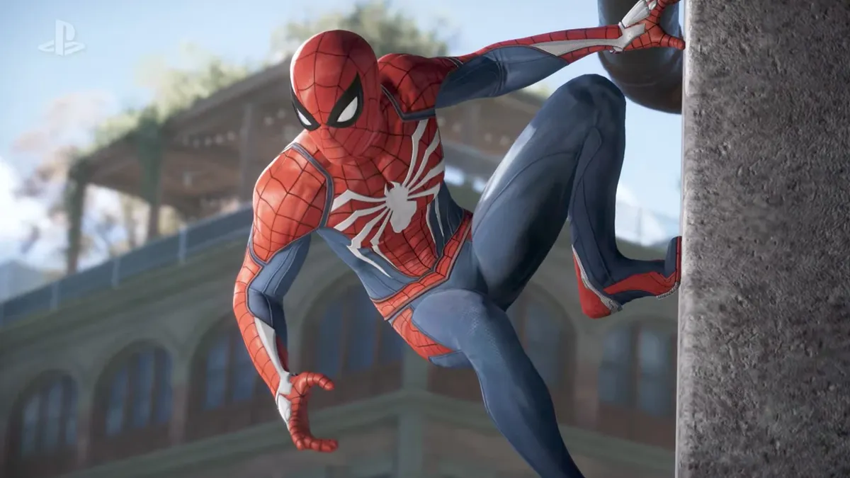
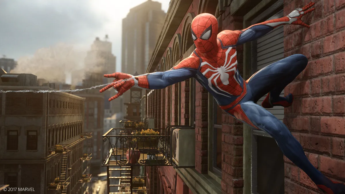
Think of Spider-Man, right now. Imagine him, as vividly as you can. It’s easy, right? He’s iconic. Everyone knows what he looks like. But here’s the interesting thing about that blue and red image in your head right now: It’s probably wrong. It’s probably a generic, portmanteau version, made up of elements of a whole bunch of different Spider-Mans.
Because there have been a great many Spider-Mans. Make no mistake about that. From the hero’s original (debated) inception point, to the darker, more detailed days of the ‘90s, to Venom, to baggy TV versions, to the Raimi movies, right through to now, Spider-Man’s costume has changed a lot. Always revolving - however loosely - around the familiar iconography you currently see in your mind’s eye, the Spider suit has regardless careened in wildly different directions over the years, to fit the demands of each era, aesthetically, tonally, and sometimes grotesquely commercially. From knobbly, rubberised awkwardness to rad, ‘90s awfulness, here’s the rundown of every important look in Spider-Man’s history, starting right at his (contested) beginnings…
Editor's Note: This feature was originally written before the released of Spider-Man: Homecoming.

1962 - The original costume

Spider-Man’s first costume was designed by genius Marvel artist Steve Ditko. It’s arguably his most iconic creation, with only Doctor Strange to rival it. However, the actual origin of Spider-Man’s look has been contested, the icon apparently having several spider-fathers.
Stan Lee claims partial credit, bringing in the legendary Jack Kirby to create Spider-Man’s first ever five pages. However, Lee discarded Kirby’s design as “too heroic,” and asked Ditko to rework what they had.
According to Ditko, Kirby’s version was closer to Captain America’s costume than Spider-Man’s final look (Kirby’s version even included a hip holster for a ‘web gun’ which, you know, sounds pretty hilarious…) and is basically unrecognisable next to his design.
But that didn’t stop Kirby’s estate from filing a lawsuit in 2009 to claim rights to Spidey (alongside Captain America, The Fantastic Four, the Hulk, Iron Man, Thor, and the original X-Men), saying Kirby was ‘key in the character's early development.’ The lawsuit was settled in 2014, and Stan Lee openly credits Steve Ditko as being the true creator of Spider-Man’s look.
“Spider-Man has one of those costumes that always seems to revert back to a version of the original design, much like Superman's suit. So while it's been remixed by plenty of artists (for instance, with the Venom suit or the Iron Spider), the original is iconic enough that Marvel returns to it time and time again. Spider-Man's full face mask, spiderweb motif and bug-eye goggles stand out from the crowd,” superhero costume expert Gavia Baker-Whitelaw, who runs the Hello, Tailor blog tells me.
The original design delivers the red, black and blue base-colours (with the blue far darker here than in subsequent takes, as it had to be mixed with black ink thanks to archaic printing equipment). It’s also decorated with a web pattern, demonstrating Ditko’s dedication to his craft (it would have been easier for the artist to leave this detail out, a detail which makes it a much more complex costume to draw). It has the full mask - complete with teardrop-shaped eyes - as well as a detail that would be fairly swiftly phased out, underarm webbing…
1966 - The classic design

I’m not sure what sort of deodorant you’d need to keep your underarm webbing fresh, but I imagine it’s probably too expensive for someone on a student budget. Thankfully, that detail was discarded by the next significant artist to work on Spider-Man, John Romita Sr.
Romita Sr was behind some of the most memorable Spider-Man plots, including the iconic Death of Gwen Stacy and Spider-Man No More storylines. But, unbelievably, he wasn’t initially confident in his abilities on the book. “The only reason I did Spider-Man was because Stan asked me and I felt that I should help out, like a good soldier. I never really felt comfortable on Spider-Man for years. I had felt at home immediately on Daredevil. On Spider-Man I felt obliged to ghost Ditko because - this may sound naive, but I was convinced, in my own mind, that he was going to come back in two or three issues… The only reason it wasn’t better was that I couldn’t ape him any better,” Romita Sr says.
"I think a lot of kids like to dress up as Spider-Man because his face is covered, so technically anyone could be under that mask"
John Romita Sr - Spidey's 1966 artist
Romita Sr might have started out trying to ape Ditko, but he tweaked the design both significantly and subtly. The underarm webbing went, the blue was brightened (thanks to improved printing technology that allowed him to phase out the black elements). Peter himself started to fill out the costume a bit more, thanks to Romita Sr’s predilection for a more muscular form.
But Peter’s increased gym-time didn’t make him any less relatable to the general public (thanks partly because of Romita Jr’s smart invention of huge new villains, such as Rhino and Kingpin, that dwarved Spider-Man in size) and this era is by far the most cosplayed by fans. Even Andrew Garfield chose Romita Sr’s design when he surprised fans at a Comic Con panel in 2011 by showing up in costume.
“I think a lot of kids like to dress up as Spider-Man because his face is covered, so technically anyone could be under that mask. It's easier to project yourself onto him because traditionally, Peter Parker (and now Miles Morales) are young and relatable, and there's less pressure to look like Clark Kent or Wonder Woman, whose ‘real’ appearance is very clearly defined at all times,” Baker-Whitelaw explains.
1977 - Spider-Woman

In 1977, Marvel ensured that not only boys would have a giant gaudy Spider-character to dress up as, but girls would too, debuting Spider-Woman in Marvel Spotlight #32, before launching her own title in 1978. Which isn’t to say equality was its intention - Stan Lee has admitted the character was actually created to protect copyright. Which is the sort of cynicism that sells comics.
“I suddenly realized some other company may quickly put out a book like that and claim they have the right to use the name, and I thought we'd better do it real fast to copyright the name. So we just batted one quickly, and that's exactly what happened. I wanted to protect the name, because it's the type of thing [where] someone else might say, 'Hey, why don't we put out a Spider-Woman; they can't stop us.’”
Appropriately, Spider-Woman’s costume was designed by a woman, Marie Severin. She based the look on a description from the character’s creator, Archie Goodwin. Spider-Woman (aka Jessica Drew)’s origin was completely separate from Peter Parker’s, and that separation is represented by the costume. The only strong element it shares with Peter’s original outfit is an element phased out by Romita Sr’s classic costume - the underarm web. They both have red colouring - but where it’s part of a pattern for Peter, the colour dominates Jessica’s outfit.
Unlike Spidey, she doesn’t have a full mask - her jaw is present in both her first appearance and her solo book, with the latter title going further, freeing her hair from the top of the mask to allow it to flow freely. The costume’s simplicity proved to be its strongest element - and it quickly became as iconic, and consistent, as Spider-Man’s costume. Of course, Spidey would undergo his most radical change in the 1980s, one that would incorporate one of the simplest designs in Spider-Man’s history, and lead to some of the most powerful ramifications.
1984 - The symbiote suit

Man, comic book professionals are one-of-a-kind geniuses, aren’t they? Fans could never design the sort of iconic looks that go on to last for decades. Fan art’s lame, right? Wrong. Big time. The greatest design change in Spider-Man’s history originated from a reader. In 1982, 22-year-old Randy Schueller submitted an idea to a Marvel competition to find the next generation of writers. Schueller’s idea saw Mr Fantastic designing a new costume for Spider-Man, one that increased his powers.
“I saw the new suit as a stealth version of the original costume,” Schueller said later. “Jet black so he could blend in with the shadows. At best, all you could see of him was the blood red spider emblem, emblazoned on his chest. In my design the spider was red, not white. I also gave him underarm webbing like in the original Ditko design.”
A few months later, Schueller received a letter from Marvel editor-in-chief James Shooter. "I want to buy it," Shooter said. The Marvel man offered Schueller $220 for the idea, and a chance to write the issue. Sadly, Schueller’s writing didn’t make it past the pitching stage, and his idea sat on Marvel’s shelf until 1984 when, much to his surprise, Amazing Spider-Man #252 pushed a version of Schueller’s outfit into official canon, drawn by Ron Frenz.
Frenz’s published design lost Schueller's blood red spider, replacing it with a large central white spider logo on the chest, matching Peter’s white eyes. The rest of the costume was all black. This design choice made the suit closer to Spider-Man foe The Punisher’s costume than anything else in Parker’s wardrobe. The parallel was a hint to the darkness that was to come for Peter. The symbiotic suit’s elegant design hid a complexity under the surface unmatched by any other costume.
Alien in origin, Spider-Man’s new suit had a personality of its own, bonding with its owner and changing his personality - with its power a metaphor for addiction. When rejected by Peter, the suit even develops feelings of hurt, and anger - bonding with Eddie Brock to create Venom, an agent of vengeance against Spider-Man.
1988 - The modern costume

Ironically, considering how popular and long-lasting Venom would be amongst fans, the character was created when new artist / Venom-inventor Todd McFarlane made it clear he didn't enjoy drawing Spider-Man’s black suit, expressing a desire to return to the classic look.
Mark Millar, who also changed the Spider suit during his iconic Civil War run, can identify. “The only time it’s really changed is for a stunt, like the black costume or the Iron Spider or whatever, and it’s always just for a little sales boost. People are curious, but very soon want the proper costume back. Steve Ditko’s design is just perfect. Anything that deviates from it just feels wrong and very quickly changes back.”
"I was not stupid enough to try and emulate John Romita because that’d be like me becoming a painter and trying to draw like Michelangelo or paint like Rockwell"
Todd McFarlane - Spidey's 1988 artist
In a notorious 1992 interview for The Comics Journal, McFarlane explained that his additions to the costume led to several arguments with Marvel. “From the very beginning I was on Spider-Man there was a fight. ‘God, Todd, why are you making the eyes so big? Todd, why are you making those spaghetti webbings? Todd, why are you making so many webbings under his armpits?’
“I was not stupid enough to try and emulate John Romita because that’d be like me becoming a painter and trying to draw like Michelangelo or paint like Rockwell. I was not going to go down in history as a good-John-Romita imitator. Now if you look at the Spider-Man books, they’ve all got a McFarlane look to them, which is good for my career because it’s free advertising for me. They’ve all got the big eyes and the curly hair and the spaghetti webbing and lots of black in the tights.”
Those bold words may make it sound like McFarlane re-strung the web with his take on Spider-Man, but - whilst there were tweaks, and some very impressive detailing - this was the closest Spider-Man had come to Steve Ditko’s original look (with the musculature of Romita Sr’s era clearly a key additional influence) for decades.
The black and blue base colouring was back, as was the underarm webbing. Spider-Man’s eyes were larger, and more expressive, the web pattern was more detailed, denser - but if you put McFarlane’s design next to Ditko’s it would be difficult to discern many differences. Still, Spider-Man #1 sold over two million copies upon its release - so I can’t really begrudge McFarlane from being proud of his achievements. And, you know, anyone who models spider-webbing after a popular pasta dish is all right in my book.
The article continues on the next page.
