
They say a picture paints a thousand words. A good thing, too, as we rarely hear publicly from the creative team of artists behind the scenes at Marvel Studios – especially one as longstanding and esteemed as Ryan Meinerding.
The head of visual developments at Marvel Studios, Meinerding has been with the company since the very beginning of the MCU, working as an illustrator on 2008’s Iron Man. Since then, his standing (and portfolio) has grown, shaping Marvel’s distinctive look across multiple projects.
GamesRadar+ recently had the chance to sit down with Meinerding to discuss all things What If…?. The Marvel animated series has stormed on to Disney Plus with its alternate takes on classic MCU heroes, and Meinerding has been instrumental in nailing the art style alongside his team and director Bryan Andrews.
From sculpting the look of a darker Doctor Strange to revealing which characters he had most trouble with on the page, and even looking ahead to the “endless possibilities” of the MCU’s exciting future, here’s Ryan Meinerding’s take on putting together What If…?.
The following interview has been edited for length and clarity.
GamesRadar+: What’s the process like in going from an initial idea for a What If...? character to the finished product? Was there a lot of back and forth between you, the writers, and director?
Ryan Meinerding: Starting off on this project, we had to figure out the style of the show. Those early characters – there was a lot of exploration in terms of ‘How simple is the style?’, ‘How different from the MCU is the style?’ in trying to find the sweet spot in being a little bit more realistic than maybe a lot of other animated projects.
It took a little bit of figuring out and we were doing that by iterations of the characters. [director Bryan Andrews] had really landed on the notion of J.C. Leyendecker, who was an American illustrator from the ‘40s. The designs for the characters [after that] fell into place relatively quickly. There were definitely ideas that needed to be explored that would take more versions and each character would be a little bit different. Realistically, a lot of the design processes went pretty quickly.
With so many of these MCU characters now being so iconic, was there any sort of trepidation in changing things up too much? Or were there any big restrictions on what you couldn’t do to certain characters?
I feel like this show is supposed to be about rampant creativity – the notion of looking at the MCU and [putting] a multiverse twist on something that’s going to be interesting and compelling. I didn’t feel like there were restrictions as much as we were trying to keep up with what [the writers] were trying to do.
They were having such interesting premises for each [episode] that would go down rabbit holes. I had worked on Thanos for Infinity War and Endgame and was really excited to work on him again. Then it became: how do we do ‘friendly’ Thanos? What are the hallmarks of that character going to be?
They were interesting challenges. The stuff I’ve worked on for the films has been more about [how] we can change the costume because that’s how we can tell the story of the characters.
With this project, because there’s so many things that can change and it’s fully animated, the notion of friendly Thanos can be the costume but it also can be that he makes different facial expressions, or he gives off a friendlier vibe. It was a little bit more exploratory in what we needed to change as opposed to just being the costume.
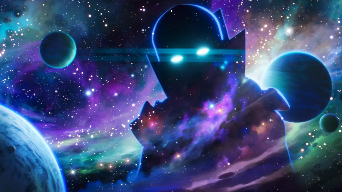
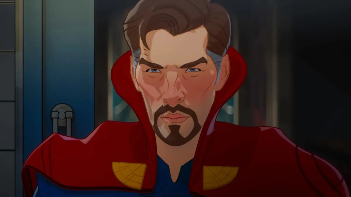
The fourth episode has a darker version of Doctor Strange. What influenced you when creating that design?
Because each one of the heroes we’ve worked on for the films sits in – ideally – an iconic slot, it’s always going to be that we’re referencing stuff that we’ve done in the MCU in this project.
We’re looking at the MCU and saying essentially, ‘We’re making an evil version – how do we get there?’ If we’re saying he had absorbed other creatures, it becomes different and ‘other’ because of those things.
I actually drew him as being this very odd-looking, malformed person because he had taken in these odd creatures. Essentially it came back to the notion of he still needs to feel like he’s Doctor Strange even though the events of his life have altered his trajectory from what we know in the MCU.
So: going darker with the costume, the gauntness in his face, and just making him feel affected by the choices that he’s made.
There are a couple of characters in the series that have dark circles under their eyes and this paler, more effective look to them and I think that was the place to look at. We’re doing the ‘classic’ version of an evil Doctor Strange. That’s where we were going.
You mentioned that malformed version of Doctor Strange. Were there any scrapped designs that didn’t make it into the final version for one reason or another?
It’s just like our normal process on the films. Sometimes I do 100-120 versions of a character before the thing gets landed on.
Was it that sort of scale for this?
It wasn’t quite that scale. Doing drawings for animation means we can get through things a little bit faster. We didn’t have the burden of some of the things from live action. For Doctor Strange, the notion of what is a darker, more evil Doctor Strange can go in a few different directions.
The reason why that one took a few more versions than a lot of the other characters was because… [of] color choices, how evil is he? How far do we push it? How affected is he by the creatures he absorbed? All those things we needed to explore in order to hone in on the right choice.
What was the most difficult character for you and your team to bring to life?
Characters like Captain Carter, Steve, and Hydra Stomper were challenging because we were developing the style at the same time we were working on the characters. It felt like we were trying to find a guiding light of style as well as what’s right for the character.
Once those things did slam into place, a lot of the designs went much quicker.
You are one of the very few people who have been at Marvel Studios since Iron Man, so you might have a better perspective than most. As an artist, as a creative, how would you define the post-Endgame era and post-Endgame Phase of the MCU compared to the others?
I feel like [there’s] endless possibilities. The notion of feeling like the multiverse branching off into crazy, interesting directions means there’s a lot of exciting places to explore [and] to see. It literally is the idea of the MCU being able to expand exponentially, right? That to me is hugely exciting, that it can include animation as well; the idea of this animated project sitting on Disney Plus with other versions of multiverse stories is super cool.
What If...? is currently streaming on Disney Plus. For more from the streamer, here are the best shows on Disney Plus.


