
 Join The Community


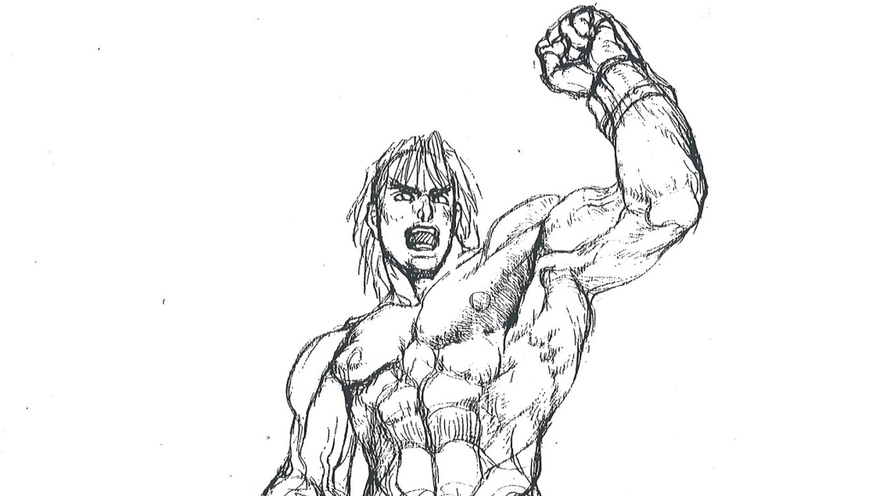
Across the various art styles that Street Fighter has tried throughout its long history, one thing has always stayed the same: the way the characters are all so darn beefy. That's no happy coincidence. Capcom recently published excerpts from its anatomical bible for company artists (via Gamasutra), a document that was compiled in the time of Street Fighter Alpha and Darkstalkers but is still regularly consulted today.
It was created by a collection of Capcom artists more than 20 years ago and edited by famed character designer Akira "Akiman" Yasuda, who left the company back in 2003. Here's a look at some of the most illuminating illustrations that Capcom shared. Be forewarned, there's a whole lotta beefcake and bone-in ribeye going on here.


It's not just aesthetics. Capcom has found that using these guidelines to exaggerate character proportions makes them much easier to read at a glance - and a glance is often all you have time for in a high-speed fighting game like Street Fighter 5. Back when it was still in the prototype stages, Capcom actually tried a few more photorealistic styles but quickly realized they were far too difficult to read - as seen here in the GDC '17 presentation that first shared the manual with the outside world.


I think they made the right call. How could any photorealistic Street Fighter ever hope to compete with the live-action perfection that was Street Fighter: The Movie - The Game?
If you have a keen appreciation for the characters but have no idea how to start playing, check out our Street Fighter 5 beginner's tips.

