40 Worst Movie Posters Ever
They don’t want you to see their movie…
The Kings Speech (2011)
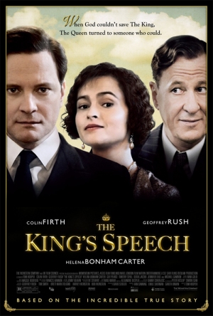
Why So Bad? A Photoshop nightmare (get ready, this’ll be the first of many), this soft-focus failure wins the Most Awful Cut-Out Award every time. Just look at Firth, he's not happy about it either.
Worst Detail: Helena could have at least run a comb through it before posing for that shot…
X-Men: First Class (2011)
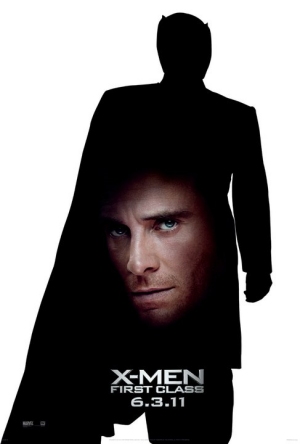
Why So Bad? Matthew Vaughn made First Class in pretty much a year – that’s a year from signing a contract to delivering the film in cinemas. Looks like the marketing department wanted to compete with that speediness by creating posters that took one minute to make. Like this.
Worst Detail : It’s a neat idea – Ian McKellen's outline literally foreshadowing Michael Fassbender’s future. But it just looks cheap and rushed.
Top Dog (1995)
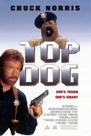
Why So Bad? Chuck Norris cashes in on Turner & Hooch and the Top Dog comics, teaming up with a canine. The film’s as bad as the poster – and that’s saying something.
Worst Detail: Wait, which one’s the dog?
Sssssss (1973)
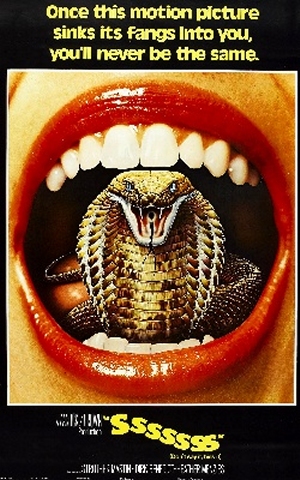
Why So Bad? Well, it’s for a bad (nay, terrible) movie, so it figures. Also, that must either be one very tiny snake, or one very large mouth.
Worst Detail: The fortuitous tagline, which holds completely true. We’ve not been the same since.
Pretty Maids All In A Row (1971)
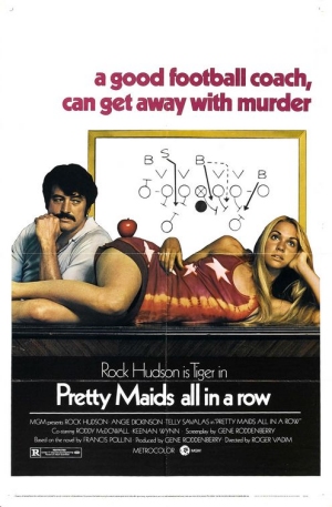
Why So Bad? The lounging lady has a strange, apple-shaped growth on her hip. Rock Hudson continues to pretend he likes women. And there’s something about basketball gameplay on a whiteboard. Badness.
Worst Detail: Who needs twist endings that actually make you go “WTF?!” This poster unashamedly gives away the film’s ending – which just means we don’t need to bother watching it. And what's that rogue comma doing in the tagline?
Extraordinary Measures (2010)
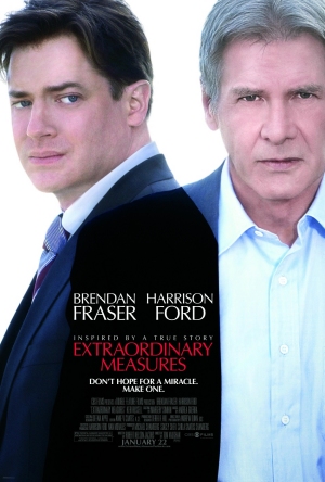
Why So Bad? Brendan Fraser looks like he really needs to pee. Harrison Ford looks like he wants to hit you just so you don’t go see him in this terrible movie.
Worst Detail: Wait, we saw the movie, and we don’t remember Fraser and Ford being stuck together like that. Oh, it’s more bad photoshopping? Eyesore.
Tooth Fairy (2010)
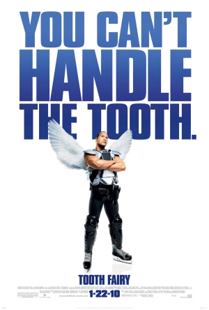
Why So Bad? It’s Dwayne Johnson further humiliating himself after the execrable Scorpion King . He’s clearly attempting to ape Arnie’s career, and falling down all the same potholes.
Worst Detail: That cringeworthy tagline. It even makes us hate A Few Good Men .
Bringing all the latest movie news, features, and reviews to your inbox
Slumdog Millionaire (2008)
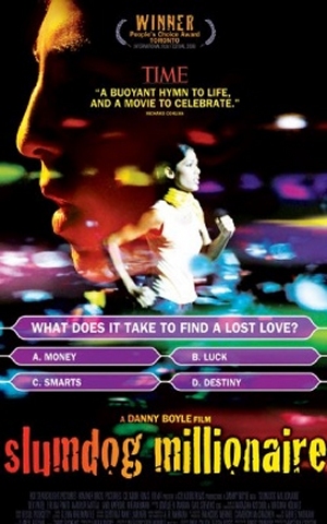
Why So Bad? It goes all obvious and plays with the Who Wants To Be A Millionaire? iconography. Which does nothing but ensure it looks tackier than a Spice Girls doll.
Worst Detail: The weird blurry colours, which are probably meant to evoke some kind of Eastern magic, but just look messy.
Antichrist (2009)
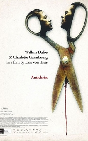
Why So Bad? Is it a thing of startling poignancy or a tasteless oddity? Hard to tell. One things for certain – Willem Dafoe and Charlotte Gainsbourg as a pair of scissors is plain silly.
Worst Detail: The blood between the scissor legs is an indication of things to come, but it’s a bit too icky for our tastebuds.
Victory (1981)
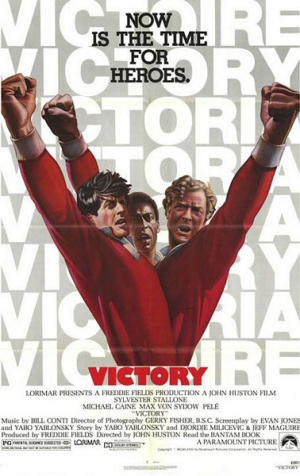
Why So Bad? All for one and one for all! Sylvester Stallone shares a waistline with his co-stars in this frankly bizarre bit of poster art.
Worst Detail: Why does everybody only have one arm?
The Total Film team are made up of the finest minds in all of film journalism. They are: Editor Jane Crowther, Deputy Editor Matt Maytum, Reviews Ed Matthew Leyland, News Editor Jordan Farley, and Online Editor Emily Murray. Expect exclusive news, reviews, features, and more from the team behind the smarter movie magazine.
