GamesRadar's box art battle
Raking a designer's eye over covers past and present in our first (and likely only) visual battle
ROUND 2
Yars%26rsquo; Revenge vs Michael Jackson%26rsquo;s Moonwalker
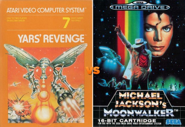
Hajime Sorayamamay nod his approval at the fearsome metallic insect barreling his way towards you and blasting Ping-Pong balls, but there’s really not much going on in that Yars’ Revenge cover is there? The title’s type sits strangely off to the right for no apparent reason, and the title itself is kerned horribly. Look at the space between the E and the N in “Revenge” and compare that to the spacing between the N and the G! Lazy. Also, whoever approved yellow type on an orange background also probably enjoys eating peanut butter and mayonnaise together. On saltines.
Winner: Michael Jackson’s Moonwalker
Winner: Michael Jackson’s Moonwalker
Grand Theft Auto: Vice City vs Gabriel Knight: The Beast Within
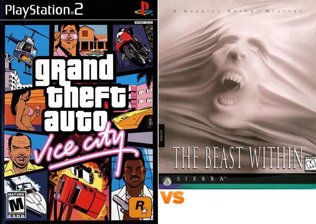
I imagine the face in Gabriel Knight: The Beast Within is screaming, “Remove me from the shackles of this shrink wrapped hell and give me a heavier typeface to promote my title because the condensed (Seriously, gaming industy, what’s with the boner for condensed type?) face with its delicate, but spiked serifs are totally getting lost in my wrinkles! And, while we’re at it... who let that ESRB rating get so close to my title anyway?! A little breathing room here, people!”
Winner: Grand Theft Auto: Vice City
Weekly digests, tales from the communities you love, and more
Winner: Grand Theft Auto: Vice City
EveryExtendExtra vs Red Steel
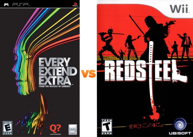
Red Steel did a clever job of creating a solid logo for their game, but the use of a red drop shadow beneath it is a visual insult to the creativity of the mark. Also, the figures in the background have a realism that, even if they’re in silhouette, is still apparent with details like folds in the fabric of their clothing. Unfortunate, then, that the same realism couldn’t be applied to the sword and gun in the logo. The gun especially, as it looks like someone merely traced an outline. Adding a few more details to it would have given the mark some necessary depth and interest. By the way, let’s pick a deeper tone of red for your blood, shall we? I’d rather not think of ketchup-smothered fries when I picture any kind of fighting game.
Winner: EveryExtendExtra
Awesome vs Left 4 Dead 2
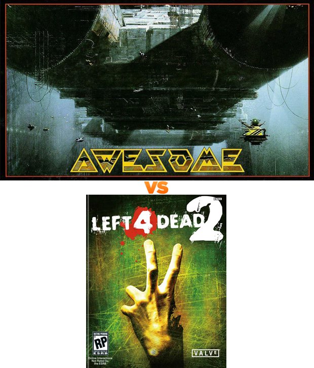
Left 4 Dead 2: four fingers, two are raised, and the opposable digit that separates humans from a majority of species on the planet and allows us to, among other things, play videogames, the thumb has decomposed and fallen off. The entirety of the title and scope of the game neatly packaged in one single element and is visually more interesting and stronger than the original. From that hand you can gather that it’s a zombie game without actually seeing the creatures. And, while both Left 4 Dead and Left 4 Dead 2 are essentially packaged the same, wouldn’t it have been nice to see 2’s zombie hand grabbing or holding something to further differentiate it from its predecessor? A little something to hint that the game had more in store than the usual zombie fare?
Winner: Awesome
ROUND 3
Michael Jackson%26rsquo;s Moonwalker vs Awesome
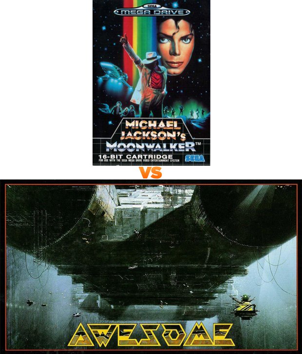
I could critique Awesome on why it’s a less successful cover than Michael Jackson’s Moonwalker, but instead I’ll just show you this:
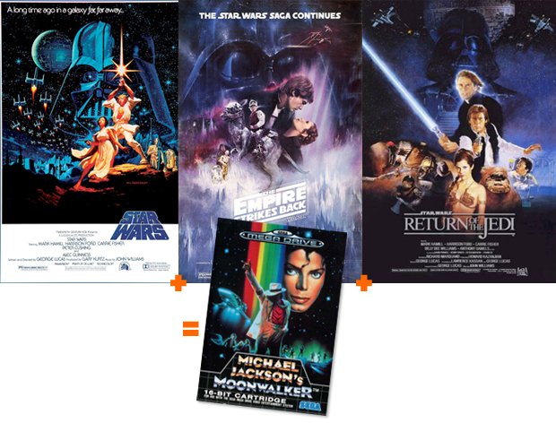
Above: Don’t tell me you didn’t notice
Winner: Michael Jackson’s Moonwalker
Winner: Michael Jackson’s Moonwalker
Grand Theft Auto: Vice City vs EveryExtendExtra
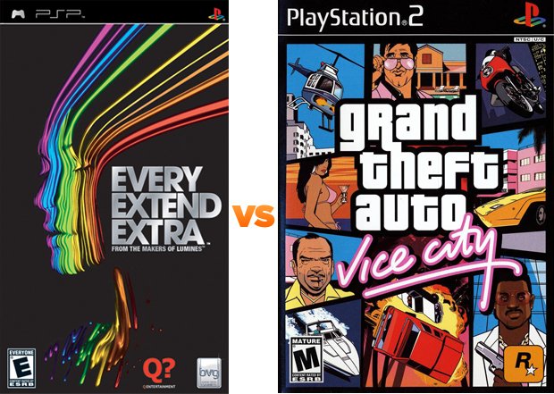
A title like EveryExtendExtra is just screaming for something interesting typographically. Three E’s, two X’s, an odd number of words that are short enough to be set in a variety of ways (Vertical? Horizontal? Dare I say it... diagonally?), and a main image that, while definitely interesting, is open enough to interpretation that you’re able to go hog wild with the title. Instead we’re given left justified stacked type in Helvetica. Really? That’s it? You give us this pretty awesome Lite Brite at high speed rainbow woman and all you could be bothered to do with the title is left justify it and give us a little shine via Photoshop-filter? *sigh*
Winner: Grand Theft Auto: Vice City
Winner: Grand Theft Auto: Vice City
FINAL ROUND
Michael Jackson%26rsquo;s Moonwalker vs Grand Theft Auto: Vice City
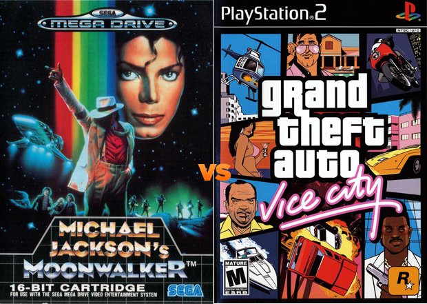
Nostalgia is such a difficult thing to let go of, even more so when it revolves around the King of Pop. However, Moonwalker features an eerie, disembodied (and clichéd) Michael Jackson head and a strange rainbow lacking several hues in the spectrum. What was the concept behind having giant-face Michael making eye contact while Smooth Criminal Michael hides his face underneath his fedora? Typographically, the shiny face is visual overkill. Highlight his name or highlight his title, but by highlighting both with the essentially the same effect you effectively make neither important. In fact, the more simply treated “16-Bit Cartridge” line almost takes more heavy visual presence due to its color and lack of cheesy type treatment. How disappointing.
Winner: Grand Theft Auto: Vice City
Winner: Grand Theft Auto: Vice City
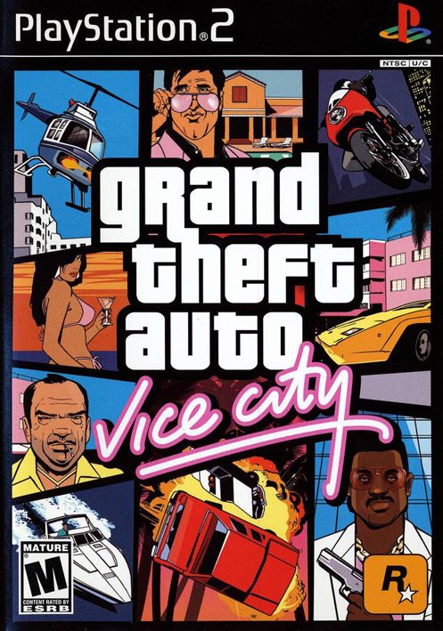
Grand Thef Auto: Vice City easily wins this battle by its strong use of typography (look at that beautiful letter spacing), expertly done illustrations (three of the four characters are making eye contact with you, thus drawing you into the cover), with great use of color and layout. Breaking this cover apart there are basically fourteen individual elements presented, and they all hold hands harmoniously to create a wonderful whole. Even the ESRB rating, usually shoved in a corner to block whatever it has to was thoughtfully paired with the illustration of a boat in a stark white to help it blend in more. The typeface used for Vice City makes a nod towards the neon lights of a major metropolis without having to rely on outer glows, bevels or 3D textures that are so often used (and abused). Subtle. Effective. Brilliant.

Rockstar obviously realized this since the franchise continues to use the same format for the rest of the series, thus successfully creating a visual brand. The platform and technologies may have changed, but the illustration style and concept remain constant and strong. With that I name Grand Theft Auto: Vice City the king of all box art.
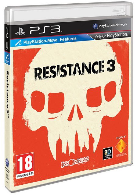
That is, until Resistance 3 is released. Oh hello, you pretty thing
May 19, 2011


GamesRadar’s ultimate hated character battle
32 of gaming's least-beloved characters square off for our entertainment

GamesRadar ultimate character battle
64 of gaming's greatest icons face off to decide who rules the internet
8 hated box art cliches
Designers should take a break from these overused visuals

 Join The Community


