
 Join The Community


What are the best games of all time? It's a contentious conversation by design, one that we thought we'd take on in celebration of the video game industry turning 50 years old.
In collaboration with the Golden Joystick Awards, GamesRadar+ has assembled a list of what it believes to be the ultimate games of all time. With millions of titles to choose between, we came to our final shortlist after considering influence, innovation, legacy, social impact, critical reception, and enduring playability. The result is a list of the 50 best video games that spans eras and genres; a selection that respects the games that defined the past and those that we believe will be consequential to the industry's future.
There's always a degree of subjective interpretation with these sorts of endeavors, so that's why we opened up the process. The entries that make up the top 20 were shortlisted by a panel of industry experts and luminaries, and voted on by the viewers of the Golden Joystick Awards, while the remaining 30 were voted on by the senior editorial team here at GamesRadar+. We took care to include just one game from each series, with exceptions made for those that have significantly pushed beyond the boundaries of 2D or 3D – thanks for making things more complicated than they needed to be, Nintendo.

Keep on scrolling for our consideration of the 50 best games of all time.
Best games of all time (50-41)
50. Animal Crossing: New Horizons

Release: 2020 | Developer: Nintendo
Animal Crossing: New Horizons became a true cultural phenomenon in 2020. Released under the unique circumstances brought on by the COVID-19 pandemic, the virtual shores of New Horizon provided a platform for players everywhere to connect with loved ones and celebrate milestones when they otherwise couldn't. Its influence is vast, pushing beyond the boundaries of video game discourse to impact the broader pantheon of popular culture. With an upgraded look for a new generation and a host of fresh features, New Horizons drew in newcomers and long-time players alike and became the second best-selling Switch game of all time. With an impressive 34 million copies sold since launch, the triumphant return of Nintendo's long-running series will be talked about for years to come.

49. Assassin's Creed Odyssey
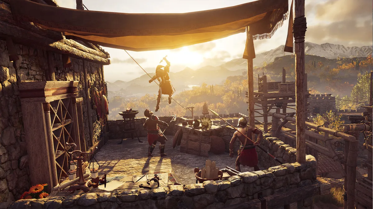
Release: 2018 | Developer: Ubisoft
Assassin's Creed Odyssey built on the RPG elements introduced in Assassin's Creed Origins to deliver a boundless adventure in Ancient Greece. With a myriad of choices to make and more customization options than ever before – including upgradeable and moddable weapons and gear – Odyssey puts you at the centre of a truly wonderful journey. For the first time in the series' history, you can also choose between protagonists Kassandra and Alexios to explore Odysseys' in-depth story set years before The Order came into the equation. Along with romance, a wealth of side quests, dialogue responses, and a host of memorable characters, Assassin's Creeds Odyssey really brought the series forward in an exciting direction.
48. Fez

Year: 2012 | Developer: Polytron Corporation
At first glance, Fez's squeaky-clean, pixelated aesthetic is a love letter to the classic platformers which defined the 8-bit and 16-bit eras. Look beneath its shiny veneer, however, and discover a dimension-breaking, landscape-shifting, super-intelligent puzzle game that breathes new life into the old-school sidescroller formula. Exploratory by design, Fez side-steps limited lives and boss battles, and instead encourages players to experiment. You do this while traversing a truly gorgeous world, conversing with an array of whimsical characters, and interacting with a slew of glyphs, treasure trails, and secret rooms, all in a bid to restore the fabric of spacetime. Fez's groundbreaking rotation mechanic in essence delivers a 2D puzzle game inside a three-dimensional world, and as a result, keeps you guessing from beginning to end.
47. Fortnite: Battle Royale

Year: 2017 | Developer: Epic Games
Simply put: Fortnite epitomises the term 'runaway success'. So popular is Epic Games' ubiquitous video game – one that has spread its tendrils into real world merchandising, pop-star crossovers, and high-street fashion, among many other extracurricular ventures – that it's hard to believe it's only a little over four years old. With its spin on the tried and tested battle royale formula, where building and construction mechanics were added to the bouts of 100-player, last-person-standing PvP, Fortnite quickly took on a life of its own with over 350 million accounts registered. Now, Fortnite highlights the true power of games – a living sandbox for community and competition. Fortnite is a fight to survive, it's a playground, and it's a social space – but perhaps most importantly, it's a forum for creative thinking and action.
46. Persona 4 Golden
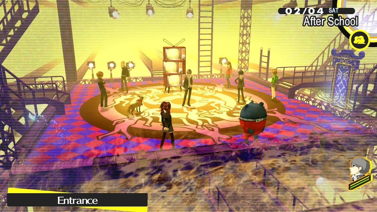
Release: 2012 | Developer: Atlus
Set in the rural town of Inaba, Japan, Persona 4 Golden explores a coming of age story of a group of high school students who find themselves investigating a series of murders. With dungeons that reflect the inner fears or desires of the characters, Persona 4 Golden blends fantasy with everyday school life to deliver an engrossing JRPG that keeps you invested with its many twists and turns. Following a school calendar year, you'll take classes, form meaningful bonds with friends, and develop a romantic relationships as you make your way through the story. While it does explore some darker elements, the adventure in Inba is full of humor, great combat, and a cast of memorable characters you won't soon forget.
45. Castlevania: Symphony of the Night

Release: 1997 | Developer: Konami
In a series with a multitude of games, rereleases, and ports, Castlevania: Symphony of the Night stands out as a major milestone for the spooky series. Inspired by The Legend of Zelda, the developers leaned into explorations and RPG elements the series had only flirted with in the past. Dracula's son Alucard is its hero, exploring Daddy's castle and chasing villain Shaft but once he's defeated, the adventure continues in an inverted version of that same castle. With its distinct style and structure, gothic melodrama, and abilities like summoning familiars and shapeshifting into a mist, the game won over critics and fans, and we haven't stopped playing it ever since. It's telling that, almost 25 years on from its original release on PlayStation, Symphony of the Night's influence on the industry has yet to diminish.
44. Forza Horizon 4

Release: 2018 | Developer: Playground Games
Forza Horizon 4 deserves special mention not only for introducing changing seasons to the Xbox racing series, but for providing a valuable service to the British tourist board. Its artistic interpretation of Britain is more visually stunning than any postcard, with tracks running through meadows and seasides and leafy forests. As well as looking pretty, the new seasons changed the opportunities each area afforded, with lakes freezing over to become safe to drive on. If the scenery didn't do it for you, there were still the 750 licensed cars to obsess over, the chance to create customized routes, and a bumper pack of content after release that included treasure hunting challenges and the ability to race in Lego cars. Simply put, Forza Horizon 4 is a truly stunning racing game.
43. Hades

Release: 2020 | Developer: Supergiant Games
Slick, stylish, and rewarding, Hades is easily one of the very best roguelikes in recent memory. Supergiant delivers a beautifully polished dungeon crawler with smooth hack-and-slash mechanics that keep you eagerly wanting to return to try and escape the underworld. The variety of different weapons and godly buffs to play around with brings an element of strategy and excitement to each run as you try to fight your way through challenging enemies and bosses. At the heart of Hades, though, is Zagreus and a cast of loveable accompanying characters plucked from Greek mythology who are all brilliantly brought to life in a signature art style. Packed full of personality and finesse, Hades is a godly example of its genre in every sense of the word.
42. Destiny 2
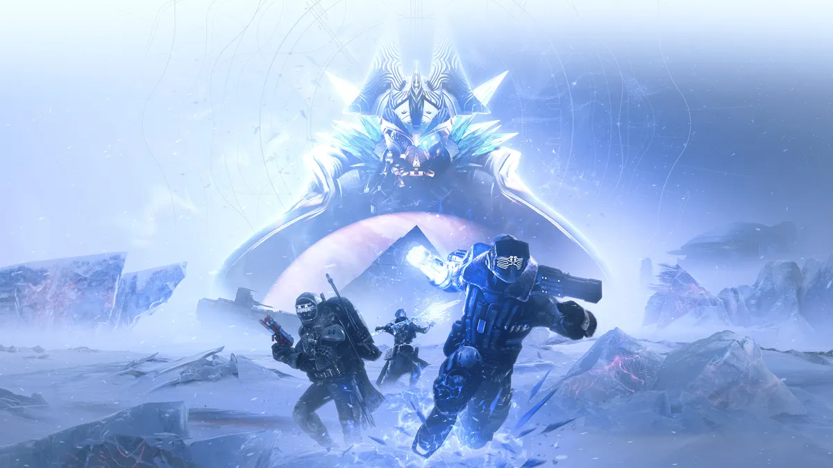
Release: 2017 | Developer: Bungie
Released four years ago, Destiny 2 is still delivering new chapters of space fantasy adventures and arguments over the best loot. It just got a new Darkness power with the Beyond Light expansion, and fans already anticipating the next big content injection – The Witch Queen – due early next year. At this point, the game has enough lore to choke a librarian and an ensemble cast of incredible characters like Savathûn, sister of Oryx, and fan-favorite Eris Morn, and is somehow delivering some of the most exciting storytelling in online gaming. When it comes to its gameplay, Bungie keeps its Guardians loyal with its ever-evolving epic story, weekly updates directly to the community, and events like raids that demand more than just shooting skills to complete.
41. Fire Emblem: Three Houses

Release: 2019 | Developer: Intelligent Systems
Intelligent Systems masterfully brought the long-running tactical strategy RPG to a new generation on the Switch. Set on the continent of Fodlan, you're put in the position of a professor who must decide which of three houses to affiliate yourself with. Each house has a select group of students who all have their own unique personalities and combat styles, and it's up to you to guide them on the battlefield. Telling a rich story full of emotionally memorable moments, each house presents a distinctly different experience with multiple outcomes depending on the choices you make. As a highly replayable and in-depth RPG with satisfying strategy mechanics, ample character development, and meaningful choices, Fire Emblem: Three Houses showcases the series at its very best.
Best games of all time (40-31)
40. Batman: Arkham Asylum
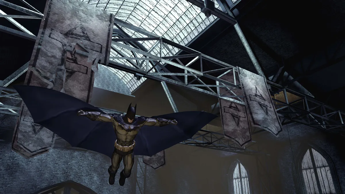
Year: 2009 | Developer: Rocksteady Studios
The superhero game which redefined superhero games. Dark, gritty, foreboding, and yet tremendous fun from start to finish, Rocksteady's first bite at the Batman apple was a huge success back in 2009. Arkham Asylum is celebrated for setting a new standard for action combat, and for bringing classic Metroidvania sensibilities into a modern 3D arena. Stealthily stalking enemies and fist-fighting in Arkham Asylum is a total joy, as is traversing its claustrophobic bounds while utilising Batman's arsenal of handy gadgets. Narrative-wise, Rocksteady was able to capture the bleak and twisted side of its protagonist and antagonists alike with aplomb, and the asylum itself is often as scary as the villains who lurk within its shadowy halls.
39. Bayonetta 2
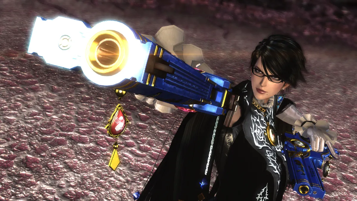
Release: 2014 | Developer: PlatinumGames
An amnesiac witch who uses her hair as a weapon against angels and demons is definitely up there as far as game pitches go, but somehow the Bayonetta series just makes it work. The spooky shapeshifter sequel saw our hero literally going to hell to save her friend Jeanne and stayed true to its predecessor's mix of intense action and spectacular style. Originally released for the Wii U, the game won over a whole new generation of Nintendo fans with a Nintendo Switch release in 2018. Bayonetta 2 struck a fine balance between accessibility and depth, and it remains a masterclass in cinematic combat design to this day.
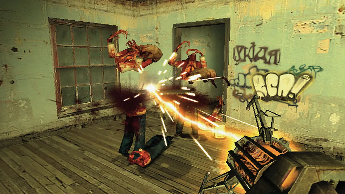
38. Bloodborne
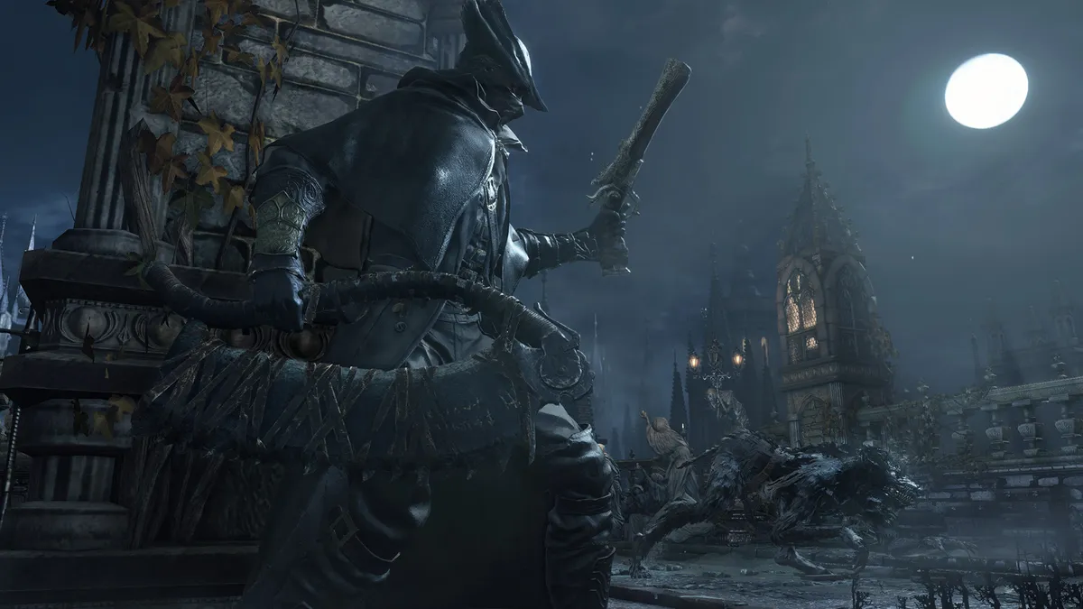
Year: 2015 | Developer: FromSoftware
FromSoftware's first pivot away from its Souls series, Bloodborne gave us yet more action-RPG fare, this time with a Lovecraftian twist. While adopting faster combat mechanics to great effect, the result is horrifyingly brilliant and exceedingly punishing, as per the devs' reputation, set within a decaying world where blood itself is the setting of Yharnam's main currency. While its predecessors hardly shy from challenge, Bloodborne enforces a new level of vulnerability on its players by removing shields entirely, placing a new onus on parry mechanics, and pitting them against some of the most terrifying and twisted bosses to grace the face of video games. From the Cleric Beast to Father Gascoine, Vicar Amelia and the One Reborn, Bloodborne's tormented abominations underline what makes this PS4 exclusive so special.
37. Inside

Year: 2016 | Developer: Playdead
After its debut venture Limbo – a gorgeous monochromatic puzzle game – was received well by players and critics alike in 2010, Playdead's follow-up, Inside, arrived six years later with a level of expectation not normally levied at independent studios. But, full credit to the developer, Inside more than delivers as a smart, dark, emotive, and intriguing puzzler, whose set-pieces often baffle, before evoking the most satisfying, punch-the-air eureka moments upon successful completion. Upon release, Limbo was compared with film noir, and with Inside having been part-funded by the Danish Film Institute, the latter's roots in cinema also shine throughout. Puzzle games have come on leaps and bounds in the last decade, but few leave such a lasting impression as Inside.
36. Shadow of the Colossus

Release: 2005 | Developer: Team Ico
Shadow of the Colossus is one of those rare games that transcends the usual confines of the medium, so much so that it should probably be on show in museums as a masterpiece. The story seems simple enough, a young hero trying to save a damsel in distress by fighting gigantic monsters, but everything from the visual style to the emotional beats of the story ultimately come together to leave scars on your soul. Each colossus is a level in itself, a huge structure that must be climbed and conquered, and the game resists the temptation to overload its hero with tools, giving you just a sword, bow, and loyal companionship of Agro the horse to succeed. You can still see the game's influence in titles released today, anytime you have to scale a huge enemy like they're a jungle gym – that's the Colossus effect.
35. The Legend of Zelda: A Link to the Past
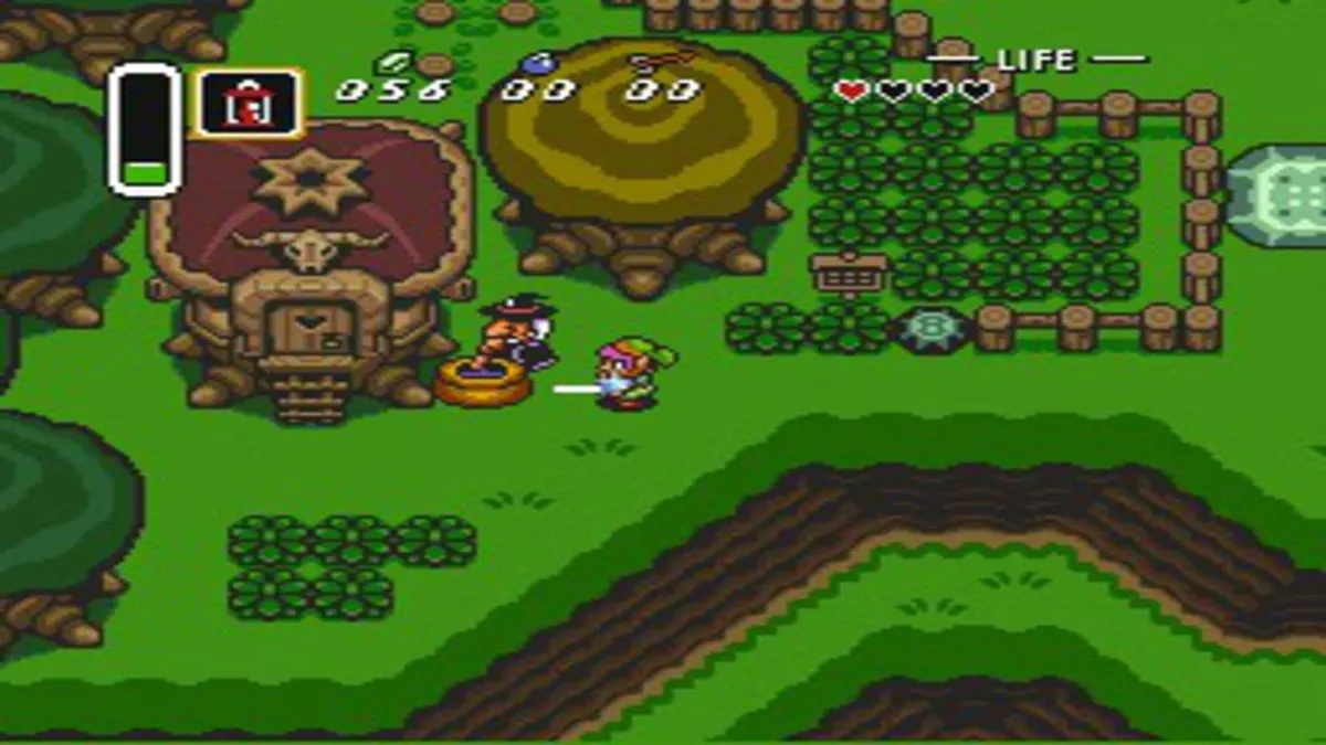
Release: 1991 | Developer: Nintendo
Want to see a fight? Trap 30 Zelda fans in a room and ask them to decide what the best of the lot is. While a 3D Zelda game ultimately made it higher up in these rankings, A Link to the Past deserves its place in the hall of fame too. The adventure's shift between the Dark World and Light World is a transformative mechanic that Zelda games have returned to again with good reason, while difficulty was fine-tuned to push you with every boss – encouraging you to explore and understand Link's powers and equipment without screaming a hint into your pointy ears every five minutes. Everyone loves A Link to the Past, from nostalgic Nintendo babies to speedrunners, and if you don't, you should probably go back and play it again. It is, after all, the best of the 2D Zelda games.
34. Dishonored 2

Year: 2016 | Developer: Arkane Studios
Dishonored 2 is everything a sequel should be. Arkane smartly reunites players with the original game's protagonist, Corvo Attano, while expanding the scope of play with a second playable character in Emily Kaldwin. Everything Dishonored did well, Dishonored 2 just does it better – its intricate world-building, multi-tier mission structure, inventive skill combinations, and array of intelligent puzzles. Throughout, there's a real sense that the city of Karnaca is a living, breathing beast which exists independently of the player's actions – be that in full stealth mode without killing a single enemy, or high chaos while offing as many foes as possible. Clockwork Mansion is not only one of the best levels in the Dishonored series, but one of the most innovative levels in the history of video games.
33. Dead Space 2

Release: 2011 | Developer: Visceral Games
Dead Space 2 is the perfect example of a sequel done right. Because everything that the original game did well in 2008 – it was fast, frantic, sometimes disgusting and always super-violent – Dead Space 2 dialed up several notches a few years later. It's been 10 years since the arrival of Visceral Games' second entry to the series, and yet few games have captured the claustrophobia of horror with such skill, timing, and finesse since. Dead Space 2 and its predecessor wear their influences on their blood-soaked sleeves, not least those derived from Resident Evil 4, but do so in all the right ways. It's a mark of deference. Here's what's come before; and here's where we're taking you now. Dead Space 2 is the pinnacle of action horror, and will undoubtedly hold its own among the highest echelons of the genre in another 10 years from now.
32. Stardew Valley
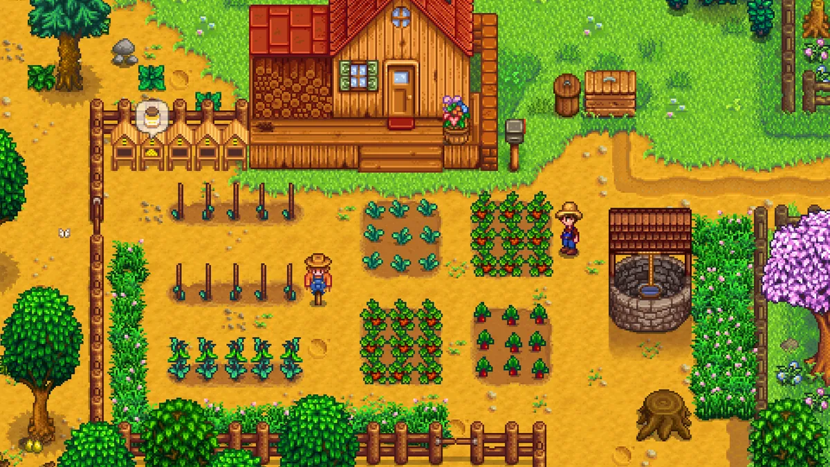
Release: 2016 | Developer: ConcernedApe
There's something so undeniably comforting about Stardew Valley. ConcernedApe may have set out to put their own distinct stamp on the farming sim formula of series Harvest Moon, but the dev ended up changing it forever. Delivering a cosy, pixelated world, you take on a fulfilling role as an office-worked turned farmer who inherits their grandfather's land. At a surface level the premise might sound simple, but as an open-ended sim with so much to discover and do, it's anything but. The residents of Pelican, though, are at the heart of what makes Stardew Valley so special. Each neighbouring character has their own distinct personality, and as you develop relationships – be it friendships or romantic bonds – you get to learn their relatable backstories. With scores of updates since it initially launched, Stardew Valley continues to shine as one of the best examples of its genre.
31. Super Metroid

Release: 1994 | Developer: Nintendo R&D1
Super Metroid was a true achievement when it arrived in 1994 and it's still influencing the games that you're playing today. The action stuck to its side-scrolling, exploration-based roots, but evolved in some notable ways. Samus gained the ability to shoot in all directions and our sense of control over the adventure was further improved by the addition of the automap and inventory screen. With state-of-the-art visual and audio design, its creepy atmosphere, and expanded mechanics that encouraged exploration, Nintendo delivered a silent crawl through a hostile alien world that the industry has never quite gotten over. Almost two decades later, and no other entry in the series has ever quite lived up to its brilliance.
Best games of all time (30-21)
30. Uncharted 2: Among Thieves

Release: 2009 | Developer: Naughty Dog
This was the moment when Drake cemented himself as the most charming of action heroes. Pairing him up with firecracker Chloe Frazer added a new frisson to the treasure hunter's usual banter, and she matched him at every quip. The sequel was also when it felt like Naughty Dog nailed the cinematic style that has become its trademark , with massive set pieces and smaller moments of emotional punches working together seamlessly. Whether you were shooting off guns and one-liners, scaling the walls of a ruined temple, or fleeing from the monstrous guardians of the fabled city of Shambhala, Uncharted 2: Among Thieves looked incredible and was one of those rare occasions where the execution was just as impressive as the image.
29. Final Fantasy 7

Release: 1997 | Developer: Square Enix
Final Fantasy 7 was one of the most influential JRPGs to land on the PlayStation, with 3D graphics that showcased just what the CD-ROM could do. A whole generation of players were introduced to the RPG through Cloud and his iconic Buster sword, and all these years later, it's impact is still very much being talked about today – thanks in part to the release of Final Fantasy 7 Remake. Its impressive sense of world-building, classic turn-based combat formula, and in-depth story work together to create one very engrossing JRPG. With a cast of characters that have cemented their way into popular culture, Square Enix delivered an experience that's legacy will live on for a long time to come.
28. Red Dead Redemption 2
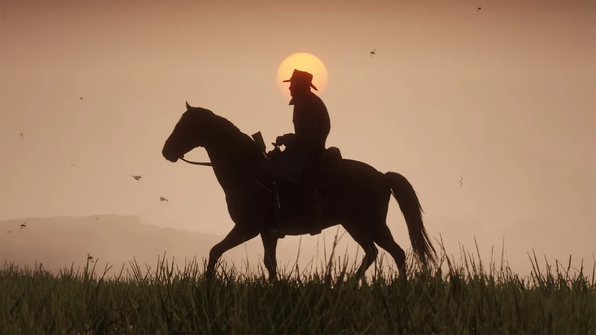
Year: 2018 | Developer: Rockstar Studios
Red Dead Redemption 2 is as epic as video games come. Set several years before the events of its series forerunner, Red Dead Redemption 2 takes place in a gorgeously-rendered, massive interpretation of the American midwest at the turn of the 20th century, and follows the trials and tribulations of outlaw and gang member Arthur Morgan. With that, expect countless heists, shootouts, hunting, horse riding, and bounties as you strive to keep the American Frontier era alive. Much like its sister series Grand Theft Auto, falling foul of the law is governed by a tiered wanted system which you'll inevitably max-out more than a few times. Simply the best western game there is, and one of the best sandbox games ever made.
27. Mass Effect 2
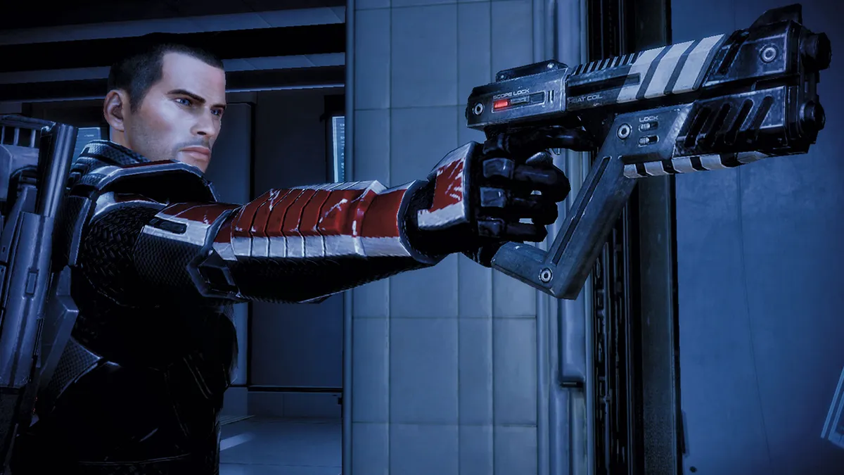
Release: 2010 | Developer: BioWare
There are few sequels that are quite as excellent and beloved as Mass Effect 2. BioWare killed off Shepard in the opening minutes of the iconic protagonist's return and gave the series a rebirth in a figurative and literal sense from that moment on. Pitted against impossible odds in a high stakes overarching suicide mission, each crew member fighting alongside you aboard the Normandy brings something to the table, and it's all too easy to form bonds thanks to their unique personalities. With refined combat, stellar character-driven storytelling, and choices that carry life and death consequences for the characters around you, Mass Effect 2 succeeded at taking the series to new starry heights in a way that few sequels do, and it's arguably become the quintessential space-faring RPG.
26. God of War
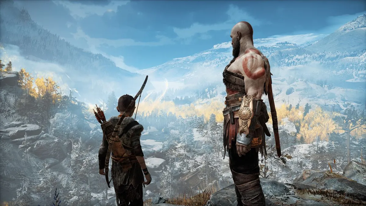
Release: 2018 | Developer: Sony Santa Monica
After Mariah Carey, it's hard to imagine a more impressive comeback than the one Kratos was able to pull off in the 2018 reimagining of God of War. Gone was the frat boy tomfoolery of the original series, instead, we got an unbelievably rich tapestry of emotion, Norse legend, and sharp bladed satisfaction. This new Kratos was just as deadly and as physically able to carve a path through the world and its warriors as before, but now we actually cared about why he was doing it, and become utterly entangled in his relationship with his son Atreus. Tears and blood were shed, in no small part thanks to the incredible performances given to the lead roles by Christoper Judge and Sunny Suljic.
25. Resident Evil 4

Year: 2005 | Developer: Capcom
In 2005, Resident Evil 4's tweaks to the familiar survival horror formula seemed subtle. But, some 16 years later, the impact it's had on horror games, and video games across the board, cannot be understated. From its fast and aggressive hordes of infected villages, to its over-the-shoulder camera perspective, so many games, spanning so many different genres, have drawn inspiration from Resident Evil 4's makeup, which is why it's considered one of the best games of all time today. By switching to a first-person perspective in its most recent outings, Resident Evil 7 and Resident Evil Village, Capcom's enduring survival horror series has been revitalised – but there's a strong argument to be made that Resident Evil 4 is Resident Evil at its very best.
24. Journey
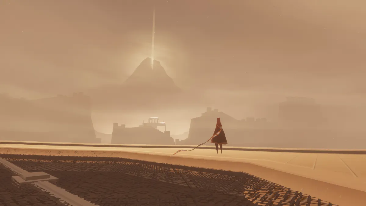
Release: 2012 | Developer: Thatgamecompany
There are few experiences quite as beautiful or profoundly atmospheric as Journey. Taking on the role of an anonymous traveler who ventures through a mysterious world, the movement of Thatgamecompany's adventure pulls you into a relaxing rhythm as you glide across sandy peaks and soar through ancient ruins. Accompanied by a gorgeous musical score, there's a deep allegory at the heart of Journey that succeeds at capturing various emotions. Along the way, you can even be joined by another nameless player in what is one of the most unique online co-op encounters you can have. As thoughtful as it is moving, with a wonderfully stylized world that entirely draws you in, Journey really is a rarity among games that everyone should experience.
23. The Witcher 3: Wild Hunt
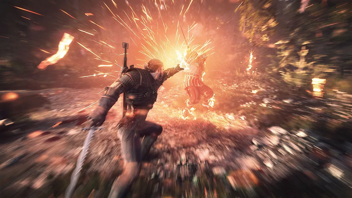
Release: 2015 | Developer: CD Projekt Red
Has any game ever come as close to perfecting the fantasy RPG formula as The Witcher 3? Drawing on the rich, fantasy novels of Andrzej Sapkowski, the game put us in the shoes of the surly monster mercenary and then set us free in a land of epic quests, complicated characters, and moral ambiguities. Even the smallest side quest could suddenly deliver an emotional epiphany, like the one with a suicidal werewolf or the tale of the ghost of a woman who was eaten alive by plagued rats. The main quest packs just as much emotional punch with a family of misfits that – even if Wild Hunt is your first ever Witcher game – feels familiar and important as you fight through the struggles of the story together. There are many heroes in gaming, but there is only one Geralt of Rivia.
22. BioShock

Year: 2007 | Developer: Irrational Games
Would you kindly agree that few games challenged us in both skill and moral decision-making than BioShock did in 2007? Because not only does Irrational Games' spiritual successor to the wonderful System Shock 2 have us exploring the crumbling underwater world of Rapture, taking on its unhinged and hostile inhabitants, and injecting ourselves with copious amounts of DNA-altering drugs; it also forces us to choose whether or not we want to harvest the souls of innocent children. That might sound like a no-brainer, but if you're to have any sort of chance of overcoming the Little Sisters' hulking, near-impenetrable Big Daddy minders, the power these little 'uns yield once consumed could come in handy. First-person shooters don't come much more thought-provoking than BioShock, and few have come as close since.
21. The Elder Scrolls 5: Skyrim
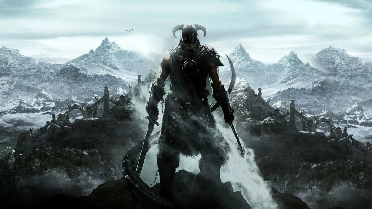
Release: 2011 | Developer: Bethesda
The expansive open-world of Skyrim offered up a sprawling adventure with an impressive level of freedom to shape your journey as the Dragonborn. With rich main story quests and an abundance of side quests that have just as much depth and intrigue, the fifth instalment in the franchise draws you into its fantasy setting and refuses to let go. You're really encouraged to play your way and decide how you want to spend your time, with a variety of different weapons, powers, and skills on offer. Building on the legacy of the Elder Scrolls series, Skyrim's vast sense of scale in every sense has continued to impact games in the RPG genre that followed. It's no wonder players keep returning time again across several platform generations and re-releases.
Best games of all time (20-11)
20. Pokemon Go

Year: 2016 | Developer: Niantic
Pokemon Go got us out of our seats and into the streets. Do you remember what the atmosphere around augmented reality technology was like in 2016? At best, it was wilfully dismissive, and at worst it was actively hostile. But then Pokemon Go changed all of that and has since given over 150 million would-be Pokemon trainers the opportunity to live out their dream of becoming the very best, like no one ever was. Developer Niantic captured the imagination of the general public and became a genuine cultural phenomenon, using a mobile devices' GPS data to locate, capture, train, and battle Pokemon relative to your real-world location. The setup is inventive, the play is simple and social, and the end result is yet to be replicated.
19. SimCity

Year: 1989 | Developer: Maxis
It's difficult to pinpoint when exactly video games escaped the common misconception that they were distractions designed for children, but we're going to make the argument that it started here – with Maxis' hugely influential SimCity. It didn't just kickstart the city-building genre, it made non-linear simulation games a phenomenon. Perhaps the gamification of city planning shouldn't have worked as well as it did, but there was something about SimCity that just spoke to a generation desperate to seize control of their surroundings. Maxis had us marking land for commercial, industrial, and residential development, building transportation systems, managing the power grid, and altering the tax rate to keep the 'sims' on the ground happy. SimCity was educational, open-ended, and impossible to walk away from.
18. Space Invaders

Year: 1978 | Developer: Taito
Space Invaders may look crude by today's standards, but the impact that Tomohiro Nishikado's shoot 'em up had on the landscape of video games from the late 1970s onwards cannot be overstated. Said to have been inspired by prior video games such as Breakout (1976), and H.G. Wells' alien invasion science fiction novel, Space Invaders was the first fixed shooter game that not only set the template for countless shoot 'em ups in its wake, but also marked the beginning of the so-called 'golden era of arcade games'. In 2007, British daily national newspaper The Times named Space Invaders as the 'most influential video game of all time'; while in 2008, Guinness World Records billed it as the 'top arcade game of all time'.
17. Super Mario Kart

Release: 1992 | Developer: Nintendo EAD
Why Super Mario Kart? The truth is, Nintendo EAD has done such a truly excellent job evolving and expanding upon the foundation laid down by this SNES classic over the last 30 years that any of the instalments (yes, even Double Dash – especially Double Dash) could quite easily sit in this position. So, what is it about the 1993 debut of Mario's kart racing side-hustle that pushed it so far up the rankings? It's because of the masterful execution of, what was at the time, a relatively novel concept. The clever track design, slick implementation of simple combat into its high-speed races, and the addition of an irresistible suite of same-couch multiplayer modes helped enshrine Super Mario Kart as legend.
16. Pac-Man

Year: 1980 | Developer: Bandai Namco
Few video games have transcended the medium and spilled into the world of pop culture like Pac-Man. The maze chase game, which sees players munching pills while outrunning ghosts on fluorescent maps, is one of the longest-running, best-selling, and highest-grossing video game franchises in history. It's playable on just about every piece of hardware imaginable, and has spawned dozens of sequels, spin-offs, and crossovers – including Ms Pac-Man, Pac-Man Plus, Mr & Ms Pac-Man, Baby Pac-Man, Super Pac-Man, Pac & Pal, Professor Pac-Man, Jr. Pac-Man, Pac-Land, and Pac-Mania. And, believe it or not, those are only the games released in the '80s. Over 40 years later, the influence of Pac-Man can not be overstated, nor can the undeniable simplicity, challenge, and replayability that lies at the heart of his debut outing.
15. Call of Duty 4: Modern Warfare
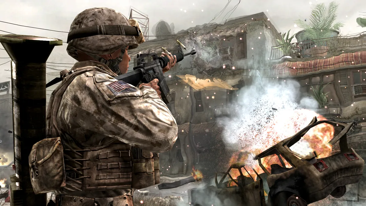
Release: 2007 | Developer: Infinity Ward
Much like Doom and Halo: Combat Evolved before it, Call of Duty 4: Modern Warfare set a new standard for the first person shooter and changed the dynamics of competitive multiplayer. The boundless energy and ingenuity of Modern Warfare's single-player campaign is still unrivalled in this space, while the introduction of the Killstreak and levelling systems, weapon customisation, and Prestige mode would bring a new-found sense of progression and retention to multiplayer gaming that has impacted generations of games and players alike. Call of Duty 4: Modern Warfare was a landmark release, its quality and innovations caused a seismic shift in the landscape of the video game industry that we're still feeling the aftershocks of to this day.
14. Portal

Year: 2007 | Developer: Valve
To say Portal was a happy surprise in 2007 is an understatement. Launched with almost no fanfare as part of The Orange Box – a five-game package which marked Half-Life 2's arrival on consoles, bundling Valve's critically-acclaimed FPS with its subsequent Episode One and Two add-ons, Team Fortress 2, and Portal itself – Portal became an overnight success, wowing with its intelligent, brain-teasing puzzles, and lightning-quick, but exceedingly dark humour. A meme-generator in a pre-meme world, Portal's antagonist GLaDOS is as charismatic, twisted and memorable as video game antagonists come, and the Weighted Companion Cube – a recurring object emblazoned with a love heart used to overcome specific puzzles – is, somehow, one of the most endearing video game allies of all time. Despite being, you know, a literal, personality-less cube.
13. Grand Theft Auto 5

Year: 2013 | Developer: Rockstar North
Any game that can straddle not one, not two, but three console generations is doing something right. Unsurprisingly, Grand Theft Auto 5 has gone on to become one of the highest selling video games of all time, with over 155 million copies shifted at the time of writing. In the absence of single player DLC, much of GTA 5's popularity today is driven by its online offshoot, GTA Online, which invites enterprising players to build virtual criminal empires from scratch – with gunrunning, drug manufacturing, nightclub ownership, and casino heisting among some of the more exotic activities offered within the game's dozens of complimentary updates. Throw in a satirically-swiping Story Mode, and GTA 5 is the complete package for would-be digital law-breakers.
12. Super Mario Bros 3

Release: 1988 | Developer: Nintendo R&D4
To a certain generation of player, Super Mario Bros. 3 remains the ultimate 2D platformer. For the rest of you out there, you're feeling the impact and influence of this legendary NES side-scrolling platformer in so many of the games you play today without even realising it. Receiving universal acclaim when it was released in 1988 and featuring on countless 'best games of all time' lists since, Super Mario Bros 3 took everything the first game in the series had done and embellished on it in multiple directions. The most potent of these features was the power-ups, built out from the simpler abilities of the past and made magical here. Super Mario Bros. 3 is an iconic 8-bit release, impressing to this day with its variety of action, tension, balance, and poise.
11. Halo: Combat Evolved

Release: 2001 | Developer: Bungie
It's a little dizzying to comprehend just how much the modern video game industry owes to Bungie. Halo: Combat Evolved established the framework that console-bound first-person shooters would follow for years to come, with its impossibly tight mechanical design and reactive artificial intelligence helping to set a new benchmark for the genre. Combat Evolved also made Microsoft a viable player in a home console market that was so volatile that entrenched industry-leader Sega was forced to concede just months before the launch of the original Xbox. With its memorable, cinematic campaign, wondrously balanced weapons and vehicles, and an endlessly-replayable, surprisingly-robust multiplayer offering, Master Chief's debut adventure was so incredible that it enshrined the Spartan, his series, its developer, and the platform that hosted it all as legend.
Best games of all time (10-1)
10. Metal Gear Solid

Year: 1998 | Developer: Konami
Stealth games existed before Metal Gear Solid, but the 1998 espionage adventure redefined the genre. With Tenchu: Stealth Assassins, Thief: The Dark Project, Hitman, Splinter Cell, and Syphon Filter all landing in the space of a few years, the turn of the millennium was a renaissance period for stealth games, and, having directed the original Metal Gear and its sequel Metal Gear 2: Solid Snake a decade prior, Hideo Kojima was already a pioneer of the sneak 'em up. Metal Gear Solid was, however, a watershed moment for the Japanese auteur's career, the stealth genre as a whole, and video games in general, as it weaved a rich tapestry of unforgettable Bond-esque villains, action hero movie-inspired plotlines, and revolutionary game mechanics over two discs on the original PlayStation.
9. Super Mario 64

Year: 1996 | Developer: Nintendo EAD
It might be difficult to imagine it now, but there was a point in time where many developers and players alike believed that the 2D experiences we had spent decades enjoying couldn't be replicated in 3D spaces. Nintendo had something to say about that, launching the N64 in the summer of '96 alongside what would ultimately prove to be one of the most important and influential video games of all time. Super Mario 64 did for 3D games what the original Super Mario Bros. did for side-scrolling platformers, setting a new standard for how movement, combat, and camera control could work in tandem with an additional dimension. Super Mario 64 is an inventive, wondrous adventure that redefined the way we play forever.
8. The Last of Us
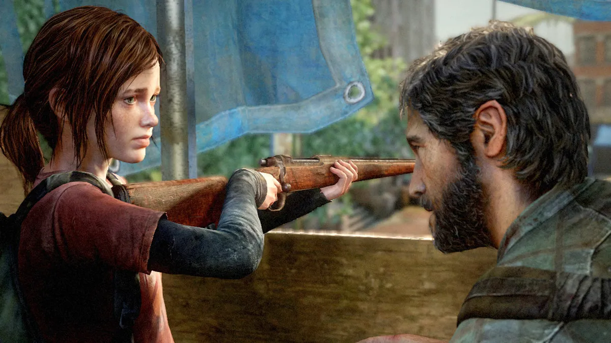
Year: 2013 | Developer: Naughty Dog
As if critical and commercial acclaim at launch wasn't impressive enough, The Last of Us has since been remastered, it's received a handful of equally impressive DLC add-ons, spawned a breathtaking sequel, and is the source material for an upcoming HBO television series. That tells you all you need to know about the impact of Naughty Dog's groundbreaking zombie action-adventure game of 2013, which explores the plight of protagonists Joel and Ellie in their journey through the post-apocalypse. It's thoughtful, emotive, and seamlessly blends engrossing narrative with high-action, gun-toting survival – wherein allocating scant resources to craft petrol bombs over health kits can be gut wrenching as staring down a horde of bloodthirsty Clickers. Terrifyingly brilliant from start to finish.
7. Tetris
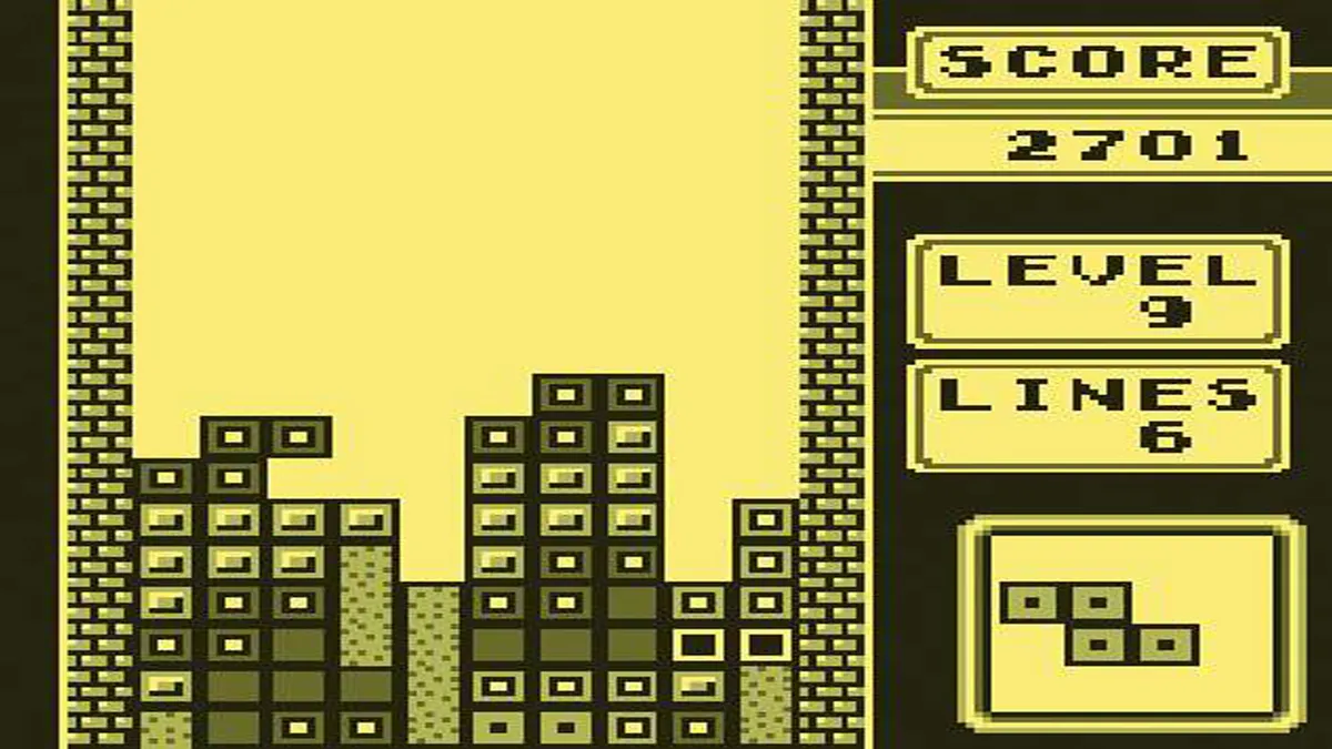
Year: 1984 | Developer: Alexey Pajitnov and Vladimir Pokhilko
Perhaps with the exception of Pong and Pac-Man, few video games hold the same notoriety as Tetris. Originally conceived, designed and developed by Soviet software engineer Alexey Pajitnov for the Electronika 60 computer, the puzzle game was thrust into the mainstream by Nintendo in 1989, whose take on the tile-matcher for its NES and Game Boy systems marked the game's first-ever outings on console. In practice, it's beautifully simple and progressively challenging, as you're tasked with fitting a series of falling shapes together, wiping full lines clear while avoiding filling your screen. The enduring success of Tetris has seen it become the most ported game of all time, while the Game Boy's take on Russian folk song 'Korobeiniki' is today one of the most recognisable video game theme tunes ever composed.
6. Street Fighter 2: The World Warrior

Year: 1991 | Developer: Capcom
The quintessential fighting game that's inspired just about every beat 'em to grace a console, PC or arcade cabinet over the last three decades. So popular was the follow-up to 1987's trailblazing Street Fighter, in fact, that between 1991 and 1994, Street Fighter 2 appeared in five different guises; with a regular edition, a Champion Edition, a Hyper Fighting variant, a Super addition, and a Super Turbo edition, all launched in the space of just three years. Today, Street Fighter is the highest-grossing fighting game media franchise in existence, Street Fighter 2 is the best-selling title among a whopping 37 main series games, spin-offs and crossovers, and Ryu and Ken are among the most recognisable video game characters of all time.
5. Minecraft

Year: 2011 | Developer: Mojang
It's impossible to imagine what the video game industry would look like today without Minecraft. Mojang's breakout independent release turned billion-dollar cultural phenomenon has shaped the way that we play today. Even as it gradually expanded and evolved over time, Minecraft never lost sight of the importance in positioning a player's imagination as a central system – one with as much importance as crafting or combat. While you may come for the survival experience, you'll stay for the endless creativity that the construction sandbox is able to contain. If you can dream it, you can build it; that's a setup as appealing to veteran gamers as it is to young children, and it remains a remarkable achievement.
4. Half-Life 2
Year: 2004 | Developer: Valve
It's hard to believe Half-Life 2 is almost 20 years old, because Valve's seminal first-person shooter still looks gorgeous today. The term 'game-changer' is sometimes overused in modern video games discourse, but Gordon Freeman's second outing really was just that when it launched towards the end of 2004, setting a new, remarkably higher standard for all narrative FPS games moving forward in the process. Few have come close in the intervening years, which is testament to the game's tight combat mechanics, astute puzzle set-pieces, and engrossing storytelling – all of which were carried into episodic sequels, Episode One and Episode Two. Hugely critical and commercially successful, Half-Life 2 shares the Metacritic top spot (96/100) with its series forerunner Half-Life and GTA 5.
3. The Legend of Zelda: Breath of the Wild

Release: 2017 | Developer: Nintendo EPD
Even now, just a few short years after the release of The Legend of Zelda: Breath of the Wild, the impact of Link's debut adventure on Nintendo Switch is difficult to quantify. It's one of those rare releases whose influence is so vast that it has quietly seeped into the fabric of the entire video game industry, the results of which are being teased out now and won't be fully realised for years to come. Heralded for its freeform approach to problem solving and its wondrous open world, remembered for its challenging combat and sharp storytelling, Breath of the Wild is a once-in-a-generation masterpiece. Unsurprisingly, it's also one of the best-selling, and most critically-acclaimed games of all-time.
2. Doom

Year: 1993 | Developer: Id Software
Doom wasn't the first first-person shooter, but it might be the most important. When id Software unleashed this carnival of carnage upon an unsuspecting world in 1993 it changed everything. It established the template for a wave of demonic shooters that helped define play throughout the '90s and it gave many gatekeepers to popular culture a new way to demonize video games. While Doom may well be remembered by many for being one of the most controversial video games in existence, we prefer to look at it for all that it accomplished. It's responsible for taking the FPS mainstream, for delivering intensive action and an arsenal of finely-tuned weapons that still holds up today, and, perhaps most importantly, for making video games "cool".
1. Dark Souls
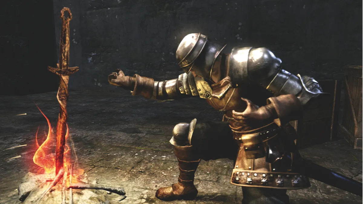
Year: 2011 | Developer: FromSoftware
From cult classic, to sleeping giant, to one of the most influential action-RPGs of a generation, Dark Souls' path to mainstream recognition was as twisted as the beasts lurking in Demon Ruins. Often billed as one of the most punishing games you'll ever play, FromSoftware's indirect follow-up to 2009's Demon's Souls is hardly a walk in the park, but, scratch beneath its difficulty, and discover a wonderful, open-lored and expertly-designed fantasy role-player, with larger than life enemies, mysterious NPCs, and epic boss battles that will leave the words 'YOU DIED' etched into your mind via the tip of a Dragonslayer Spear. 10 years since release, so many games owe their existence to Dark Souls, and, thanks to its 2011 hit, developer FromSoftware is now a household name.
For more on FromSoftware's action-RPG masterpiece: Why Dark Souls has been crowned the best game of all time.
For more, check out our rankings of the 20 best video game consoles and hardware of all time and the 50 best game characters of all time.

