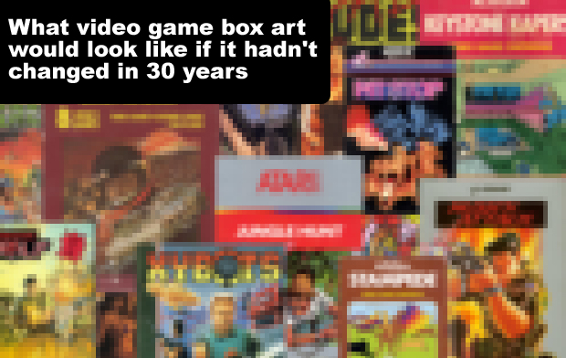
What video game box art would look like if it hadn't changed in 30 years
The craptacular box art of yesteryear, applied to the games of today
What video game box art would look like if it hadn't changed in 30 years
Have you ever wondered what it would be like if video game box art hadn't changed in 30 years? No. I don't suppose you have. Why would you? You've got more important things to think about. But I haven't.
After pondering this transparently inane hypothetical scenario, I decided to turn it into a thing on the internet. And this is it. A pictorial-based feature in which I have spliced old box art with new games just for the sake of it (while still retaining each game's modern logo and typography). In the grand scheme of things it's a pretty simple concept to grasp. So without further pointless explanation, please continue to browse my just-about-serviceable Photoshop handiwork at your leisure...
Grand Theft Auto V | Old box art taken from A.P.B. (1989)
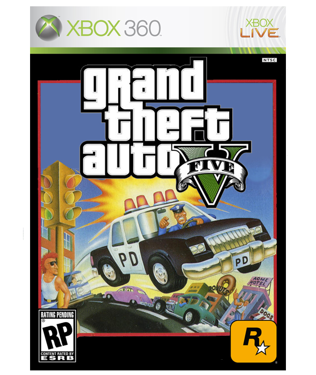
The 80s were a decade when people didn't think straight. Their heads were a muddle with shoulder pads and Rubik's Cubes and hair-dos and Police Academy movies. It's no wonder that everyone thought it was totally fine to use kid-friendly cartoon box art for games that - looking back - probably weren't completely appropriate for kid-friendly cartoon box art.
It was the bewilderingly stupid age of stupid before some responsible grown-ups finally thought perhaps some kind of age-rating system for games might be a good idea. And it was glorious while it lasted. I love the idea that even with its mature themes of violence and sex and drugs and broken morality, a game like GTA could be visually represented with some dismissively goofy-looking box-art that essentially says "I'm a policeman. It is my job to chase you. WEEEEEEEEEE!!!!!"
The Elder Scrolls V: Skyrim | Old box art taken from Wing War (1983)
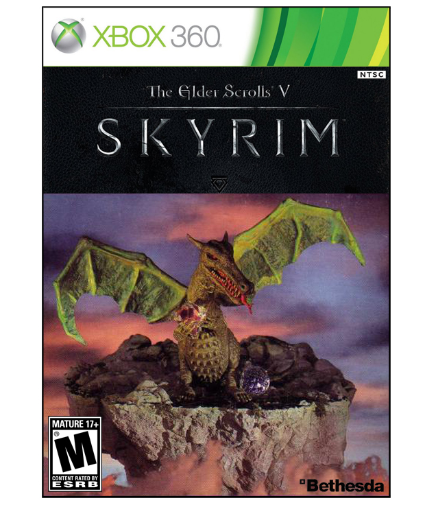
You could pay some shaven-headed, Apple-worshipping, thick-rimmed glasses wearing design guru wank specialist a small fortune to visualise your intellectual property via the medium of pictures and typography composed in an aesthetic frontage commonly referred to by plebs as 'box art'.
Alternatively, you could get your mate Brian who works Tuesday afternoons and all day Saturday in the Game Workshop at the top of town to knock together a three dimensional diorama of a dragon holding a diamond-shaped bit of plastic and then take a photo of it.
Battlefield 3 | Old box art taken from Armor Battle (1982)
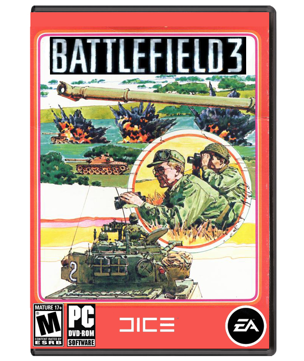
This was the distinctive box-art design style for quite a few of Intellivision's games in the early 80s. It might lack the technical complexities of modern computer-facilitated design, but more than makes up for it with genuine artistic personality and the sense that it has been created by an individual artist (in this case an artist called Steve Huston) as opposed to a committee of graphic designers.
And it's got tanks and explosions and men strategising with binoculars and is consequently the perfect old-school box-art fit for Battlefield.
Fun fact: The art budget for Intellivision's boxes was approximately $800 per box.
Monster Hunter Tri | Old box art taken from Pool of Radiance (1988)
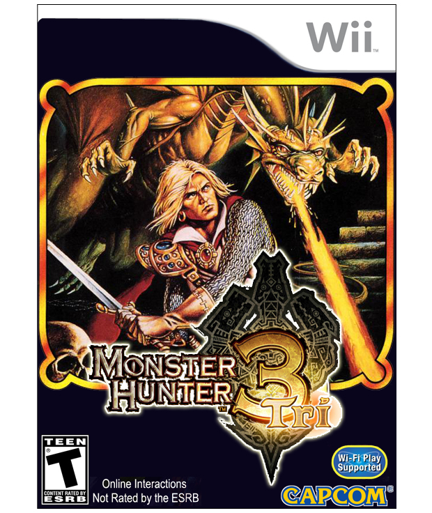
Really not too dissimilar in composition to the actual Monster Hunter Tri box art. It's an armour-clad warrior, sword in hand, about to go toe-to-toe with a belligerent lizard. The real difference is the art from 24 years ago is much more... restrained. For starters, we just don't get sensible-sized swords like that any more. Swords today have to be physically impossible to hold - humongously proportioned pizza slices of death capable of eviscerating entire skyscrapers in a single blow.
And the dragon looks wimpy. Enough to impress the easily impressed 8-bit kids at the time, but those kids were full of unregulated food additives and MTV so they were in no fit state to know any better. Put anything less than a 20 storeys high mega-beast on the cover of a game today and the kids would literally point and laugh and then go buy Call of Duty instead.
Virtua Tennis 4 | Old box art taken from Tennis (1981)
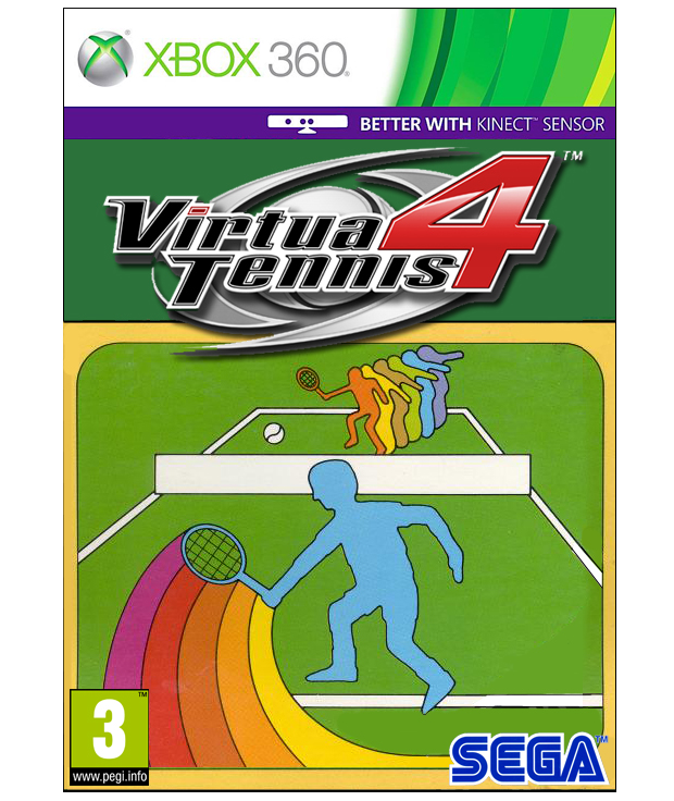
Before Activision became the ruthless mega-corporation we know today, it used to have a real thing for rainbows. Lovely friendly happy rainbows that were happy. It used rainbows to make some of the most colourful and memorable Atari 2600 game packaging ever made.
Take the box-art you see above. Remove the lovely happy rainbows and you're left with the most basic artistic representation of tennis you can possibly get before it devolves into Pong. But with the lovely happy rainbows it is a thing of beauty and much more lovely to look at than the actual Virtua Tennis 4 cover, which features the sweating, gurning faces of some of the sport's real-life stars. And no rainbows.
Soul Calibur V | Old box art taken from Barbarian (1987)
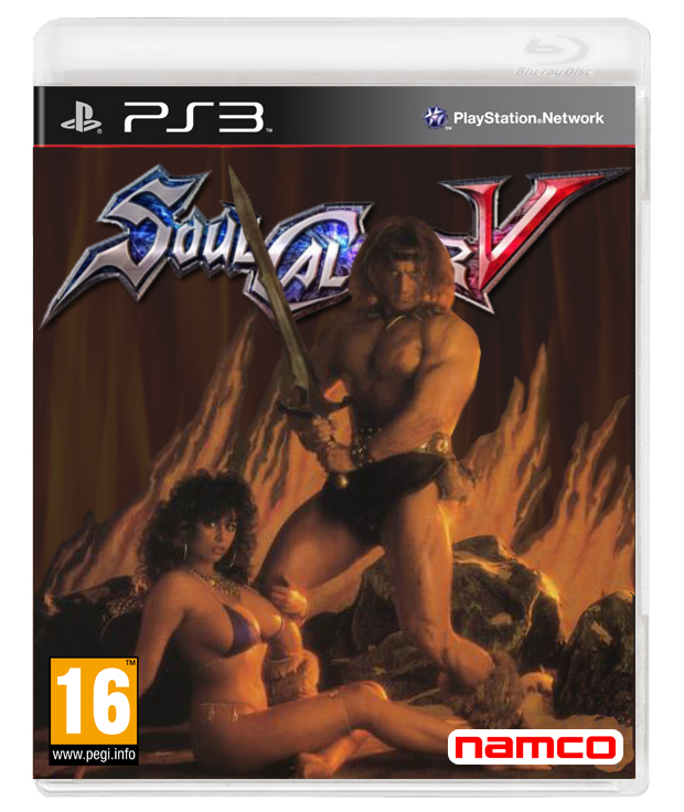
The combination of big sword and minimal boob coverage make this a perfect fit for Soul Calibur. And if the blatant sexualisation and objectifying of women was still completely fine and OK with everyone just like it was in the 80s, I've absolutely no doubt we'd still have game covers just like this. But we don't.
In fairness to the 80s, it was probably the shit-storm of controversy around the Barbarian cover that made some grown-ups re-think the idea that such imagery was totally cool to use when marketing to kids. Although nobody seemed to mind that the game featured decapitations. They were rubbish 8-bit decapitations. But still. Decapitations.
Weekly digests, tales from the communities you love, and more
Red Dead Redemption | Old box art taken from Outlaw (1978)
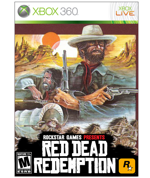
The cowboy dude on this old Atari 2600 box-art even looks like Red Dead's John Marston. He's got a beard. And a hat. And guns. All the defining characteristics of a cowboy dude.
The old box-art could *almost* pass as new box-art. But not quite. It evokes the vibe of Red Dead, but the art is too flat. Too passive. The cowboy dude needs to stick out his arm and point the barrel of one of those guns right at us. BLAMMO. Eye-catching. Impact. Design objective completed.
Lesson: Perspective drawing is hard.
Demon's Souls | Old box art taken from Gateway to Apshai (1983)
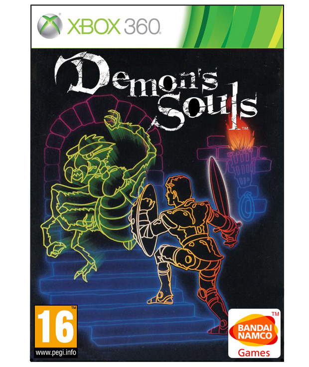
Old game publisher Epyx favoured this distinctive neon-inspired psychotropic disco style for loads of its releases in the 80s. And this particular one works as a Demon's Souls cover rather nicely.
Although, admittedly, the monster appears to be waving its insectoid appendage at the brave warrior in a manner not entirely befitting a game like Demon's Souls, suggesting something along the lines of "Please enter my dominion so we may watch the game and drink cool brewskis together" rather than "My intention is to kill you immediately". But whatever. Personally I'm all in favour of friendly neon-inspired psychotropic disco monsters.
Call of Duty: Modern Warfare 3 | Old box art taken from Bazooka Bill (1985)
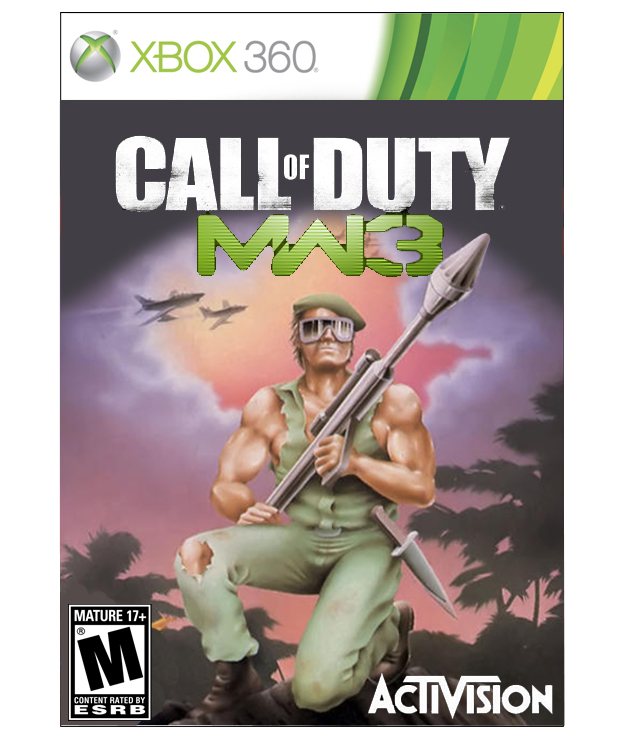
Nondescript man with weapon.

