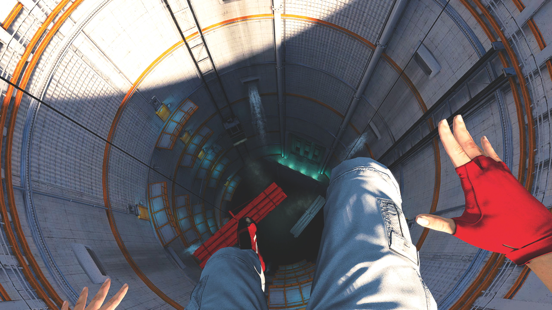
Mirror's Edge originally looked like "every other Unreal game" in 2008, but it literally made people sick: "Moving very fast through the world, you got simulation sickness"
The Gears of War treatment didn't really work for Mirror's Edge

Weekly digests, tales from the communities you love, and more
You are now subscribed
Your newsletter sign-up was successful
Want to add more newsletters?

Every Friday
GamesRadar+
Your weekly update on everything you could ever want to know about the games you already love, games we know you're going to love in the near future, and tales from the communities that surround them.

Every Thursday
GTA 6 O'clock
Our special GTA 6 newsletter, with breaking news, insider info, and rumor analysis from the award-winning GTA 6 O'clock experts.

Every Friday
Knowledge
From the creators of Edge: A weekly videogame industry newsletter with analysis from expert writers, guidance from professionals, and insight into what's on the horizon.

Every Thursday
The Setup
Hardware nerds unite, sign up to our free tech newsletter for a weekly digest of the hottest new tech, the latest gadgets on the test bench, and much more.

Every Wednesday
Switch 2 Spotlight
Sign up to our new Switch 2 newsletter, where we bring you the latest talking points on Nintendo's new console each week, bring you up to date on the news, and recommend what games to play.

Every Saturday
The Watchlist
Subscribe for a weekly digest of the movie and TV news that matters, direct to your inbox. From first-look trailers, interviews, reviews and explainers, we've got you covered.

Once a month
SFX
Get sneak previews, exclusive competitions and details of special events each month!
In the nearly 18 years since its release, Mirror's Edge has built a sparkling reputation for its sparkling buildings and blue skies. This, apparently, wasn't developer DICE's plan.
The parkour game's developers reflect on its now incomparable look and feel in a new interview with Design Room, where they admit Mirror's Edge was originally set to join its apocalyptic siblings – like Gears of War or Fallout 3 – in looking very, let's say, piss yellow. But looking at this corroded version of Mirror's Edge literally made people nauseous.
Senior producer Owen O'Brien explains that "Mirror's Edge started off looking like every other Unreal game, to be honest." But here's where listening to your body is important. O'Brien says, "we found that when you were moving very fast through the world, you got simulation sickness very quickly. We discovered that it was lessened if you made the world cleaner and less detailed."
So players' subconscious selves demand prettier, squeakier video games, I guess. But these instructions from their third eyes were ultimately beneficial to Mirror's Edge, which would have otherwise looked like every other game in 2008.
Even art director Johannes Söderqvist calls the game's initial art "generic," featuring stereotypical signs of dystopia like "more run-down, sort of New York-style rooftops with these water towers" instead of the sleek, futuristic silver skyscrapers it ended up with. Mirror's Edge looked "pretty brown, like a regular game, if you will," he says, which "wasn't bad; it looked good, actually. But there was no style to it, or a fairly generic style."
Weekly digests, tales from the communities you love, and more

Ashley is a Senior Writer at GamesRadar+. She's been a staff writer at Kotaku and Inverse, too, and she's written freelance pieces about horror and women in games for sites like Rolling Stone, Vulture, IGN, and Polygon. When she's not covering gaming news, she's usually working on expanding her doll collection while watching Saw movies one through 11.
You must confirm your public display name before commenting
Please logout and then login again, you will then be prompted to enter your display name.


