Awful Box Art: Street Fighter series
How can one of gaming's most respected franchises keep getting such ugly-ass packaging?
Street Fighter II Special Champion Edition
Genesis/Mega Drive | 1993
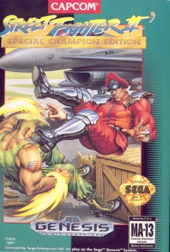
After a year of SNES-only dominance, Street Fighter finally made its way to the Genesis in 1993. Its arrival was such a major event Sega released a six button controller just to accommodate new players, and its layout helped define the Saturn controller a few years later.
As for the box itself, it’s surprisingly decent, though perhaps a bit too literal, attempting to cram several in-game moments into one image: Sonic Boom, Bison kick, F-16 and busted crate all in one tiny piece of box art. Regardless, it’s worlds better than anything so far, and we can’t pick it apart as easily as the previous games.
Super Street Fighter II
SNES/Sega | 1994
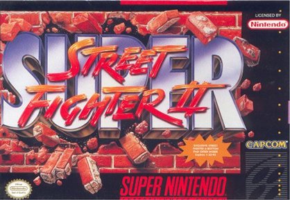
Wow. Forget characters, forget even trying. Let’s just use a brick wall and have the logo do its best Kool Aid Man impression. This was the hardest sell, trying to convince kids who’d already bought two SNES entries that they needed yet another $60 game, and this is the best they could come up with?
However, this is the first SF game with Capcom’s modern logo, so that’s something for the superfans to jot down.
Super Street Fighter II Turbo
3DO | 1995
Weekly digests, tales from the communities you love, and more
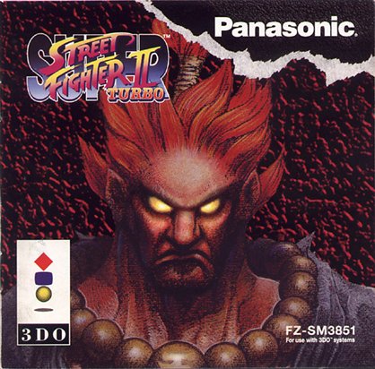
Above: Image courtesy of vgmuseum
So 3DO, a system you’ve likely never played, had a port of Super Turbo while the SNES and Genesis had to sit this one out. Surely luring in potential buyers with such a prestigious exclusive would be easy, but they botched it yet again with the then-unknown Akuma taking center (and the only) stage with nothing more than a Windows 95-standard wallpaper image.
The Akuma image is strong, but as a package it’s yet another underwhelming representation of the fastest, hardiest fighter of the day.
Street Fighter Alpha
PSone | 1996
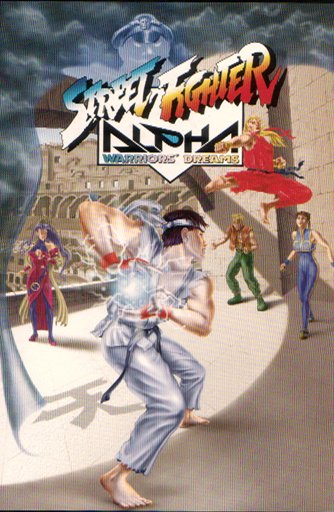
The Alpha series saw totally revamped, wildly colorful renditions of popular SF combatants, along with many new characters who were equally arresting. Did any of that make the cover? Of course not. Instead, there’s this Franken-box with way too many ideas clamoring for attention, all at a confusing perspective that suggests the people in the distance are a foot taller than Ryu.

Noteworthy awfulness #1: Chun Li, gazing up at Ken with an awed expression as if she can’t believe what she’s seeing. Keep in mind, this is a girl who shoots fireballs from her hands.

Noteworthy awfulness #2: Bison’s presence is the hardest to reconcile. Everything on the box takes place “inside” his cape, which is casting strange shadows and hiding the fighters from blue storm clouds. Take him out and the others still look boring and halfhearted, but at least it’d make sense structurally.

Noteworthy awfulness #3: That’s Akuma’s kanji all right, but even though it stands for “sky,” it’s been ironically placed on the floor. Maybe someone thought the 3DO box went overboard, yet still wanted Akuma on the cover and figured hiding his kanji was a cool “oh hey Akuma’s in this too!” middle ground.
Bonus art: Street Fighter Alpha re-release
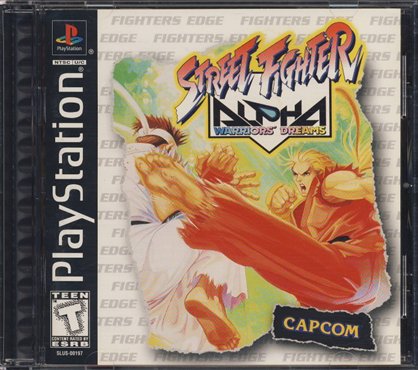
Early PlayStation games were shipped in tall, Sega CD-style cases for the first several months, then converted to standard jewel cases later on in 1996. Alpha’s first release was in the former, while this re-release saw, perhaps for the first time, wholly appropriate box art on a CD-sized jewel case. The best so far.
Street Fighter EX Plus @lpha
PSone | 1997
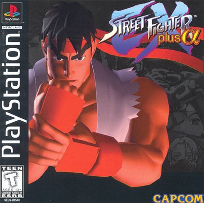
Street Fighter made the leap from 2D to 3D with the now-defunct EX series, seen here in its PlayStation incarnation. We’re not wild about the deep-in-thought Ryu render, as it’s both bland and obscuring the far prettier background artwork, but at least they chose an iconic character and not Skullomania. But what the hell is up with his eyebrows?
Street Fighter Alpha 2
SNES | 1997
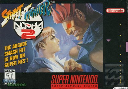
Above: Image courtesy of moby games
This is probably the best of the SNES covers, as it clearly depicts two buff dudes about to throw down. One is the main character you recognize, the other is an intimidating powerhouse you’re dying to see in action. Sakura’s in there too, peering in between two mountainous mounds of man chest. Too bad this is the worst version of Alpha 2 by far, so slow and plodding it’s nearly unplayable.
Street Fighter EX2 Plus
PSone | 1999
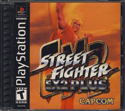
Looks like fan art using a rudimentary modeling program, maybe Bryce 3D or something. Amazing that this would pass the many, many channels necessary to make the final product. The logo’s a mess and even though the background’s probably supposed to be a sunset, it looks more like the color of freshly spewed barf. Ick!
Next page – Dreamcast makes its final push and SF box art cleans up
A fomer Executive Editor at GamesRadar, Brett also contributed content to many other Future gaming publications including Nintendo Power, PC Gamer and Official Xbox Magazine. Brett has worked at Capcom in several senior roles, is an experienced podcaster, and now works as a Senior Manager of Content Communications at PlayStation SIE.
