
The 2019 rebrand of the X-Men comics series, from both a storytelling and design standpoint, aimed to breathe new life into the iconic franchise.
Writer Jonathan Hickman, along with artists Pepe Larraz, R.B. Silva, and Marte Gracia, changed the status quo of the mutant marvels, all the while preserving its old stories with a mind-bending time-travel / alternate reality storyline. This new story direction came with a bold revitalized branding direction for the X-Men franchise.
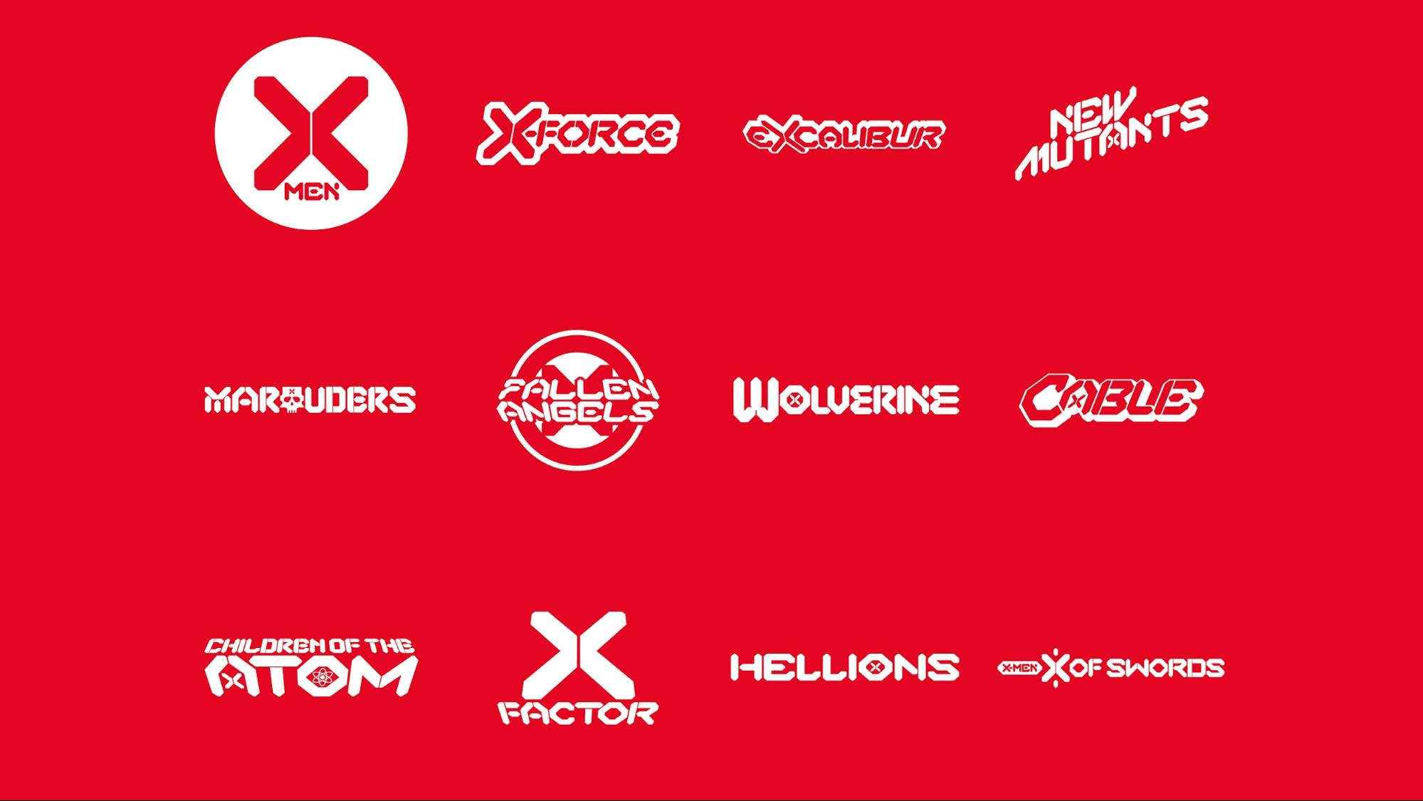
Designed by Tom Muller, the mutant militia's new brand identity shied away from the more traditional comic book-inspired logo. The new brand relies on a more structured, future-facing design system.
It's the Colossus of logos, quiet yet powerful.
The new identity is reminiscent of classic swiss design. The new branding and it's more versatile logomark will help carry the X-Men franchise, and all of its companion books, into the future.
The new X-Men logo

Tom Muller's logotype and design system for the X-Men brand is heavily inspired by Swiss design and minimalist aesthetics. Swiss Design became popular in the '50s, focused on minimalist design to allow the content to take center stage. Over the years, this aesthetic has evolved into a design philosophy that governs everything from subway signage to book design.
Minimalist logos, when executed right, have a very long shelf life. Think Apple, FedEx, and Nike's Swoosh, to name a few. What they all have in common are their versatility and the ability to convey a lot with a little. This new X does that in spades. One look and you know Beast isn't far away.
The hard, angled, simple shapes create a strikingly simple logo execution. The classic 'X' symbol is trimmed down to a tight, bold mark that is easily recognizable across all the mutant brands. The logo's style is expanded in a custom typeface known as 'X Display' that adorns each new X-title in the Hickman series.
Tom Muller spoke with Creative Bloq on the impetus for the new logo design and how it pertains to the X-Men.
"In part, the new logo design reflects ideas on the evolution of species and the duality of social groups that has always permeated the X-Men stories. The halves of the X can also be read as > and < signs or even arrows.
"The final logo is a clear evolution and refinement of those initial concepts. It was important for everyone that we struck the right balance between being new and future-facing whilst keeping that clear X-Men' X' recognizable and build on the foundations of the X brand."
Old X vs. New X
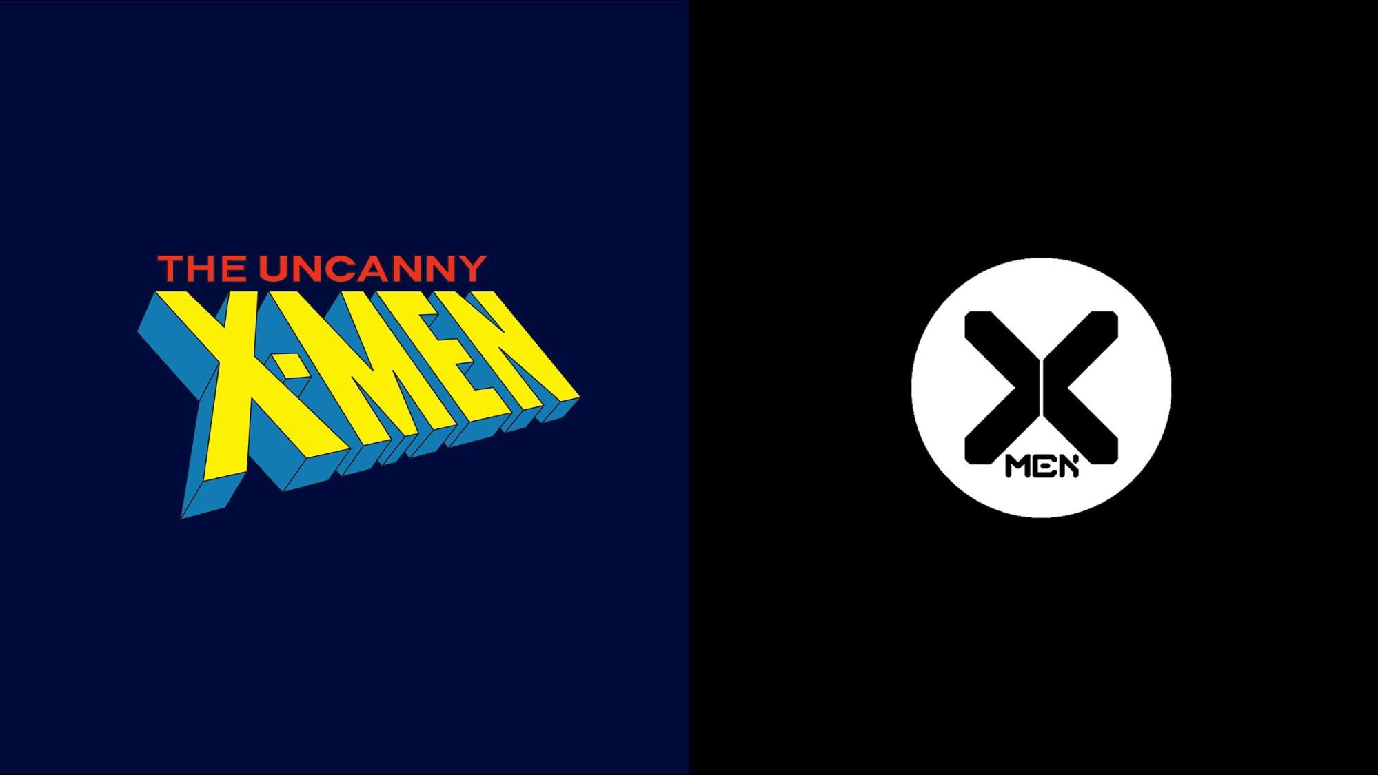
Who doesn't remember the old 90's X-Men with fond memories? I suppose younger fans of the X-Men don't, but we aren't talking about them! Seeing that 3-D rendered, comic book logo crackling with electricity on television indicated a good time was coming. But all good things aren't meant to last forever.
The classic X-Men logos follow the trend of colorful, beveled, 'in your face' comic book titles. X-Men specifically lean towards angled logotype, sharp edges, and deep perspective tails on the word marks. This convention is used to draw people's attention on comic shelves as the books compete with a litany of other highly visceral imagery around it. X-Men always had the benefits of being at the end of the rack, owning the tail end of our alphabetized comic book selection.
The old X-Men logos show a distinct lack of scalability. Staples of a successful logo is its ability to work in black and white and if it's legible at small sizes.
The FedEx logo, for example, is a classic, scalable logo that works great in all sizes, monochrome, or in color. The sneaky arrow hidden away in the 'E' really puts it over the top.
The new X has many of these auspicious qualities, along with the added greater than/ less than symbols hidden away in plain sight. Once you see it, you can't unsee it, and I love that.
Improving a classic using a minimalist design system
The future of comic book branding lies in design systems. A visual bible chocked full of repeatable patterns, visual standards, typography guidelines, and approved color palettes used to dictate the voice and tone of the X properties. At its forefront, a brand mark that is both scalable and adaptable will solidify the brand identity.
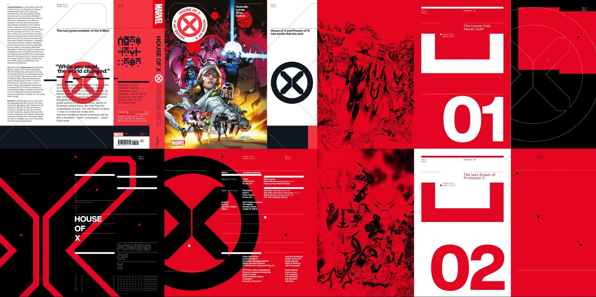
As you read through the series, there are interstitial pages dispersed throughout the book detailing the backstory and providing context to some of the goings-on in the comic. These pages are extensions of the new brand, written in black and white, adorned with glyphs and graphs reminiscent of the angled X at the brand's forefront. The copy is typeset in Helvetica Now (a favorite of mine), and Helvetica Monospaced. Helvetica is the granddaddy of all Swiss design and a typeface ubiquitous with legibility and function.
These pages are minimalist explorations of storytelling in comics. The bold glyphs paired with the classic graphic design workhorse Helvetica, form a modular, Swiss-inspired design system that allows for mass amounts of content to be digested easily, quickly, and is easy on the eyes. As Tom Muller put it in a Tumblr post announcing House of X #1 "This is what comics can look like when you put two guys who like design systems in the same room."
The future of X
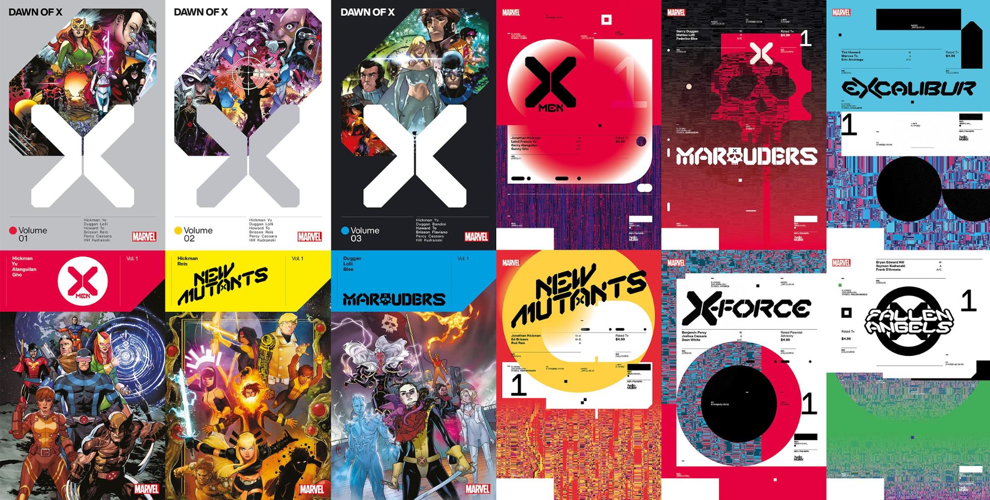
Moving forward, this new logo gives the X-Men brand a lot of flexibility. The segmented X logo can be used as a pattern all on its own. Pull the segments apart to create new shapes and patterns that feel familiar and brand appropriate. You can see the versatility in the auxiliary comics like New Mutants and Wolverine.
The custom typeface extends across the entire X-Men suite to give it continuity, and more importantly, it allows readers to visually recognize companion books with ease. No more wondering what comics connect to what series (a problem I still encounter today). Behold the power of design systems! Branding is essential, and when done correctly, it makes life easier for your audience.
I bet you never wonder which product is made by Apple.
That courtesy is now extended to the X-Men books.
X marks the spot
To stand the test of time, a brand has to adapt to the changing landscape. That includes comic brands. They need to attract new audiences while also satisfying the nostalgia of their loyal fanbase. This latest X-Men logo does both. It sets up the mutant brand for the future by providing a scalable logo and design system that pays homage to classic swiss graphic design. The brand's minimalist approach allows for a multitude of uses in various mediums without feeling overbearing or overshadowing the art in its comics.
The X-Men 'X' has always been iconic, this new one continues the trend.


