Designing the 'Dawn of X' X-Men era: Tom Muller
Tom Muller talks about his rebranding of Marvel's X-Men
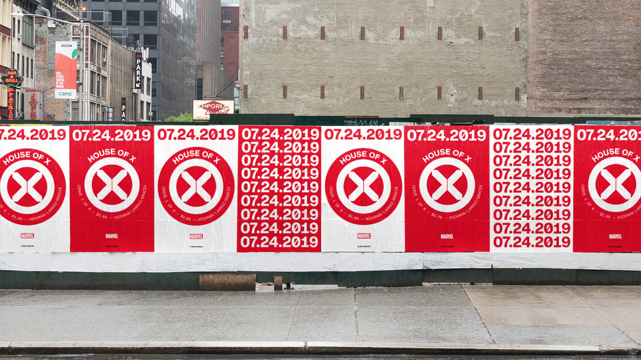
A new era for Marvel's X-Men begins this July with writer Jonathan Hickman's Powers of X and House of X limited series. And with a new era, the team needed a new mark.
Enter Tom Muller.

While Hickman is an accomplished graphic designer himself (and has done design work for some of his previous Marvel projects), Hickman's got two twice-monthly titles to write - not to mention his creator-owned projects. If not himself, Hickman knew who he'd trust.
Over the past 19 years, Muller has designed logos, covers, treatments, and ephemera for DC, Image Comics, Valiant Entertainment, and others. He's designed movie posters for everything from Harmony Korine's Spring Breakers to a re-release of Terminator 2, and was hired personally by Darren Aronofsky for Noah's graphic novel release.
Newsarama spoke with Muller about this new X-Men project with Jonathan Hickman for Marvel Entertainment, and went over themes, variations, and even played around with which mutant might've designed it in-continuity.
Newsarama: Tom, let's go chronologically - how were you first approached about doing this X logo?
Tom Muller: Jonathan reached out directly to ask if I was interested and available to work with him on the X books he's writing and design the logos for those.
Get the best comic news, insights, opinions, analysis and more!
Nrama: And so how would you describe Jonathan's involvement in the overall process?
Muller: Prior to starting the project we've been aware of each other's work (and dare I say fans of each other's), and Jonathan is also a very talented designer - so we're speaking the same language.
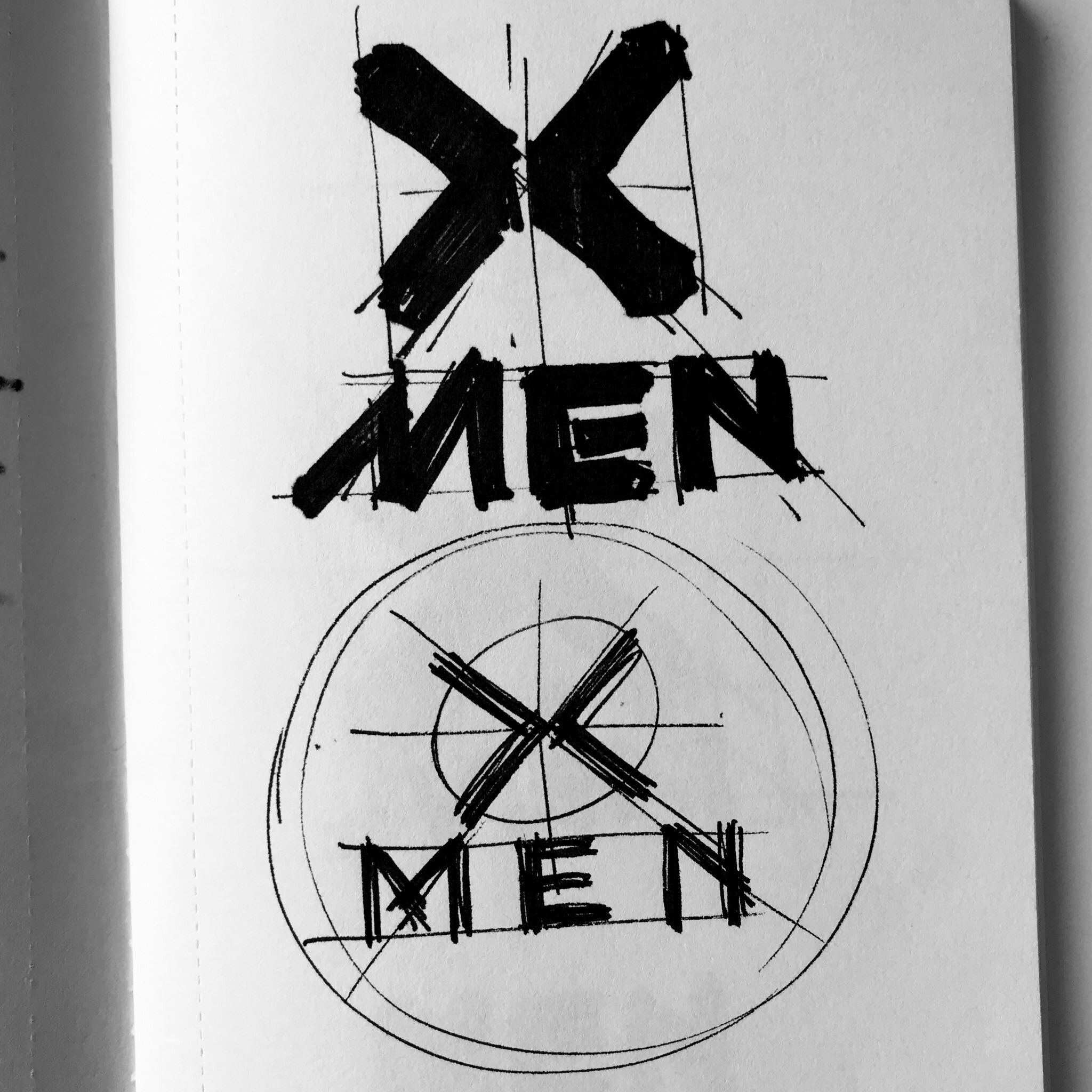
We've had a few chats and we're thinking along the same lines in terms of how we want to approach the design of the series. Currently - as Jonathan is busy writing the books - I send him design concepts that are presented to Marvel, and we take it from there. When we kicked off the project, all Jonathan said was "I need a big X"; and that's how we got the ball rolling.
Nrama: For you as a designer, how is it being asked to step in to design something for Jonathan Hickman - a writer but also a designer you were a fan of. It has to be somewhat different from a non-designer approaching you, or a company in general?
Muller: Well, as I said Jonathan and I have been fans of each other's work for a while; so there's already that mutual respect and admiration. It also really helps - and this is by no means a given - that we have very similar thoughts about design and comic book design specifically, which already takes away certain thresholds. Of course - and this goes for all clients I work(ed) with - working with someone who understands design (and in Jonathan's case, someone who actively practices it) creates a shorthand that allows you to work in a much more agile manner.
Nrama: Was anyone else involved?
Muller: Apart from signing an NDA with Marvel I'm working directly with Jonathan.
Nrama: The X-Men 'X' logo has been redesigned several times, and incorporated into suits, belt buckles, and the like. What aspects of X-Men history impacted you and your design here?
Muller: Apart from being aware of the X-Men's "X" logo history there wasn't anything specific from the past that I wanted to overtly reference; apart from making sure that the "X" somehow says its an X-Men book; and you try to add something new to the canon by developing a new contemporary design that fits the books today.
Nrama: Are you aware if this X logo will be used in the story?
Muller: I have no idea at this juncture.
Nrama: When designing this, can you walk us through how you might have designed it to be used not just in comics but in wider implications such as on merchandise - the idea that it's not just a logo for a printed comic book? Is that pretty much baked into anything you do at this point as a designer?
Muller: At this juncture, we haven't actively looked at secondary applications beyond the comics. However, that doesn't mean I didn't consider it. A very comics-specific thing is that logos often get designed in isolation, in many cases without available cover art; which means that by default your goal is to design a mark that works across (and on top of) multiple elements. Any ancillary applications would logically flow out of that.
Generally (as I hope is visible from my work) I always look to design logos and brand marks that can function across a wide variety of applications, and comics are no exception to that approach.
Nrama: This is a weird aside, but bear with me - in story, who in Marvel continuity would've designed this?
Muller: Obviously Professor X, maybe with some help from Hank McCoy.
Nrama: Wow, I didn't think Xavier and McCoy to be the designers on the team. This is tangential, but do you want to expound on that?
Muller: What did I get myself into! [Laughs]
Well, Charles has always been the brains behind the whole operation. If he's anything like a COO he'll have had some ideas about the visual identity of his outfit, and Hank is the resident maker; and most folks I know that design and make products usually have a logo idea in their back pocket.
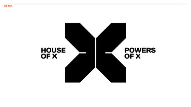
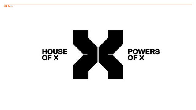
Nrama: In the X you designed here, the endpoints are connected to the circle but there is a vertical break in it. What does that break symbolize to you?
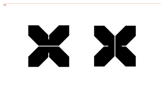
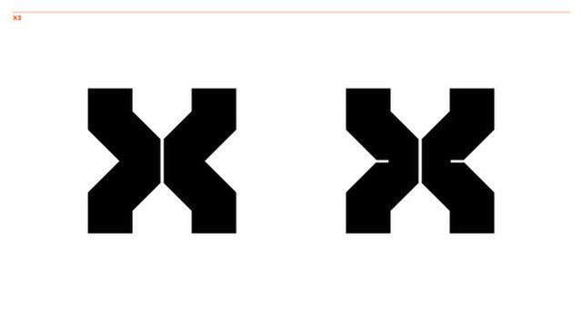
Muller: Part of the design references one of the initial teasers Marvel released that said: "When two aggressive species share the same environment, evolution demands adaptation or dominance". I've always felt that there's that duality running across the X-Men stories through the decades, and in part, the new logo hints at that duality or clash. The halves of the 'X' can also be read as > and < signs or even arrows. That's all I can say.
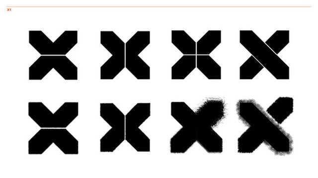
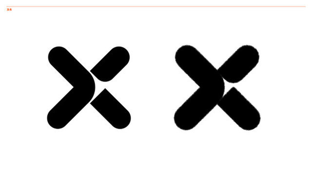
Nrama: You've shared with us some iterations you created on the way to the final design. Were there any specific ones you were fond of?
Muller: As you can see, the final logo is a clear evolution and refinement of those initial concepts. It was important for everyone that we struck the right balance between being new and future-facing whilst keeping that clear 'X-Men' 'X' recognizable and build on the foundations of the X brand.
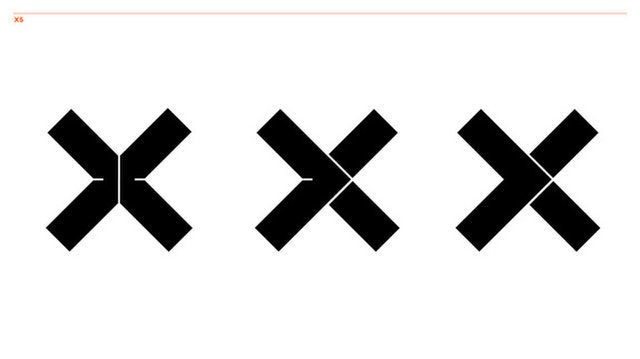
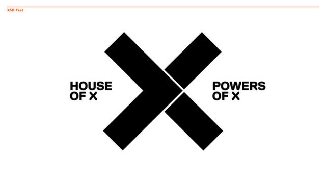
Nrama: I'm really partial to the variation with the left arrow overlapping the right one, possibly symbolizing an evolutionary step with one species taking over for another. I can understand why that might not fit narratively with what Marvel and Jonathan planned. Can you talk about that logo at all?
Muller: That concept was actually coming more from a 'pushing to the future' idea where there's a hidden arrow in the X.
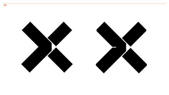
This was an idea I wanted to explore since I've always felt that one of the strongest themes in the X-Men books is that sense of facing the future and pushing to a next step whether that's mutants being 'the next step in human evolution' or something else. The forward arrow is a nice mnemonic to tell people 'this story is going forward.'
Nrama: How did you, Jonathan, and Marvel finalize which one was 'the one'?
Muller: Jonathan and I went through a few design revisions, to begin with. Jonathan has some specific ideas he's shooting for in terms of how the books look, and as we narrowed down the choices based on Jonathan's notes he then presented the options to Marvel and we went with the X set in the roundel - which was our preferred option.
Nrama: Can you say if you had a favorite - and if so, why? Even if it ultimately wasn't chosen? And how do you feel about the one chosen?
Muller: To be honest, I'm really happy with the new logo. This design really evolved from all the various design concepts and is a distillation of the best elements.
Nrama: For the design nerds reading this, can you say what programs you used in the process of making this?
Muller: The usual suspect: Adobe Illustrator.
Nrama: So, have you seen any tattoos using this yet? What would you say to someone thinking about it getting it tattooed?
Muller: I haven't seen any real ones, but have seen people chatting about adding the new X to their collection of X-Men tattoos. It's not the first time I've come across fans getting tattoos of logos I designed; and it's incredibly humbling to see people take something you designed and make it a part of themselves.
Nrama: Did you do any other design work for Hickman's X-titles, or just this X logo?
Muller: Currently we're working on the House of X and Powers of X cover dresses, which will feature the new 'X' as you've seen from the various promos Marvel has been releasing.
Beyond that? Who knows…
Nrama: Big picture, what were your goals starting this project?
Muller: The big picture is that the logo has some longevity and that it becomes part of the X-Men design canon. And that the fans embrace it.
Nrama: And do you think you achieved it all? Did you learn anything in doing the process?
Muller: Time will tell!
Read our detailed analysis and review of Tom Muller's 'Dawn of X' era X-Men logo.
Chris Arrant covered comic book news for Newsarama from 2003 to 2022 (and as editor/senior editor from 2015 to 2022) and has also written for USA Today, Life, Entertainment Weekly, Publisher's Weekly, Marvel Entertainment, TOKYOPOP, AdHouse Books, Cartoon Brew, Bleeding Cool, Comic Shop News, and CBR. He is the author of the book Modern: Masters Cliff Chiang, co-authored Art of Spider-Man Classic, and contributed to Dark Horse/Bedside Press' anthology Pros and (Comic) Cons. He has acted as a judge for the Will Eisner Comic Industry Awards, the Harvey Awards, and the Stan Lee Awards. Chris is a member of the American Library Association's Graphic Novel & Comics Round Table. (He/him)

