50 Worst '80s Movie Posters
Hot pink lettering anyone?
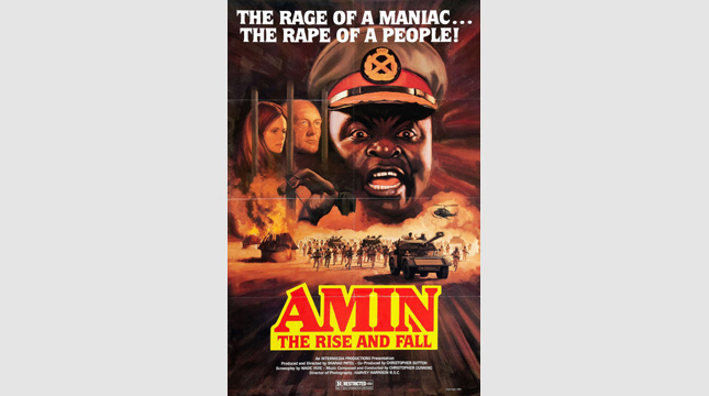
Amin: The Rise and Fall (1981)
The Poster: How do you treat an extremely sensitive period in a nation’s past, the memory of which is still extremely raw? Like this, silly!
Worst Detail: That tagline really is staggeringly crass…
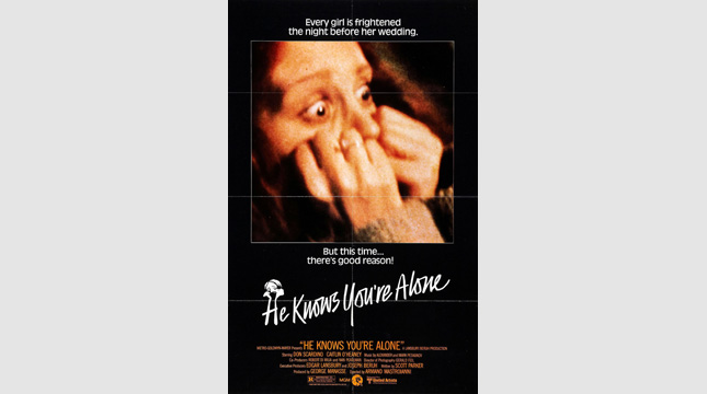
He Knows You're Alone (1980)
The Poster: Is this the most tenuous tag-line ever? It may well be…
Worst Detail: That image is the dictionary definition of trashy. Exploitation ahoy!
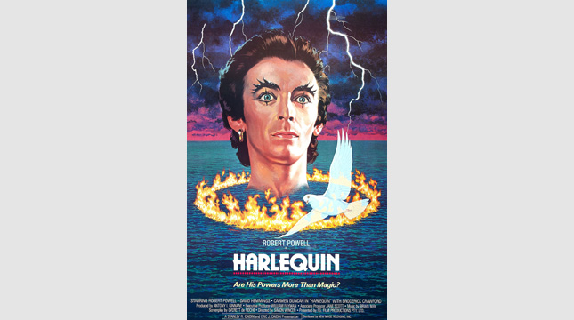
Harlequin (1980)
The Poster: The disembodied head of Robert Powell floats over the ocean, surrounded by a ring of fire and a dove. Who wouldn’t want to go and see this?
Worst Detail: Why is the ocean on fire? Why is that dove smiling? His powers must be more than magic!
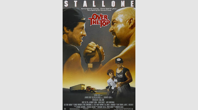
Over the Top (1987)
The Poster: We know this one is supposed to be drenched in testosterone, but it all seems a little camp to us. Even with that heavy-metal font…
Worst Detail: It’s a toss-up between Sly’s weirdly smooth bicep in the foreground, and the fact he’s got his cap on backwards in the main image. Grow up…
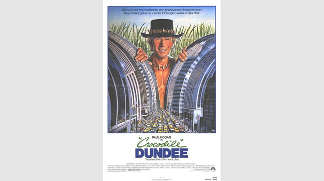
Crocodile Dundee (1986)
The Poster: Blimey, Godzilla’s looking rough isn’t he? Oh wait, that’s just a giant Paul Hogan. Equally terrifying…
Worst Detail: It’s the concept that makes this one so poor – it just doesn’t work! Although Hogan’s shit-eating grin hardly helps matters.
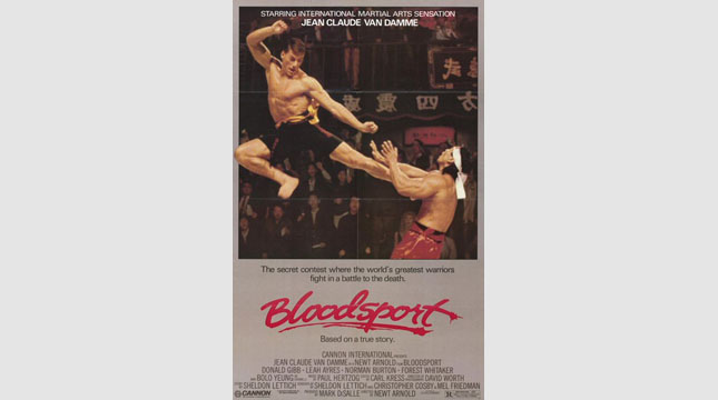
Bloodsport (1988)
The Poster: JCVD does his level best to kick a hole clean through his opponent's chest. Pow!
Worst Detail: The half-baked defence offered by his opposite number. Although maybe he's just staggered by the height of Van Damme's leap!
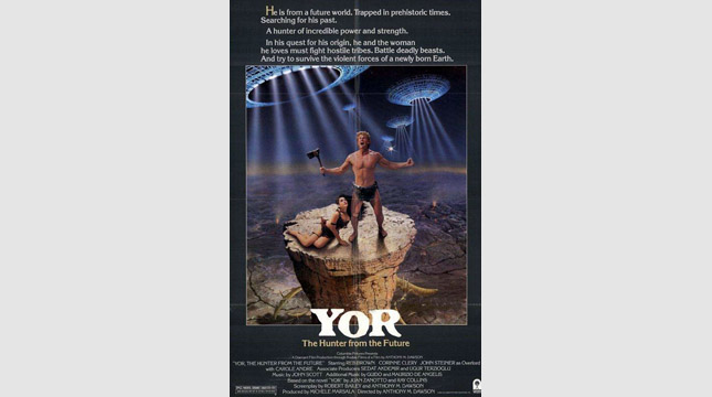
Yor: The Hunter from the Future (1983)
The Poster: A loincloth-sporting loon howls at the moon in anger with his plight. He’s stuck in the past you see. And he… IS FROM THE FUTURE!
Worst Detail: Yor’s expression. He’s clearly having some sort of episode…
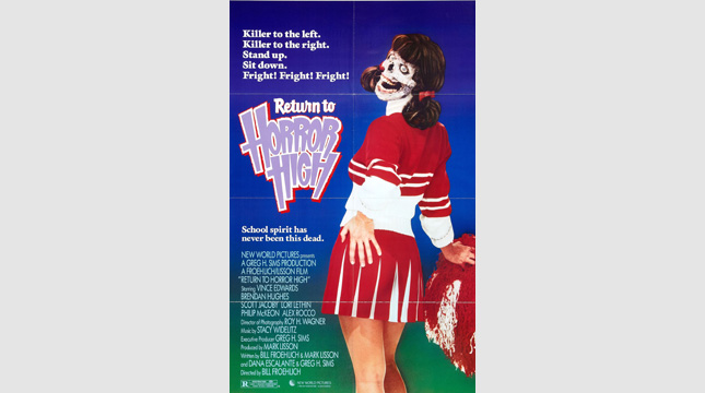
Return to Horror High (1987)
The Poster: It’s an undead cheerleader… but wait, why has she got a fleshy body if she has a skeletal face? Ummm….
Worst Detail: Her hands! Those are definitely male hands. Jesus!
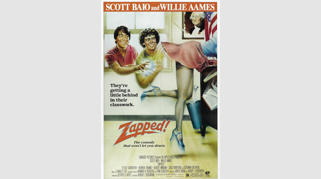
Zapped (1982)
The Poster: A teenage boy uses his telekinetic powers to carry out what looks like a sexual assault. Uh, great?
Worst Detail: See above. Causing a woman to fall over and expose herself was funny back then, okay?
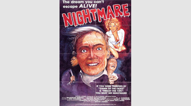
Nightmare (1981)
The Poster: Well, it does exactly what it says on the tin, doesn’t it? You won’t sleep well after gazing at this harrowing ensemble…
Worst Detail: It looks as though that creepy old dude is wearing a man’s face as an earring. Is that intentional? We’d hazard a guess at “no”.
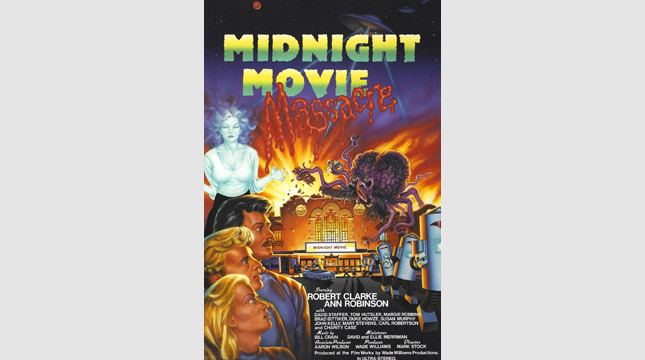
Midnight Movie Massacre (1988)
The Poster: Ghosts, aliens, robots… they’re all on display in this OTT monstrosity. Least intimidating robots ever? Probably.
Worst Detail: Despite the wealth of monsters on display, the humans are by far the most terrifying element here. Particularly the girl!
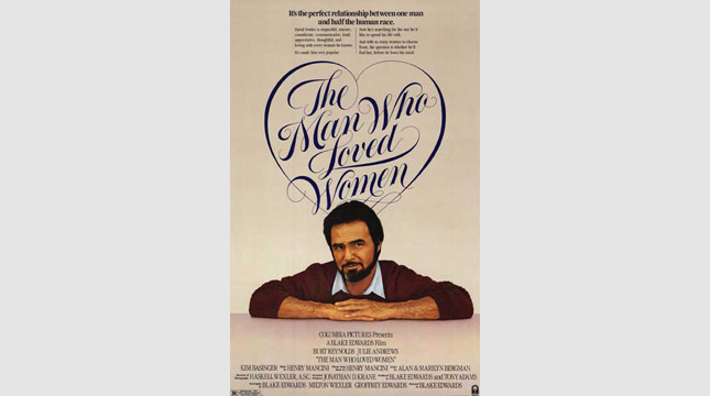
The Man Who Loved Women (1983)
The Poster: An extremely hirsute Burt Reynolds contemplates his love for the opposite sex. Who hasn’t been there?
Worst Detail: Another essay instead of a tag-line. Too much information. Oh, and then there’s Burt’s goatee…
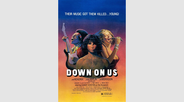
Down on Us (1984)
The Poster: Jimi Hendrix, Jim Morrison and Janis Joplin are all recreated in, er, stunning detail in this remarkable one-sheet.
Worst Detail: We’re not sure quite what’s happening with Joplin’s boobs, but the effect is unsettling to say the least.
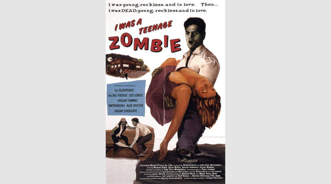
I Was a Teenage Zombie (1987)
The Poster: A cheap and cheerful picture of a remarkably healthy-looking zombie and his swooning beau. They really broke the bank with this one, eh?
Worst Detail: Most of the artist’s efforts appear to have gone into lovingly rendering the damsel’s breasts. The moustachioed fellow on the other hand…
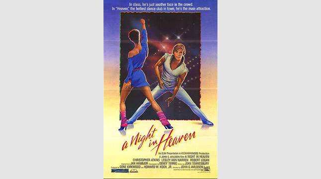
A Night in Heaven (1983)
The Poster: How do you make sure your female lead feels appreciated? Have her face away from the camera for the poster, that’s how! Nice legwarmers, mind.
Worst Detail: The exposition-heavy tagline is narrowly edged out by the fact Christopher Atkins seems to be dancing in space.
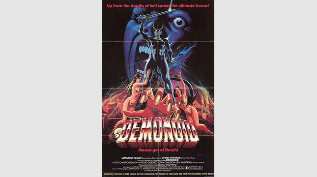
Demonoid: Messenger of Death (1981)
The Poster: That horned chap must be Demonoid. He’s come to deliver of message concerning somebody’s death. Hope he breaks it to them gently.
Worst Detail: Demonoid’s overly-muscled thighs are a bit troubling…
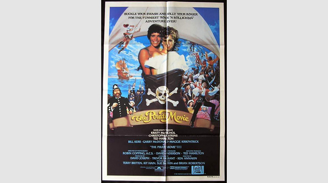
The Pirate Movie (1982)
The Poster: Yo-ho-ho, me hearties, Christopher Atkins has got his kit off again for another troubling movie poster. Put it away, mate.
Worst Detail: That tagline is tortuous… “Buckle your swash and jolly your roger”? We’ll pass, thanks.
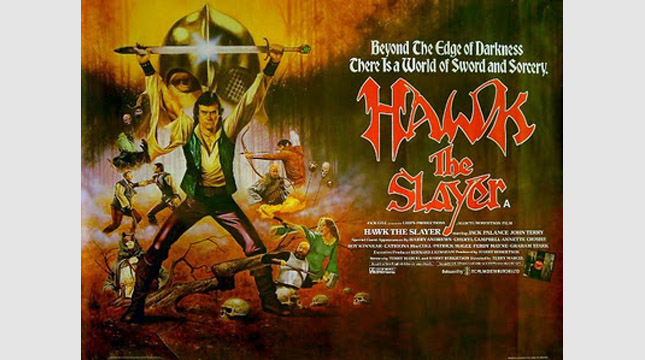
Hawk the Slayer (1981)
The Poster: John Terry strikes a pose. A big, camp pose. Pretty macho, we think you’ll agree…
Worst Detail: The fact that he looks like he’s midway through the YMCA…
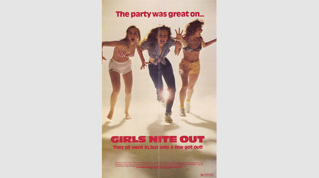
Girls Nite Out (1984)
The Poster: We’re assuming these three are supposed to be looking scared, but the lady on the left looks like she’s having a blinder and the one on the right is laughing. Poor show girls…
Worst Detail: Despite the naff image, the worst part of this is the wholly unnecessary misspelling of the word “nite”. Pointless.
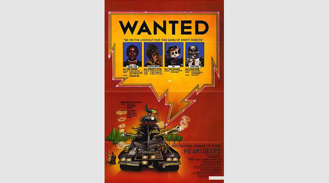
Heartbeeps (1981)
The Poster: Andy Kaufman’s sci-fi comedy, featuring a band of “misfit robots”, is trailed by a ridiculously information-heavy poster. Who’s got time to read all that?
Worst Detail: The fact that you have to really scan the poster to find out the name of the film. What a mess.
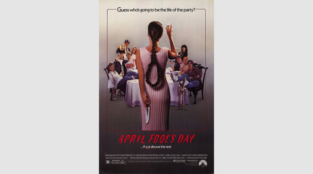
April Fool's Day (1986)
The Poster: A teenage girl raises a glass to her pals, concealing a knife behind her back. And the fact that she’s plaited her hair in the shape of a noose. It’s a difficult age…
Worst Detail: The noose effect must have sounded cool in theory, but in practice, it just looks ridiculous!
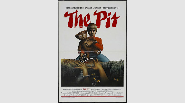
The Pit (1981)
The Poster: Look out, it’s the most terrifying child ever to make his infernal way onto a movie poster. Avert your eyes!
Worst Detail: The fact that “Jamie’s” eyes look like they belong to a crack addict rather than a small boy.
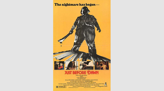
Just Before Dawn (1981)
The Poster: That machete-wielding figure would probably be quite intimidating if he wasn’t so fat. As it is, it’s all we can do to keep a straight face.
Worst Detail: Is that knife meant to be bigger than his entire torso? If you say so…
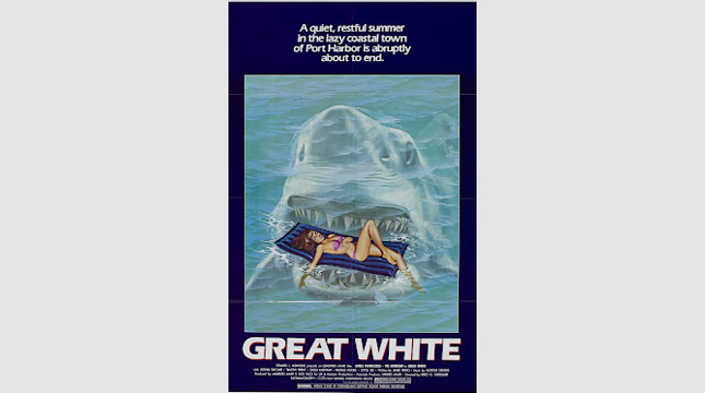
Great White (1981)
The Poster: This looks familiar… we’re sure we’ve seen this somewhere before. Hmmm…
Worst Detail: The perspective is hilariously out of whack, never mind the fact that the shark looks like a toothy iceberg.
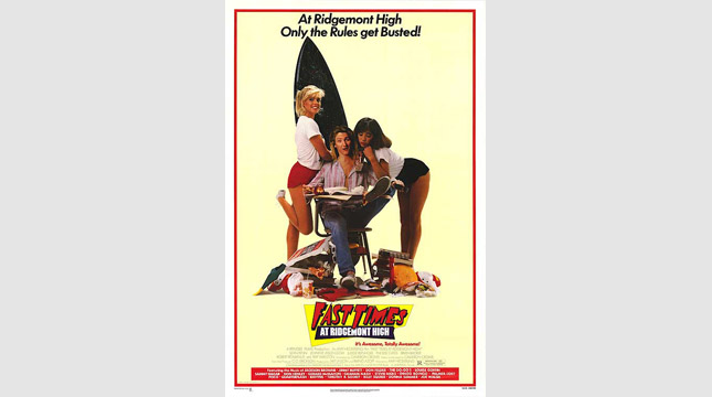
Fast Times at Ridgemont High (1982)
The Poster: Surfboard? Check. Bodacious babes? Check. Sean Penn looking gormless? Check. Looks like we’re all set for one kerazy movie!
Worst Detail: The self-conscious wackiness of the whole thing just reeks of desperation. Trying that hard to be cool is never going to work…
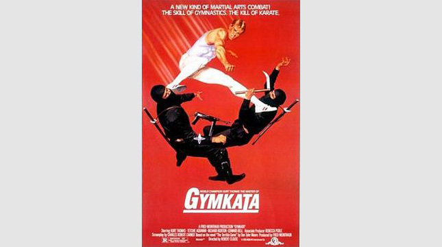
Gymkata (1985)
The Poster: A young man in a leotard takes down a pair of weapon-toting ninjas. Bit embarrassing for them, isn’t it?
Worst Detail: That tagline is beyond the pale: “The skill of gymnastics… the kill of karate.” Sheesh.
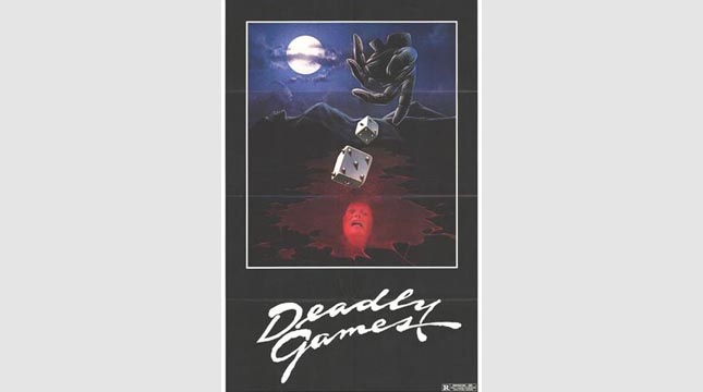
Deadly Games (1982)
The Poster: A disembodied, gloved hand rolls a pair of spiked dice into a pool of blood containing a woman’s face. What else do you need to know about the film? Nothing, that’s what.
Worst Detail: The whole thing is cheap, nasty and nonsensical, but the glove is the worst bit. Who has a hand shaped like that?
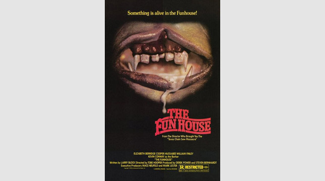
The Funhouse (1981)
The Poster: A foaming, drooling mouth sporting a set of nasty, uneven gnashers. Not sure how appropriate a cleft palate is for a trashy horror poster, to be honest…
Worst Detail: That strand of drool really makes us want to look away. Gross.
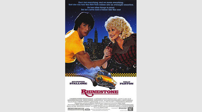
Rhinestone (1984)
The Poster: It’s Sly Stallone and Dolly Parton, together at last. And they’re arm-wrestling! Wait, what?
Worst Detail: The hopelessly ponderous tag-line. Not exactly punchy, is it?
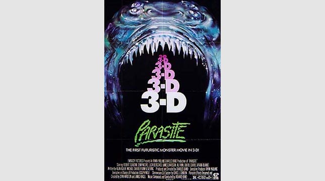
Parasite (1982)
The Poster: It’s the European one-sheet for Avatar … what’s that? Oh. Our mistake.
Worst Detail: It’s not clear enough how many dimensions the film will be presented in. Bit of an oversight…
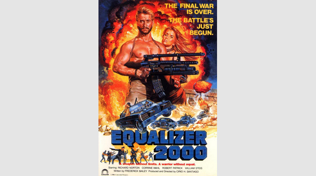
Equalizer 2000 (1988)
The Poster: Richard Norton is packing one hell of a firearm there. We count six barrels… some kind of record?
Worst Detail: The hilariously bombastic tagline. “The final war is over” – hooray! “The battle’s just begun” – boooooo!
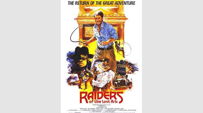
Raiders of the Lost Ark (1981)
The Poster: Indy dispenses with his famous fedora for this low-rent version of the classic Raiders poster. What a dud…
Worst Detail: Where’s the classic Indy font? That title looks terrible without it.
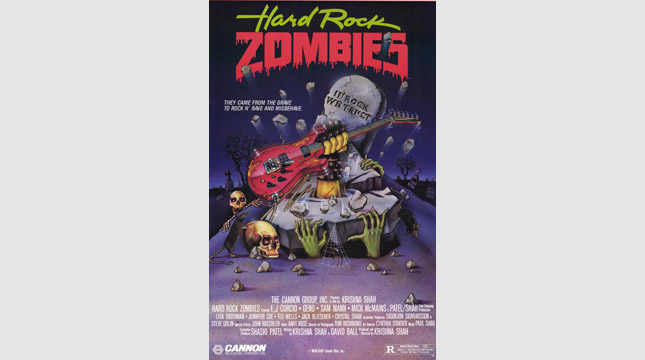
Hard Rock Zombies (1985)
The Poster: Confusingly, despite the title, most of the undead nasties on display here seem to be skeletons. And why are some of those grasping hands green, when the main one is white? So many questions…
Worst Detail: The cringey tagline, “they came from the grave to rock ‘n rave and misbehave.” Ouch.
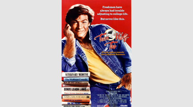
Teen Wolf Too (1987)
The Poster: Jason Bateman’s head is crudely grafted onto a wolf-man’s body in this troublingly denim-heavy sequel.
Worst Detail: Some of the “puns” on those book spines are truly awful. “The wolfman cometh”… brilliant.
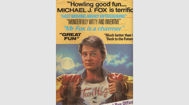
Teen Wolf (1985)
The Poster: Michael J Fox channels his inner animal, showing some worryingly well-developed chest hair in the process.
Worst Detail: His neck goes on for ever! It’s like a periscope. Freaky stuff…
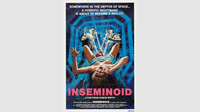
Inseminoid (1981)
The Poster: A pair of suited astronaut-types get nailed by a laserbeam-shooting newborn. Nothing weird about that.
Worst Detail: The horrified expressions of the faces of the spacemen are really quite disturbing.
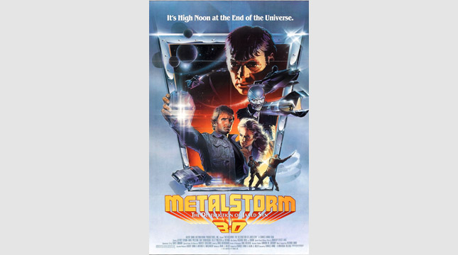
Metalstorm: The Destruction of Jared-Syn (1983)
The Poster: What a title, eh? It’ll have to be some poster to live up to that. Oh…
Worst Detail: The man with a giant wrench for an arm. Enough said.
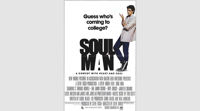
Soul Man (1986)
The Poster: C Thomas Howell gives his best ’80s pose in this bizarrely obtuse poster that gives away next to nothing about the film it’s supposed to be advertising!
Worst Detail: That tagline is neither witty or informative. Guess who’s coming to college? That guy, presumably. But who is he? Aaaargh!
Though, to be fair, if you know the high-concept of Soul Man , you'll understand why the poster-scrawlers decided to keep any plot information as vague as possible.
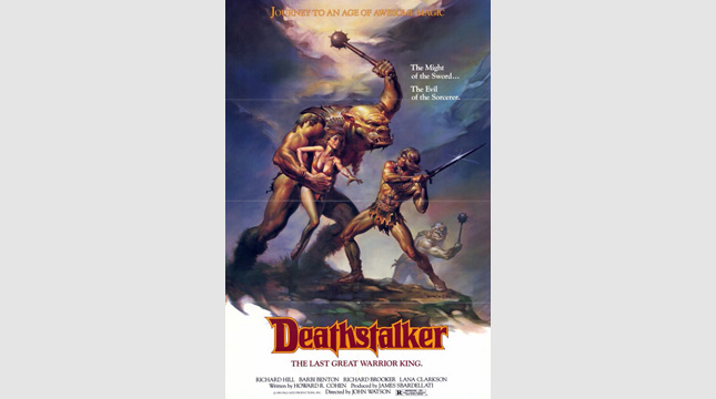
Deathstalker (1983)
The Poster: A hilariously camp Dungeons and Dragons style one-sheet, complete with glistening pecs, a scantily clad damsel and a couple of trolls for good measure.
Worst Detail: The weirdly svelte waist of our sword-swinging hero. Does he favour a corset?
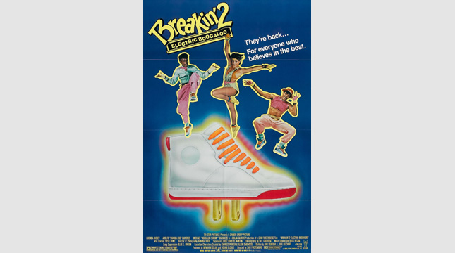
Breakin' 2: Electric Boogaloo (1984)
The Poster: Arguably the most hideously titled film of all time, it’s only fitting that Breakin’ 2 should have an equally chronic poster to match!
Worst Detail: That trainer looks as if it was drawn by a small child. A small child who has never seen a trainer before…
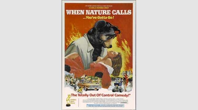
When Nature Calls (1985)
The Poster: We always liked the poster for Gone With the Wind , but what if Rhett Butler had actually been a bear? Hmmm?
Worst Detail: The bear’s simpering expression. He looks a bit demented to us…
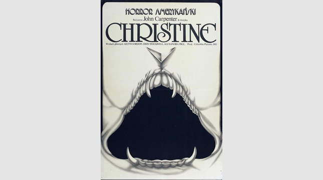
Christine (1983)
The Poster: A European take on the Stephen King adaptation, Christine . Does anything about this say “possessed car” to you? No, us neither.
Worst Detail: Call us sick, but this looks more like a poster for Teeth . If you see what we mean…
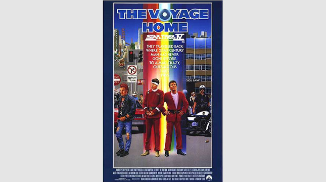
Star Trek IV: The Voyage Home (1986)
The Poster: Spock and Kirk are transported to San Francisco via a rainbow-coloured beam of light. Nice and subtle…
Worst Detail: The San Fran backdrop looks like the sort of thing you’d have played though on the Atari.
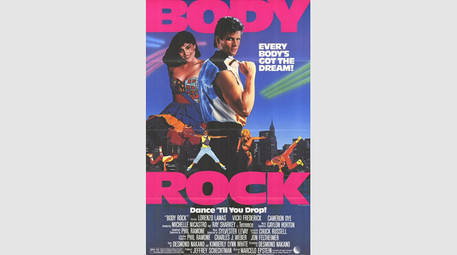
Body Rock (1984)
The Poster: Hot pink colour-scheme, sleeveless jacket, big-time coiff… it couldn’t be more ’80s if it tried. And believe us, it tried…
Worst Detail: The sort-of pun, “Every body’s got the dream.” It doesn’t really work, does it?
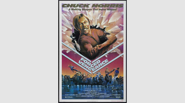
Forced Vengeance (1982)
The Poster: Chuck Norris is so infuriated by his movie’s clunky title, he’s used his elbow to break it in two! Take that, title.
Worst Detail: The Streets of Rage -style action going on in the bottom half of the poster!
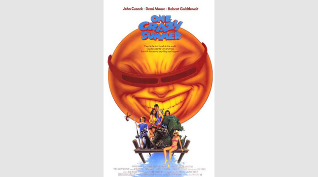
One Crazy Summer (1986)
The Poster: Demi Moore, John Cusack and other assorted Bratpackers strike a pose whilst a manically bodacious sun beams down menacingly. Yikes!
Worst Detail: The sun is sporting some pretty radical shades… but how are they staying on? He doesn’t have any ears!
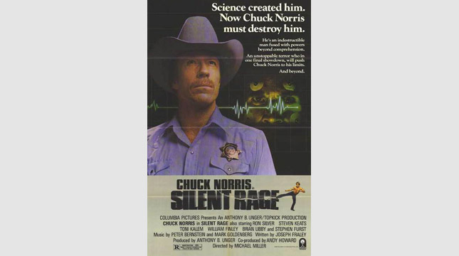
Silent Rage (1982)
The Poster: Once again, Chuck ain’t happy with the title and has decided to kick seven shades out of it. Why don’t they ever consult him beforehand?
Worst Detail: “Science created him. Now Chuck Norris must destroy him.” Bloody science…
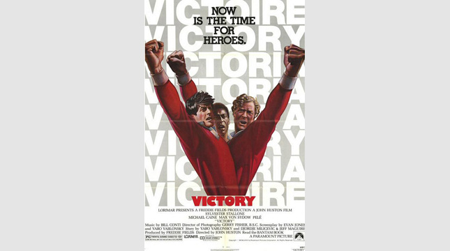
Escape To Victory (1981)
The Poster: Sly Stallone, Michael Caine and Pele appear grafted together, like a many-headed mythical beast. They also seem to be wearing rugby shirts.
Worst Detail: The fact that Pele doesn’t seem to have been given a body at all. Odd.
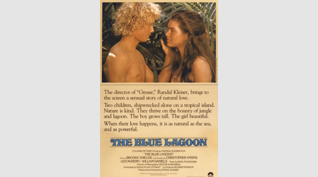
The Blue Lagoon (1980)
The Poster: A controversy-baiting image of teen lovers Brooke Shields and Christopher Adkins, accompanied by the sort of overwrought blurb more commonly found on the back of a Mills and Boon novel.
Worst Detail: This line is the nadir: “When their love happens, it is as natural as the sea, and as powerful.” Utterly meaningless.
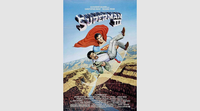
Superman 3 (1983)
The Poster: The infamous image of Superman carrying Richard Pryor in his arms like an oversized baby. A low point for the Man of Steel…
Worst Detail: We don’t know which is worse, Pryor’s comedy gurn or Reeve’s “grit my teeth and think of the paycheque” expression…

George was once GamesRadar's resident movie news person, based out of London. He understands that all men must die, but he'd rather not think about it. But now he's working at Stylist Magazine.

 Join The Community


