30 Greatest Hand Drawn Movie Posters
A golden age of movie art...
Bringing all the latest movie news, features, and reviews to your inbox
You are now subscribed
Your newsletter sign-up was successful
Join the club
Get full access to premium articles, exclusive features and a growing list of member rewards.
Gone With The Wind (1939)
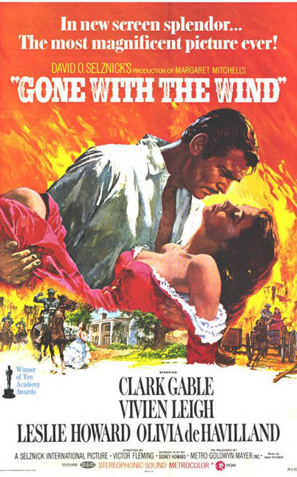
The Poster: The iconic image of Clark Gable and Vivien Leigh as painted by renowned artist Symeon Shimin.
Why So Great? From the intensity of Gable’s stare, to the flaming skies behind him, everything about this poster is highly dramatic. Highbrow stuff.
If It Had Been Badly Photoshopped: Gable’s shirt would be opened further to reveal a digitally-enhanced six-pack. That’ll put bums on seats, right girls?
The Muppet Movie (1979)
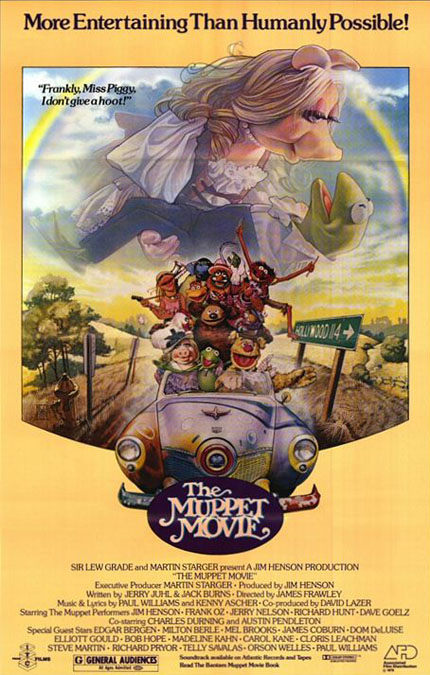
The Poster: The Muppets spoof Gone With The Wind to rib-tickling effect.
Why So Great? Proof, if proof were needed, that the great Drew Struzan can make absolutely anything look epic. If this doesn’t put you in the mood for the upcoming return of the Muppets, nothing will.
If It Had Been Badly Photoshopped: We would have had Kermit and Miss Piggy’s heads crudely grafted onto the bodies of Clark and Vivien. Which would at least have been eyecatching…
Gremlins (1984)
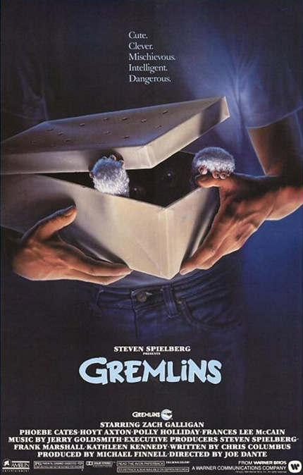
The Poster: A low-key one-sheet for Joe Dante’s cuddly critters.
Why So Great? Minimalism is the order of the day here, with John Alvin’s murky artwork hinting at the Gremlins’ less cuddly characteristics. Nice vein detailing on the hands, too. Loves those hands, does Alvin!
If It Had Been Badly Photshopped: An angry gremlin would be gnawing its way through one of those pinkies! It would have looked crap.
Maniac (1980)
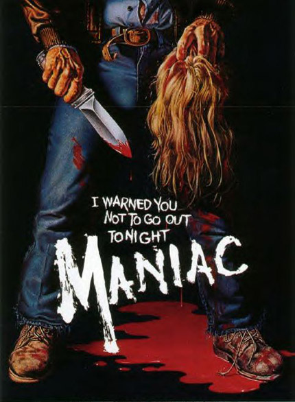
The Poster: A suitably grisly image to accompany the ‘80s slasher flick. The moralising tagline is an added bonus!
Why So Great? Everything about this is brilliant, from the bulging veins to the bloodstained jeans. We also love that the unseen killer hasn’t bothered to do up the bottom two buttons on his shirt. That’s the sign of a real maniac…
If It Been Badly Photoshopped: It would only be tolerable if the disembodied head were revealed to belong to Tom Savini!
Sand Pirates Of The Sahara (2001)
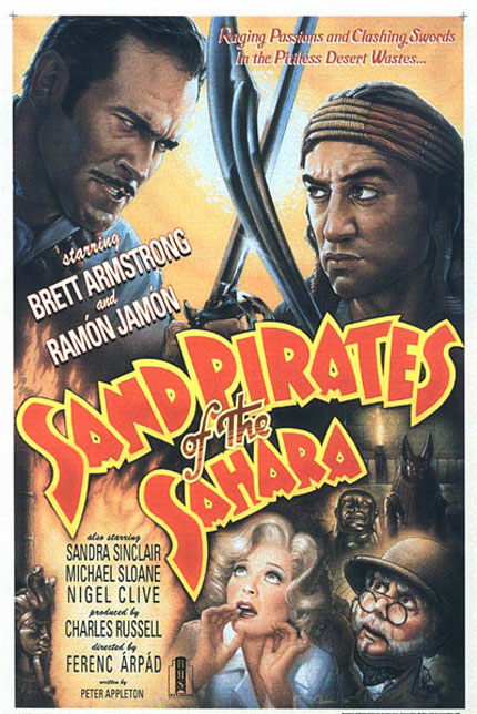
The Poster: Don’t recognise the title? That’s because the film doesn’t exist… at least not in real life. This film within a film features in Frank Darabont’s The Majestic , and even boasts its own poster, as designed by John Alvin.
Why So Great? It features a moustachioed Bruce Campbell. What more could you possibly ask for?
If It Had Been Badly Photoshopped: So long as the moustache remained untouched, we wouldn’t really mind!
TRON (1982)
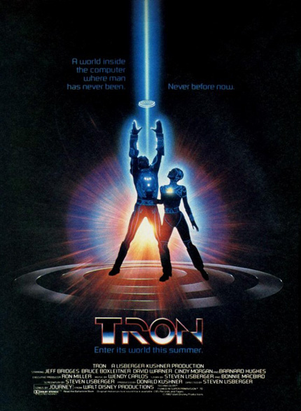
The Poster: Light discs ahoy! The TRON poster hails a brave new world of special-effects filmmaking.
Why So Great? It looks truly epic, with the halo-like light disc lending an almost biblical feel to proceedings. If the visual effects would prove to be somewhat iffy, you wouldn’t know it from this poster…
If It Had Been Badly Photoshopped: Sticking any in-film footage on the poster would have utterly shattered the illusion. “Enter its world now…” reads the tagline. But only after you’ve bought a ticket…
The Goonies (1985)
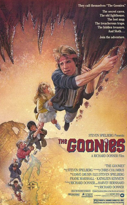
The Poster: One of the many collaborations between Drew Struzan and Steven Spielberg, this time for kiddy caper The Goonies .
Why So Great? In one image, Struzan manages to perfectly capture the film’s sense of adventure and excitement. The treasure map detailing in the background is a nice touch.
If It Had Been Badly Photoshopped: A badly photoshopped image of Sloth would have had children running screaming from multiplexes…
Bringing all the latest movie news, features, and reviews to your inbox
The Evil Dead (1981)
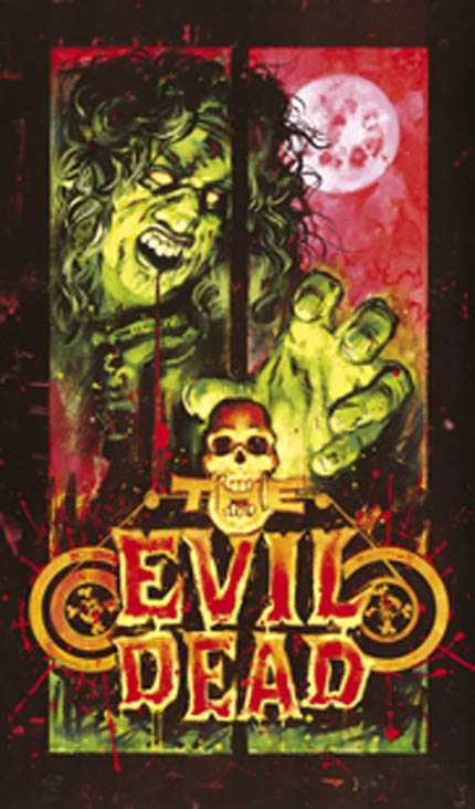
The Poster: Graham Humphreys turns his hand to Sam Raimi’s low-budget horror classic in this colourful Evil Dead promo. A riff on his original poster, this was the artwork designed to coincide with the film’s post-ban release in the UK.
Why So Great? As awesome as the graveside poster is, we feel this lurid, technicolour nightmare better sums up the deranged mania of Raimi’s video nasty.
If It Had Been Badly Photoshopped: We’d have Bruce Campbell grafted into the background. Which would probably still look cool…
Indiana Jones And The Temple Of Doom (1984)
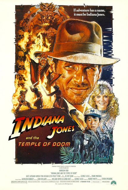
The Poster: Having originally commissioned another artist for Temple Of Doom , George Lucas wasn’t happy with the end product, and contacted Drew Struzan for an alternative image. He became the Indy artist of choice from thereon in.
Why So Great? There’s just so much going on! Harrison Ford looks particularly badass in this one, whilst the inclusion of the heart-clutching Mola Ram brings a welcome degree of menace to the table.
If It Had Been Badly Photoshopped: It would have ended up looking like the menu from our local Chinese.
Nosferatu The Vampyre (1979)
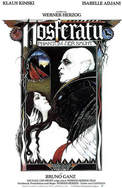
The Poster: A distinctly gothic affair to promote Werner Herzog’s toothy chiller.
Why So Great? The monochrome colour scheme of the main image works a treat, with the crimson belt throwing an ominous splash of red into the mix. The twin badges, one of a hammer and stake and the other of a bat, provide the final flourish.
If It Had Been Badly Photoshopped: Klaus Kinski would look even more terrifying. But not in a good way.

George was once GamesRadar's resident movie news person, based out of London. He understands that all men must die, but he'd rather not think about it. But now he's working at Stylist Magazine.
 Join The Community


