The visual evolution of game logos
See how your favourite games' logos have changed over the years
Weekly digests, tales from the communities you love, and more
You are now subscribed
Your newsletter sign-up was successful
Want to add more newsletters?
Every Friday
GamesRadar+
Your weekly update on everything you could ever want to know about the games you already love, games we know you're going to love in the near future, and tales from the communities that surround them.
Every Thursday
GTA 6 O'clock
Our special GTA 6 newsletter, with breaking news, insider info, and rumor analysis from the award-winning GTA 6 O'clock experts.
Every Friday
Knowledge
From the creators of Edge: A weekly videogame industry newsletter with analysis from expert writers, guidance from professionals, and insight into what's on the horizon.
Every Thursday
The Setup
Hardware nerds unite, sign up to our free tech newsletter for a weekly digest of the hottest new tech, the latest gadgets on the test bench, and much more.
Every Wednesday
Switch 2 Spotlight
Sign up to our new Switch 2 newsletter, where we bring you the latest talking points on Nintendo's new console each week, bring you up to date on the news, and recommend what games to play.
Every Saturday
The Watchlist
Subscribe for a weekly digest of the movie and TV news that matters, direct to your inbox. From first-look trailers, interviews, reviews and explainers, we've got you covered.
Once a month
SFX
Get sneak previews, exclusive competitions and details of special events each month!
While game content, design and technology constantly change year after year so does game packaging and design. This interests us.So we've taken 10 major game series and visually charted their logos' progression to see howthey'veevolved. We've even added comments.
Be aware in most cases we've gone for 'canon' games rather than offshoots or side projects. Also, the images aren't supposed to represent every title from a series, just the ones which show the logo design evolving the best, in case you were wondering.

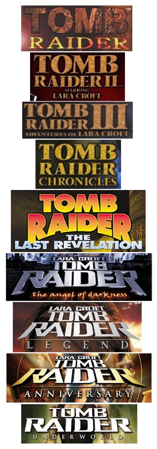
General theme? Adventure, stencil typeface, tomb textures
How's it changed? Intially choosing to represent the fact that tombs are made of rocks by re-using the same stone effect, Raider's logo design changed tack with the launch of new Lara in Angel of Darkness.
The new direction represented the mid-2000's obsession with brushed metal and incorporated an element of the Star Wars 'A long time ago' fading-into-the-distance effect.
Is it better today than before? Definitely - they made the first one by throwing a copy of PhotoShop 1.0 at a wall.

General theme? Blue, the S is a bit like a tube that Sonic might go through, this is harder than we thought
Weekly digests, tales from the communities you love, and more
How's it changed? Amazingly, given that Sonic has always been about going really fast, none of the logos attempted any sort of motion-blur. That's a FACT that you can't argue with.
Sonic wins hands-down in terms of brand consistency - the font has never changed. The designers have settled into a pattern of just changing the inner texture of that font in recent iterations. Which in some indeterminate way is like Sega'sapproach to the Sonic game series.
Is it better today than before? Not really, we quite like the stark, business-like nature of the original Master System logo.

Next up: Metal Gear and Metroid
