


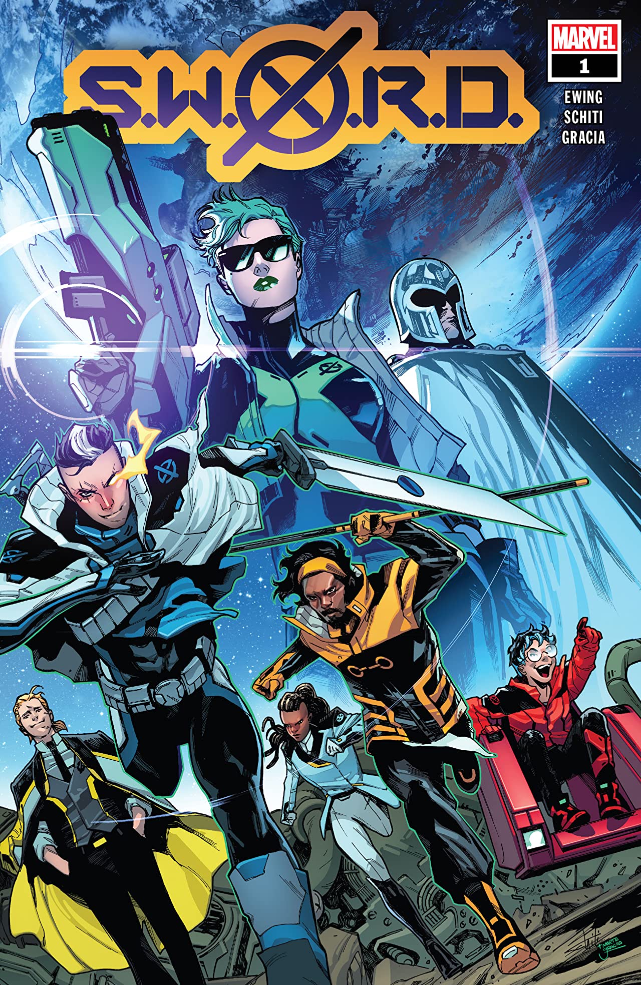
The cover to S.W.O.R.D. #1 seems quite simple at first glance. A shot of Earth from space makes up the background, revealing the setting, while the foreground is dominated by a swathe of characters – teen Cable, Abigail Brand, Manifold, Fabian Cortez, Wiz-Kid, and Frenzy (who are all in snazzy new outfits) and Magneto – illustrating the central cast. Its greatest strength however is in what's not a part of the image, what we can't see. The cast are setting off for something, Wiz-Kid is enthusiastically pointing in that direction. It's the great unknown and S.W.O.R.D. is racing towards it.
Written by Al Ewing
Art by Valerio Schiti and Marte Gracia
Lettered by Ariana Maher
Design by Tom Muller
Published by Marvel Comics
'Rama Rating: 8 out of 10
As Abigail Brand puts it later in the issue, "This is what comes next."
Al Ewing has continually proven himself during his time at Marvel as a writer that plays well with others in the House of Ideas' sandbox, while also using the space he's given as the opportunity to build up his own ideas across multiple series, like he did on a string of various Avengers titles previously.

S.W.O.R.D. is no different, with Ewing's script nimbly threading its way through the current era of X-Men and their Krakoan life as well as what he's been doing on a cosmic level across Empyre and Guardians of the Galaxy. Reteaming with the artist of that event (Valerio Schiti), this first issue jumps right into showing us around the Peak (a.k.a. S.W.O.R.D. Station One) in order to explain its function, the process behind it, and the purpose of the team that now mans it.
They're also joined by Marte Gracia, who could easily be called the company's best working colorist. It makes for a stunning issue. The scale of the station is evident from the first glimpse and the pair focus in further with each moment after that. Schiti's linework makes the Peak feel lived in and fully operational, a stark difference to the foreboding isolation that came across when it made an appearance in 'X of Swords.' Now a hybrid of nature and technological ordinance, much like Krakoa, Gracia utilizes the palette they established with House of X and Powers of X. Verdant green is the defining color, with plant-life having found its way into every room and crevice of the architecture.
And while the narrative brings a multitude of threads together, Ewing has a way of making it go down easy, regardless of how much knowledge of the various strands that readers are coming to the series with. An early infographic breaks down the hierarchy of the station as well as a brief paragraph that details the most essential information from the recent crossover and why Brand has come back to what is now part of the mutant space program.
Built around Magneto's tour of the facilities – he's going to be their council representative -- it mirrors House of X #1 in its structure, though Magneto is much more jovial here than he was with the humans there. Ewing's script moves with verve through the various components of the Peak, anchored by a consistent pitter-patter of dialogue. Cable greeting Magneto upon his arrival with a joke about surviving the experience sets the lightness in tone.


Though the station is not all sunshine as some moments of friction between cast members crop up, namely between Brand and Magneto. The master of magnetism has spent his recent time focusing on building up Krakoa as a nation for all mutants, while the returning commander has larger concerns. Even if the Peak is floating above Krakoa, her awareness of the wider cosmic situation – a moment which teases the impending tie-in to King in Black – means she believes it has to be there for the planet at large. The creators capture her wonderfully, from Ewing's pragmatic characterization to Schiti and Gracia's strong character acting, all the more notable for how her shades hide what is typically the most emotive feature of a face.
While the book is predominately based on the station, the glimpses of what lies beyond are even more visually ravishing. The art team is already proving to be a strong match for the series' thematic concerns. One particular beat captures Brand and Magneto against a window looking out at the stars, the vista making the specks of light far off in the distance representative of something to be discovered. Compared to Ewing's creator-owned series, We Only Find Them When They're Dead, there's a greater sense of optimism in S.W.O.R.D.'s outlook. Mutantdom is better off than they've ever been, it wouldn't be right for them to sit still at a time like this. Now is the moment to see what else they can find. It looks like it'll be worth following them.
Read Newsarama's spoiler-filled breakdown of S.W.O.R.D. #1.
