Avatar (2009)

Controversial choice, maybe, considering the souring of critical opinion which has undermined Avatar’s legacy since its record-breaking debut almost ten years ago. But, love it or hate it, James Cameron's stereoscopic vision nevertheless redefined the possibilities for three-dimensionality in cinema, and set a new standard for immersing the audience through the power of technology. And, if we're honest, Pandora still looks remarkably tactile and luxuriant on a flat screen at home.
Why it looks so good: The combination of the psychedelic colours and some impressive 3D will make your mind spin (in a good way).
Heat (1995)

Good looks needn't always involve spectacular scenery, pyrotechnical explosions or eye-popping colours. Michael Mann's sleek aesthetic effortlessly exudes an appealing modernity, and Pacino and De Niro, playing cops 'n' robbers in designer suits, are models of minimalist cool matched by the look of the Los Angeles urban jungle which surrounds them. For nearly three hours, Mann and his team (notably cinematographer Dante Spinotti and production designer Neil Spisak) conjure up an ethereal, existential world of steel and neon from everyday LA, with edge-of-your-seat street shootouts for added excitement.
Why it looks so good: The quintessential embodiment of cool, Heat is dripped in a stylish gloss that is entirely its own.
Wallace and Gromit: The Curse of the Were-Rabbit (2005)

The painstaking process of stop-motion animation meant that it took Aardman a full working day to produce just one second of Wallace and Gromit’s grand introduction to the world of cinema, but the results of this strenuous work are what give the film its visual flair. Since every frame has been so lovingly crafted, Aardman’s unmistakable personality imbues every pixel, bringing the film to life with colour and panache. The Curse of the Were-Rabbit is a genuine joy to behold, and the timelessness of its unique aesthetic remains an absolute treat for the optical senses. Never has plasticine looked this good.
Why it looks so good: The uniquely handmade quality of Aardman’s big-screen debut is endlessly endearing.
Finding Nemo (2002)

With apologies to Walt Disney, only one Pixar film makes the cut. But it's a good 'un: Andrew Stanton's realer-than-real dip under the ocean, which looks like the most astonishing aquarium ever devised. The crew’s art team underwent extensive training in marine biology and oceanography to ensure that their presentation of life beneath the water was accurate, and this authenticity permeates and embellishes the film’s already gorgeous animation. It's a good job the film's storytelling is up to scratch, otherwise audiences might be tempted just to sit and gawp at all of the underwater action.
Why it looks so good: It feels like every square-inch of the Pacific Ocean is given its due in Finding Nemo, and it all looks stupendous.
The Assassination of Jesse James by the Coward Robert Ford (2007)

The long list of criminal injustices in Oscar history must surely include the lack of a golden guy for British Director of Photography Roger Deakins, who has secured eight nominations to date, but no wins. Andrew Dominik's gloriously evocative Western highlights Deakins' approach: a pumped-up classicism that somehow looks both timeless and modern, a perfect fit for this ever-relevant cautionary tale of brotherhood and betrayal. Breathtaking vistas are juxtaposed against intimate shots of the humans who make up this story, and both are utilized effectively to immerse your senses ever further into the film’s serene beauty.
Why it looks so good: The film’s composed stillness bears a hypnotic quality that shouldn’t be missed.
Sin City (2005)

It's rare that a film's aesthetic is so bold that, within years, everybody is copying it (see Snyder, Zack). Yet Robert Rodriguez's green-screen experiment, plonking live actors in digital sets, remains one of the most innovative and influential revolutions in cinematic style this side of the millennium. The monochromatic hue and grungy visual style won’t be to everyone’s taste, but Sin City is so confident in its own skin that you can’t help but be impressed by everything on show. Who needs three dimensions when this level of control can deliver a distilled essence of crime noir?
Why it looks so good: By sticking closely to the aesthetic of its graphic novel heritage, Sin City makes a lasting impression that’ll linger long after you’ve seen it.
Pan's Labyrinth (2006)

Fantasy, arguably, is easy to make astonishing but hard to make truly beautiful, as countless kitsch prog-rock L.P. covers will testify. All the more remarkable, then, that Guillermo Del Toro's stunning movie (half full-on fantasy, half brutally realistic war drama) is absolutely spell-binding to look at, with its out-there prosthetics merging seamlessly with Guillermo Navarro's earthy colour palette. Del Toro reaffirms his highly respected status as a visionary auteur with Pan’s Labyrinth, as his masterpiece is replete with visually striking scenes and powerful imagery that burns into the brain.
Why it looks so good: The set design is nothing short of stupendous, bringing mythological fantasy to life.
Apocalypse Now (1979)

Given the nightmare shoot (recastings, heart attacks, truculent stars, and typhoons), all signs suggested that Francis Ford Coppola's Vietnam War epic would turn out to be a big and bloody mess. Instead, in the hands of cinematographer Vittorio Storaro - a man seemingly unaware of the concept of ugliness - the jungle becomes a beautiful napalm bonfire; the night sky a trippy, lethal light-show; the battlefield a canvas for modern-day Valkyries. It's the scorched look of Apocalypse Now that coheres the insanity into a mentalist masterpiece.
Why it looks so good: As a work which completely immerses you in its historical setting, Vietnam flicks don’t get more impressionistic than this.
There Will be Blood (2007)

An ambitious, original filmmaker needs an expert pair of eyes to guide him, and the unsung hero behind Paul Thomas Anderson's ascent to the top of his profession is his regular Director of Photography, Robert Elswit. From the disco inferno of Boogie Nights, through to Magnolia's raining frogs and Punch-Drunk Love's cartoonish colours, Elswit's images have consistently surprised, but none more so than There Will Be Blood. Aided by David Lynch collaborator Jack Fisk's claustrophobic production design, Elswit nails the stormy textures of 19th Century America, notably in the pitch-black beauty of an oil geyser literally painting the land dark.
Why it looks so good: The film promises blood, but the real eye candy arrives in any of the scenes involving oil.
Blade Runner (1982)
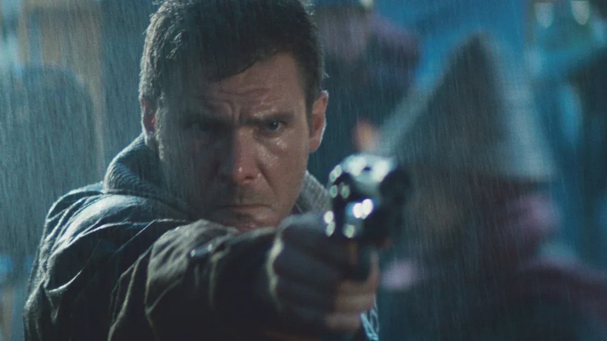
In narrative terms, the 2019 of Blade Runner is a bleak, ugly future where derelict buildings are lashed by acid rain and illuminated by garish neon billboards. But this is Ridley Scott we’re talking about and, as filtered through his ad-man's sensibility, this is a richly imagined world to die for. Jordan Cronenweth's cinematography is breath-taking, but really this is production designer Lawrence G. Paull and art director David Snyder's triumph, as an unforgettable bricolage of outlandish retro-futurism. A timeless classic that still acts as the benchmark for cyberpunk sci-fi cinema today.
Why it looks so good: The neon-soaked atmosphere pervades every joyous pixel on the screen.


