An extremely interesting history of game packaging
It's got pictures and stuff
Of course you do. You love games enough to visit a site that’s known for writing about this exact kind of esoteric nonsense. In fact, you probably noticed how much the 360 and PS3 cases have changedin just the past year. So without further yammering let’s get into a big ol’ list of game boxes through the ages.
There are several potential starting points for this article, but for the sake of hitting the widest possible nostalgia group, let’s go with the Atari 2600. Unlike today, where boxes are rigidly uniform, the Wild West days of the 2600 led to nearly every company adopting its own style of box and cartridge. Imagine looking at a store shelf and trying to figure out which of these games plays on your system. Madness!
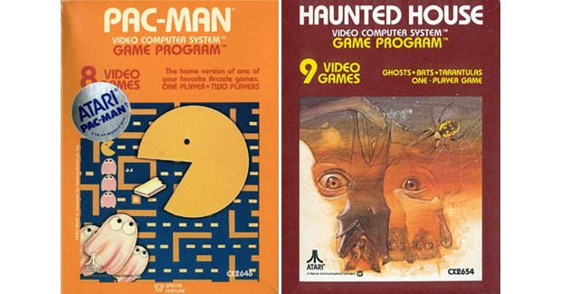
Above: Pac-Man and Haunted House exemplify early 2600 boxes, with the name and modes featured prominently
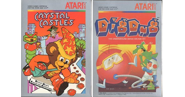
Above: Later, the style switched to silver boxes with huge art
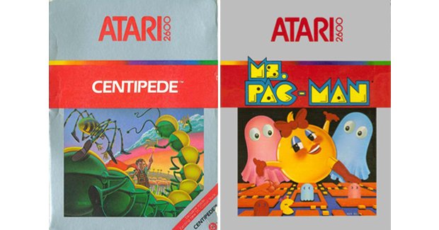
Above: This silver variation worked its way in even later, with smaller art and tons of wasted space
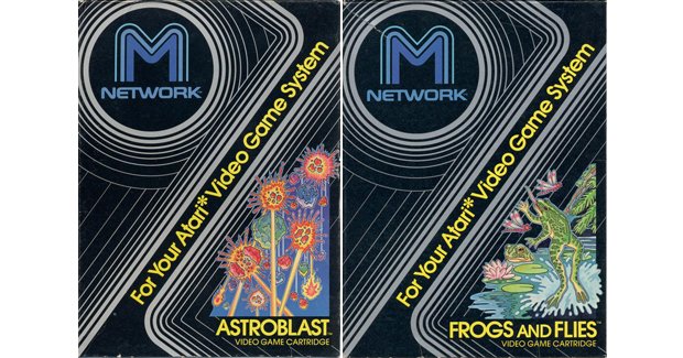
Above: M Network released games with this dizzying design, plus its cartridges were unlike other 2600 games
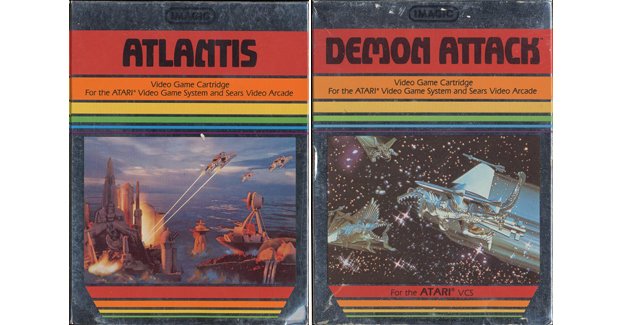
Above: Imagic is supposedly gaming’s second third-party developer ever (the first being Activision), and it released 2600 games in shiny, reflective boxes
Weekly digests, tales from the communities you love, and more
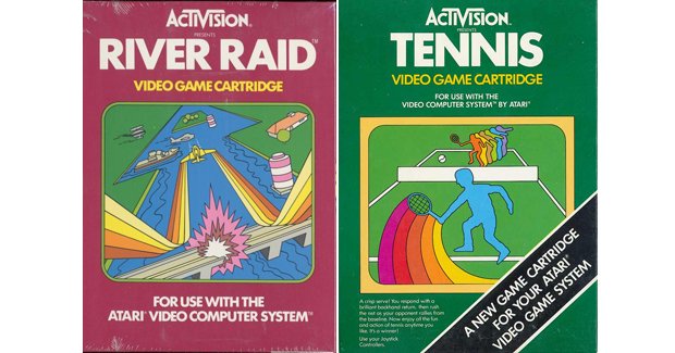
Above: Speaking of Activision, it made sure every game featured the company logo and its signature color wave
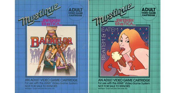
Above: “Adult” publisher Mystique placed its art on a grid, along with a warning to protect children from the cripplingly awful gameplay hidden inside
Believe it or not, this merely scratches the surface of 2600 packaging. Like we said, almost every company had its own presentation (and oftentimes its own unique cartridges), so that means there are roughly as many box types as there are ‘70s game companies. As we move forward, you’ll see this “every man for himself” attitude fade away – which would you prefer?
The next major touchstone would be the NES, which followed in the 2600’s chaos-riddled footsteps and allowed each company to print boxes as they saw fit. Even Nintendo failed to keep a consistent style throughout the system’s life, though it did begin with an iconic first run of games that all looked the same.
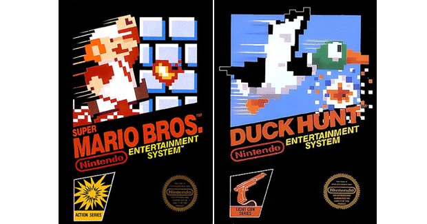
Above: The NES launch games mostly stuck to this specific formula – a game sprite in action, with diagonal game name and a “Series” designation in the corner
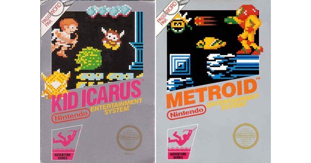
Above: When Nintendo introduced passwords with Metroid and Kid Icarus, it kept the sprite/diagonal look but changed the box to silver
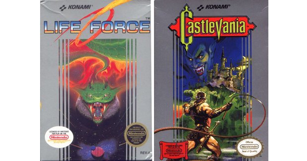
Above: Which was kind of confusing once Konami shipped all its games in silver boxes as well
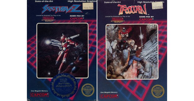
Above: Capcom began life on the NES with a weird floating grid, always behind a piece of character art
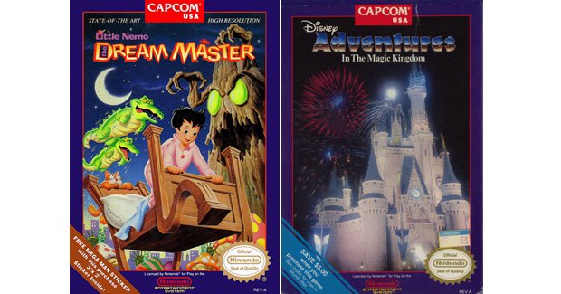
Above: Later, Capcom dropped the grid and put everything in a violet border
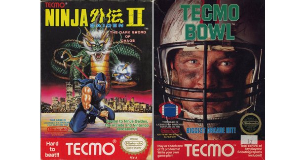
Above: Tecmo slapped a big red rectangle and logo on the bottom of its big hits, namely Ninja Gaiden and Tecmo Bowl
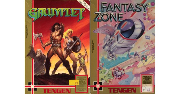
Above: Tengen (in between lawsuits) released games with a gold half-border
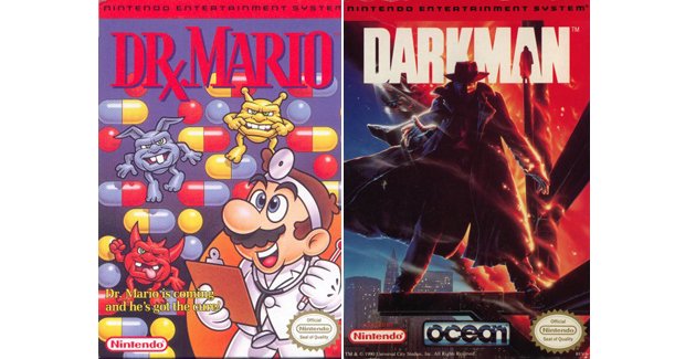
Above: As the years wore on, Nintendo adopted a fairly standard-ish red bar across the top of its games. Still, not every game used this approach
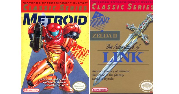
Above: Nintendo re-released classic games from the early days (maybe the first instance of “Greatest Hits” packaging), each stamped with “The Original” on the box
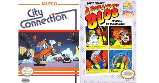
Above: For the most part though, companies could do whatever they wanted. Each game required a Seal of Approval, but even that could dance around the box
With such relative freedom, publishers could design very striking, very unique boxes that leapt out from the retail shelf. However, this wouldn’t be the case for much longer, as once Sega and Nintendo started going head to head, the need for a unified presentation was made quite clear.
Next up – Sega’s many attempts to find a consistent style
A fomer Executive Editor at GamesRadar, Brett also contributed content to many other Future gaming publications including Nintendo Power, PC Gamer and Official Xbox Magazine. Brett has worked at Capcom in several senior roles, is an experienced podcaster, and now works as a Senior Manager of Content Communications at PlayStation SIE.

 Join The Community


