The worst box art of 2011
35 of the year's ugliest attempts at game packaging
Weekly digests, tales from the communities you love, and more
You are now subscribed
Your newsletter sign-up was successful
Want to add more newsletters?
Join the club
Get full access to premium articles, exclusive features and a growing list of member rewards.
11. Fix It: Home Improvement Challenge
Released: Nov. 29
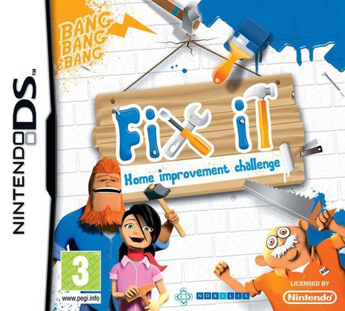
Boring as it is, the European box art for Fix It would actually be pretty unremarkable, if not for the crazy-eyed old man and the kid from Mask over there, who’s apparently developed a gruesome neckbeard and an affinity for hammers since 1985. Otherwise, this box is the very picture of restraint – especially when compared to the US version:
As though it weren’t bad enough that Crazy Eyes and Neckbeard are now full-on charging at us with brandished tools, their giggly friend is wearing the same waxen expression – and this time she’s carrying a shovel, which makes it all the more horrifying. As if she’s just there to watch and clean up afterward.
Also, take care to notice the slovenly man in the wifebeater. Notice also that he’s about to get run over by Crazy Eyes and Neckbeard, who are somehow driving a bus at the same time they’re preparing to murder us. THEY ARE EVERYWHERE.
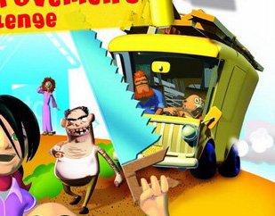
Above: Look out, slovenly man! Also maybe get those teeth looked at
12. Dungeons: The Dark Lord
Released: Sep. 27
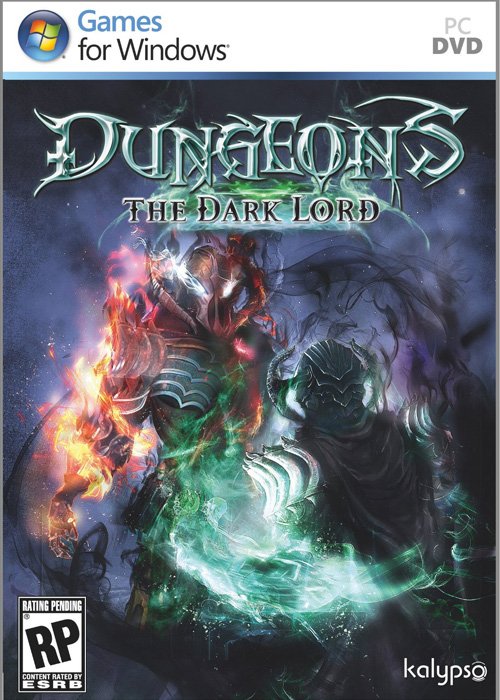
Unlike most of the boxes on this list, the cover for Dungeons: The Dark Lord was created with what’s clearly a respectable degree of artistry and talent. Sadly, none of that talent has been put toward giving us a single goddamn clue as to what’s supposed to be going on here.
Weekly digests, tales from the communities you love, and more
13. Duke Nukem: Critical Mass
Released: June 6
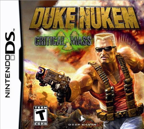
Duke Nukem Forever might have caught a lot of flak from critics this year, but at least its cover gave us something to focus on other than how veiny Duke’s arms are, or how his entire left shoulder is just one massive goiter.
14. Jerry Rice & Nitus’ Dog Football
Released: Aug. 16
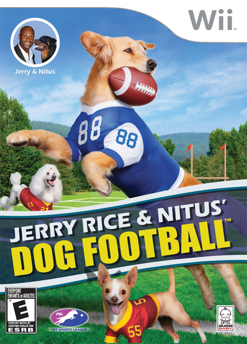
We honestly can’t find much fault with the photography or composition on display here; it’s the concept of the thing that makes us ill at ease. Because frankly, there is no way any of these dogs could possibly live up to the expectations that Jerry Rice’s name on a football game creates.
15. Petz Bunnyz Bunch
Released: March 8
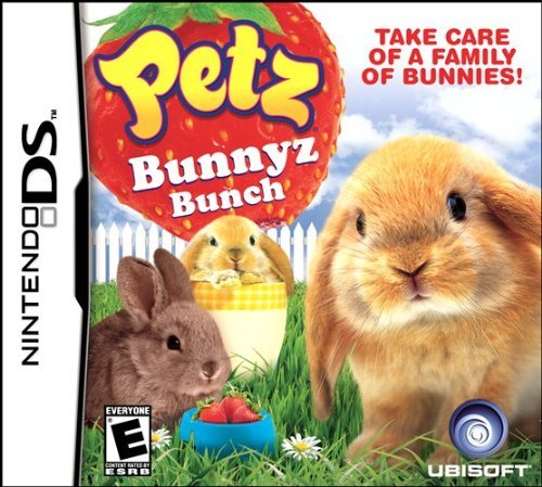
We have kind of an unspoken competition going with the art directors of the Petz series: Every year, we try to find filthy things on the boxes they design. And every year, they try to throw us off the scent with increasingly inoffensive and cuddly imagery. With Bunnyz Bunch, they appear to have finally succeeded.
Or they would have, if we were so easily fooled.
16. Super Sonic Racer
Released: July 19
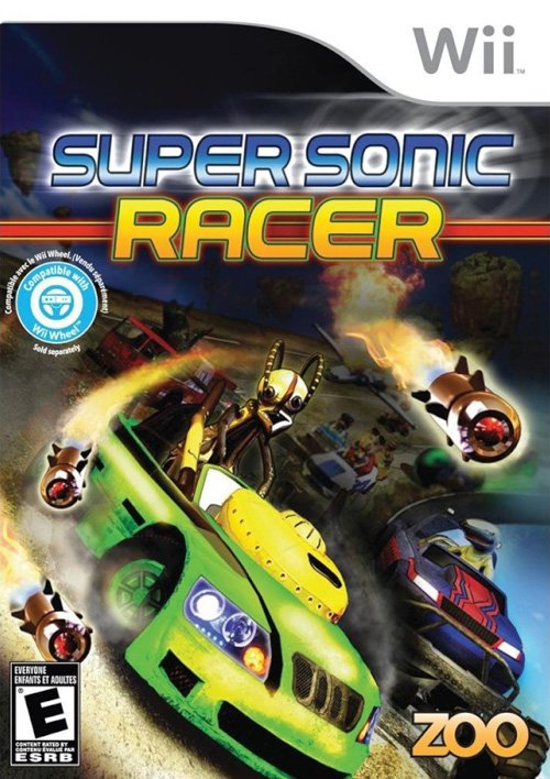
Aside from being a little ugly, posed at a weird angle and sporting a background that’s mysteriously shadowed out, we can’t tell what the hell that driver at the center (who aside from Missiles and Green Car is the focus of the image) is supposed to be.
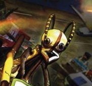
Above: A cockroach? A robot? An ant? A terrible mascot for a videogame?
17. Dead Rising 2: Off the Record
Released: Oct. 11
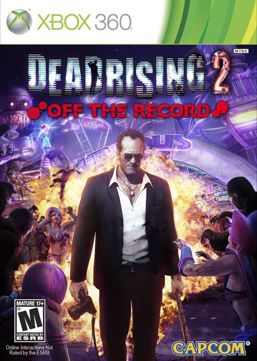
We like Dead Rising 2: OTR. We do. But this box? This box is a hideous amalgamation of purples and golds, with a Frank West who looks more like Michael Madsen, and a bunch of zombies who look more like flinching showgirls than menacing undead cannibals. It may be a good representation of the game’s craziness, but knowing that doesn’t make it any easier to look at.
18. Family Farm
Released: May 27

Family Farm knows what you did. It watched, helpless, while you did it. And while the humans might not fully understand the act or your motivations in carrying it out, the animals sure as hell do. And they are horrified.

Above: Especially the cow. The others may be frightened, but only the cow sees the monster inside you
19. Maximum Racing: Drag & Stock Racer
Released: Mar. 14
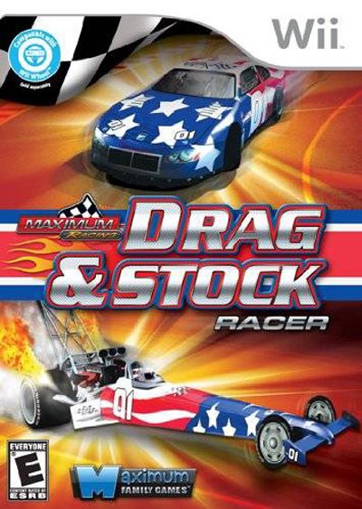
This box thinks you’re a simple-minded chump who not only likes static pictures of cars, but will buy anything so long as it’s glowing and plastered with the Stars & Stripes. Right now it’s laughing behind your back about what a dumbass you are. Are you just going to take that? From a box!? Next time you see this thing in the store, punch it square in the jaw.
20. Champion Jockey: G1 Jockey & Gallop Racer
Released: Nov. 8
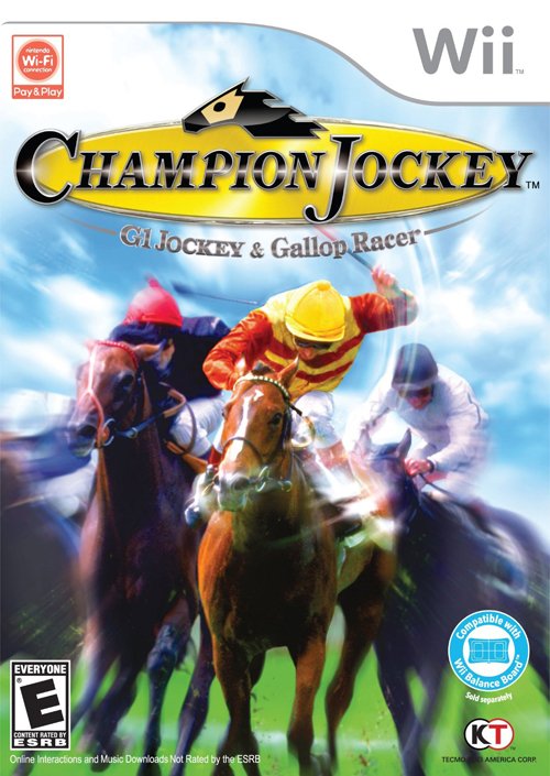
Champion Jockey could have gotten off easy. If it had only stuck with that photo, it could have just been boring and unremarkable, instead of one of the worst boxes of the year. But then some brilliant mind went and smeared blur effects all over it to give it the illusion of motion, and now we’ve got this sorry piece of Vaseline-covered crap.
 Join The Community


