When we talk about how games have evolved over time, we often talk in terms of polygons and pixels. Where once you could count the number of pixels that made up a character on one hand, we now have lifelike models and environments made out of so many lines of code that they sometimes look more real than reality.
But what if there was another way to look at games and analyze them? What if there was something you probably glossed over that could tell you what era a game came from, and what sensibilities it was designed with? What if you could see your games in a new way by looking at... their menus?
I know, I know. Video game menus are not the most exciting topic in the world. But there's been a change, an evolution in this seemingly most basic of video game attributes, happening right under our noses, and I'd wager most of us haven't even noticed. If it helps, think of scrutinizing menus like codebreaking - uncovering hidden messages left by a game's developers. And if that doesn't help, well... let me show you what I mean.
Article continues belowThe evolution of a hedgehog
Let's break this down by looking at one of gaming's longest-running franchises, Sonic the Hedgehog. The Sonic games are, relatively speaking, pretty basic. There might be a new gimmick or two, ie. Wisps or Werehog transformations, but the core formula for Sonic has remained 'good guy vs bad guy and army of robots' for more than 20 years. That makes it easier to notice differences than, say, Mass Effect, where BioWare was always going to try and make things look befitting of its sci-fi universe.
And don't worry, we're just going over Sonic's highlights - we'd be here all day if we analyzed every game starring Sega's mascot.
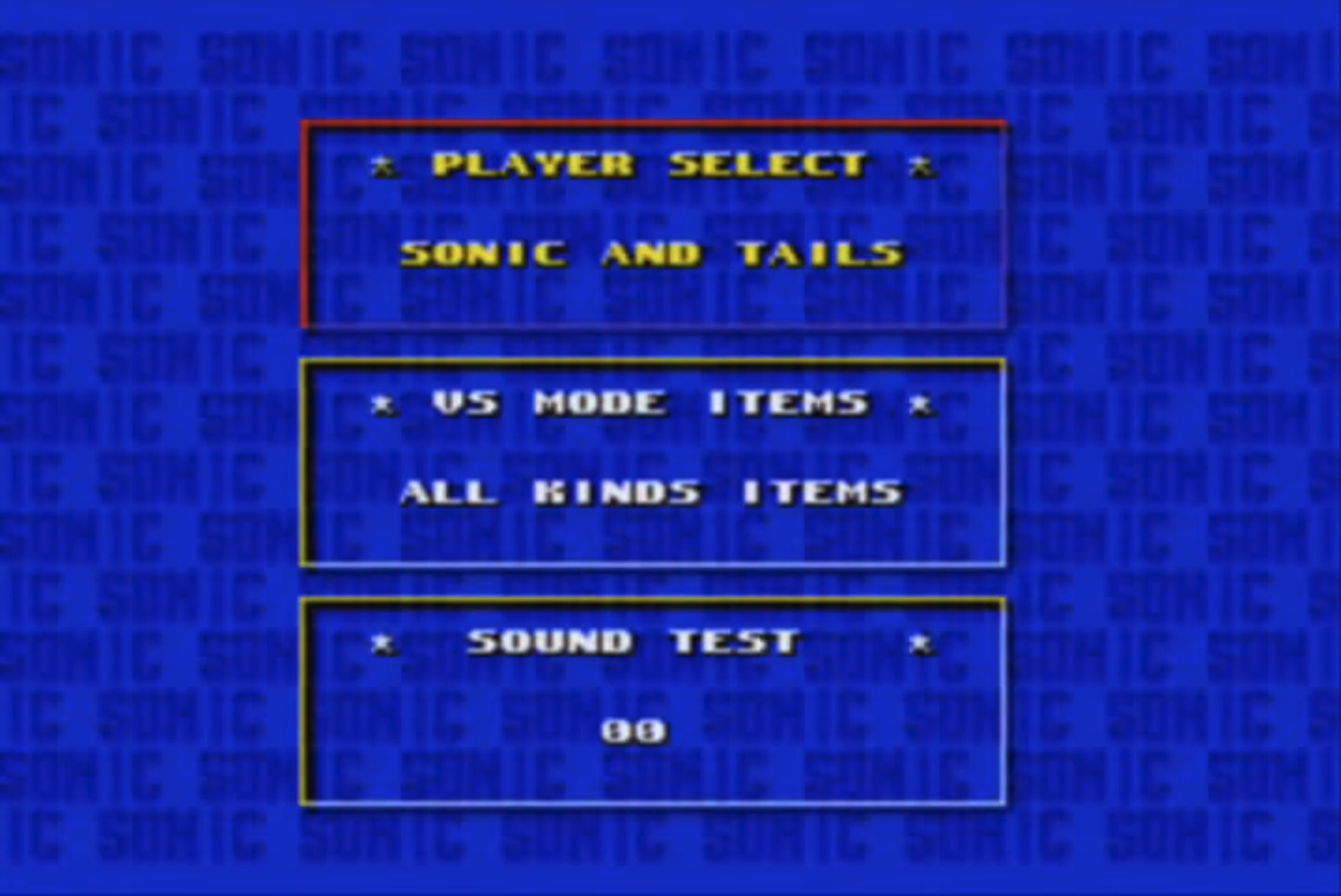
The first Sonic the Hedgehog game, released in 1991, lacked a real menu. You simply pressed start and away you went. Meanwhile, Sonic the Hedgehog 2 had a rudimentary menu rooted in functionality over pleasing aesthetics. The text is simple and spacing large. Text is centered horizontally, but not vertically. The text boxes themselves are see-through, and straight lines criss-cross in the background.
While Sonic 2 arrived on Genesis / Mega Drive in 1992, it was still rooted in '80s aesthetic graphic design: bright colors, geometric shapes, and repeating patterns dominating the majority of a space. And sure, some of this is due to limitations of the hardware, but there's no denying at the end of the day, this looks like a slightly fancier DOS menu.
Weekly digests, tales from the communities you love, and more
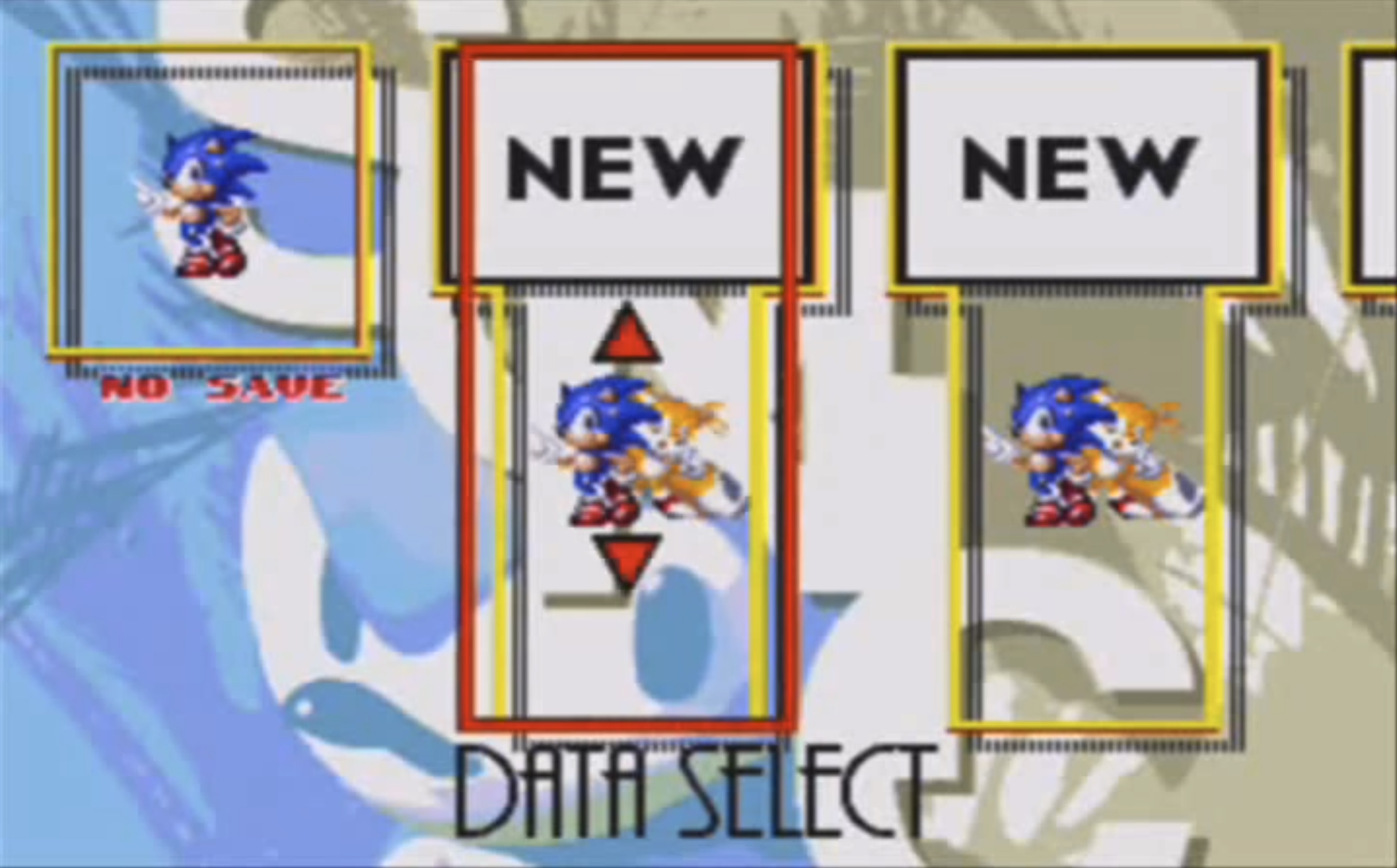
I adore Sonic 3's menu, which captures the essence of '90s graphic design fabulously. Where the '80s insisted on repeating patterns, visual language of the '90s focused on clashing elements. Look at the famous Solo Jazz Pattern as an example: high contrast between the fat and thin brush strokes, highly saturated (one might even say garish) color palette, and an unevenness of the ups and downs gives an impression of not taking things too seriously. Think back on '90s commercials and you'll see the same insistence on cheeseball wackiness.
Compare that to the Sonic 3 menu. The red selection rectangle overlaps the yellow highlights behind it in odd and uneven places. The black border behind the yellow is off-center and composed of vertical lines and dots, breaking up the flow of the outline. The background image is a close-up of Sonic's face with a hodgepodge of lines and shapes cutting across it, and the word ‘SONIC’ in descending, uneven font.
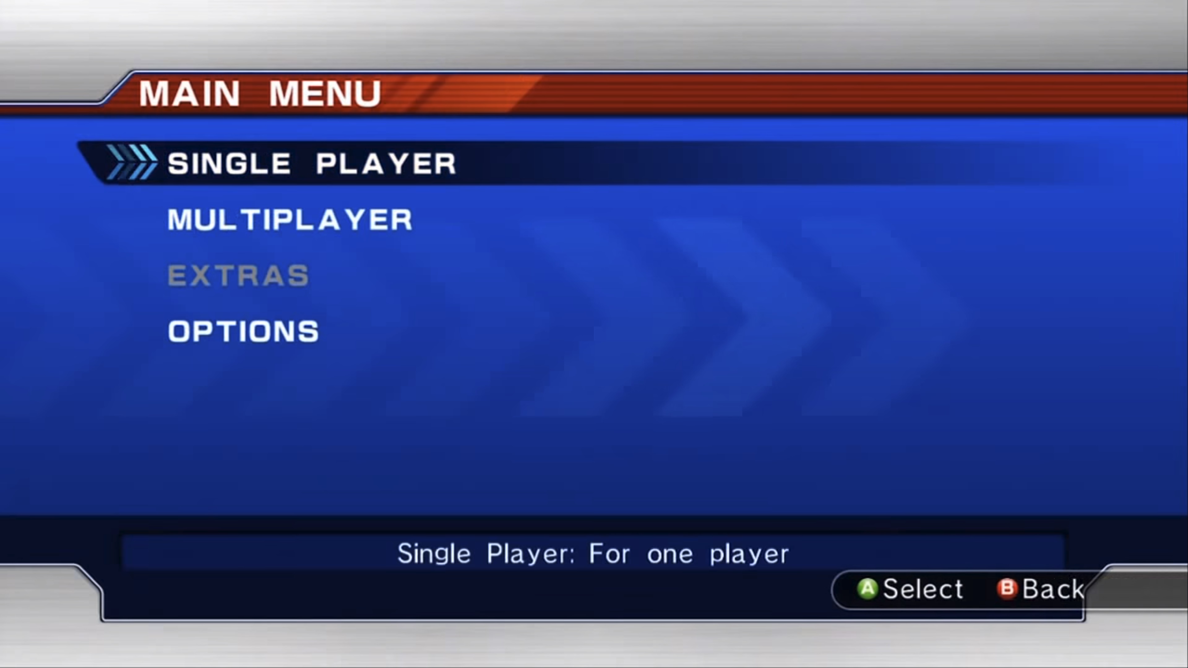
Skipping ahead to Sonic 2006, we see new millennium graphic design in full swing. There's a hint of asymmetry, but it's not dominating. The fonts are sans serif, the selection box is now a minimalist highlight instead of a blocked out square or rectangle, and a metallic sheen gives a feel for the decade's obsession with technology. Art is constantly in a state of push and pull, action and reaction; the '00s were a shift away from the loudness of the '90s, and this menu exemplifies that.
Another trend you'll see often in '00s media is making the menu or options a part of the world. As Hollywood shifted away from VHS to DVD and film studios touted interactive menus, customers became attached to the idea that navigating a menu could be an experience unto itself. You ever watch the original X-Men on DVD? It's like you're really walking into Cerebro! Okay, maybe it's a bit cringe-y in retrospect, but at the time, that was cool as hell.
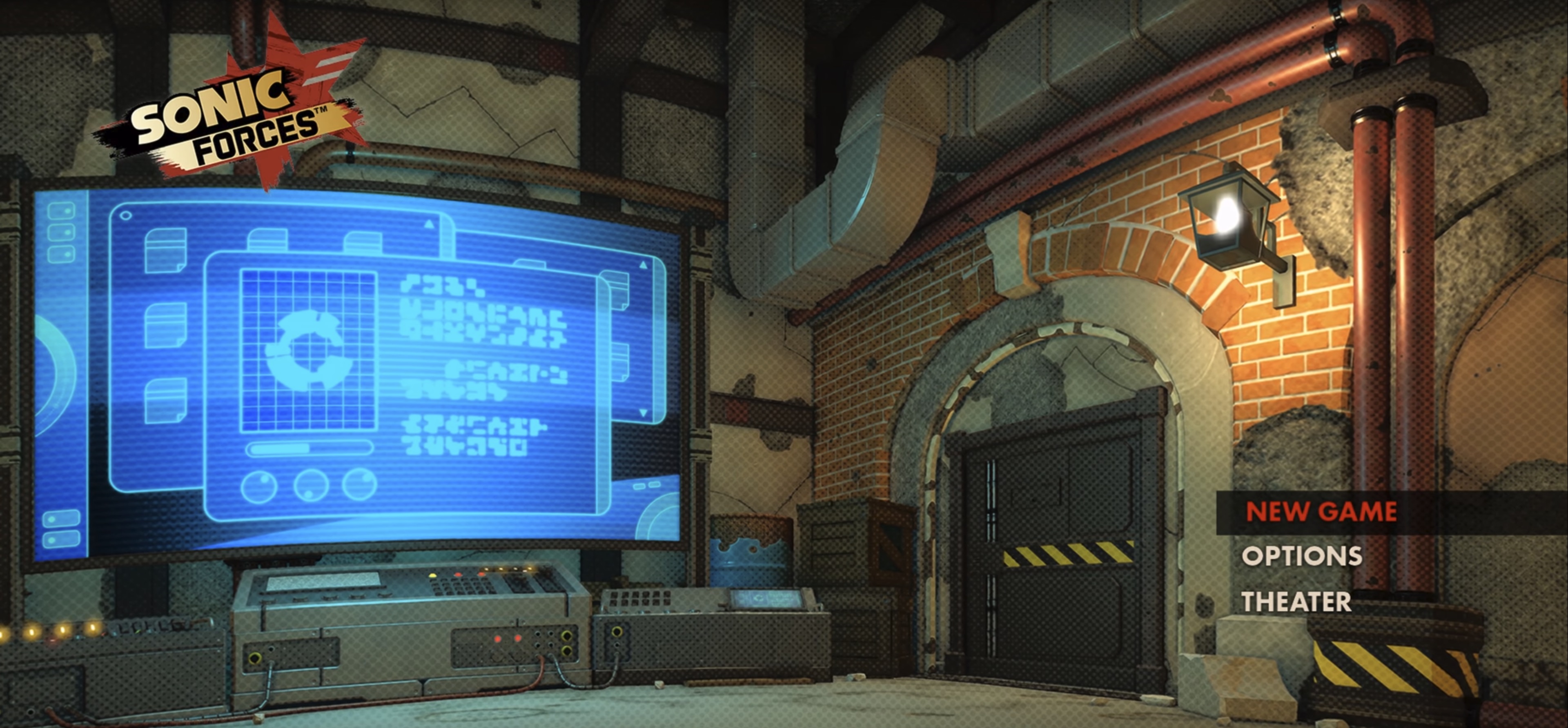
Once more jumping ahead - this time to the most recent game in the series, Sonic Forces - and we see the '10s focus on selling a concept with imagery instead of words (see: your uncle's Facebook memes, YouTube thumbnails). The game's logo is shifted to the upper corner, while the menu itself is in the bottom-right. The mesh overlay is reminiscent of an Instagram filter. #SonicSafron
Overall, your eyes take in more of the visuals, and the space seems larger; a byproduct of designing for an era when large-screen televisions are at their most affordable and we push for higher and higher resolutions.
A few more examples
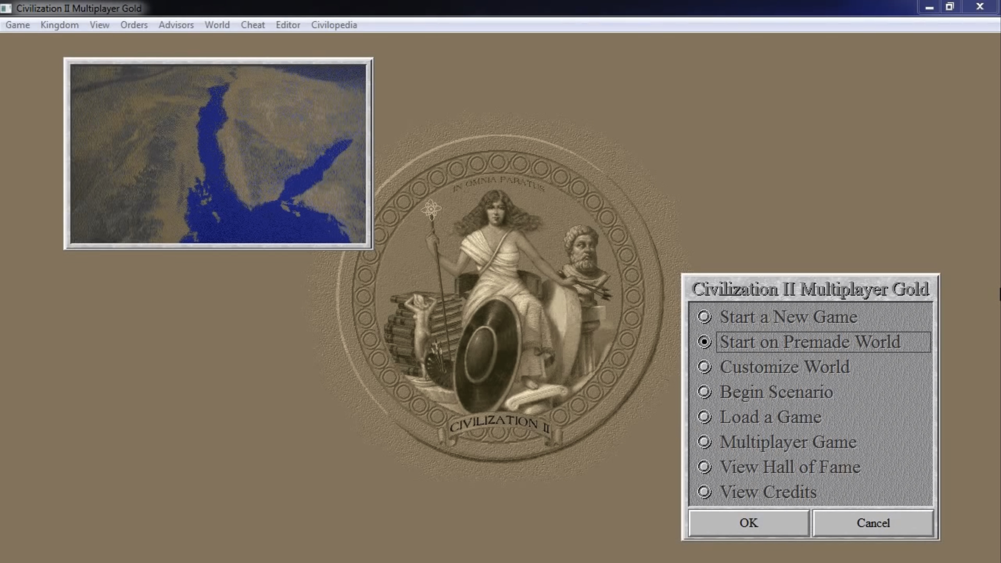
Look at other games from their respective eras and you'll see similar trends. Compare Sid Meier's Civilization games - from the OS-style options of early Civ games…
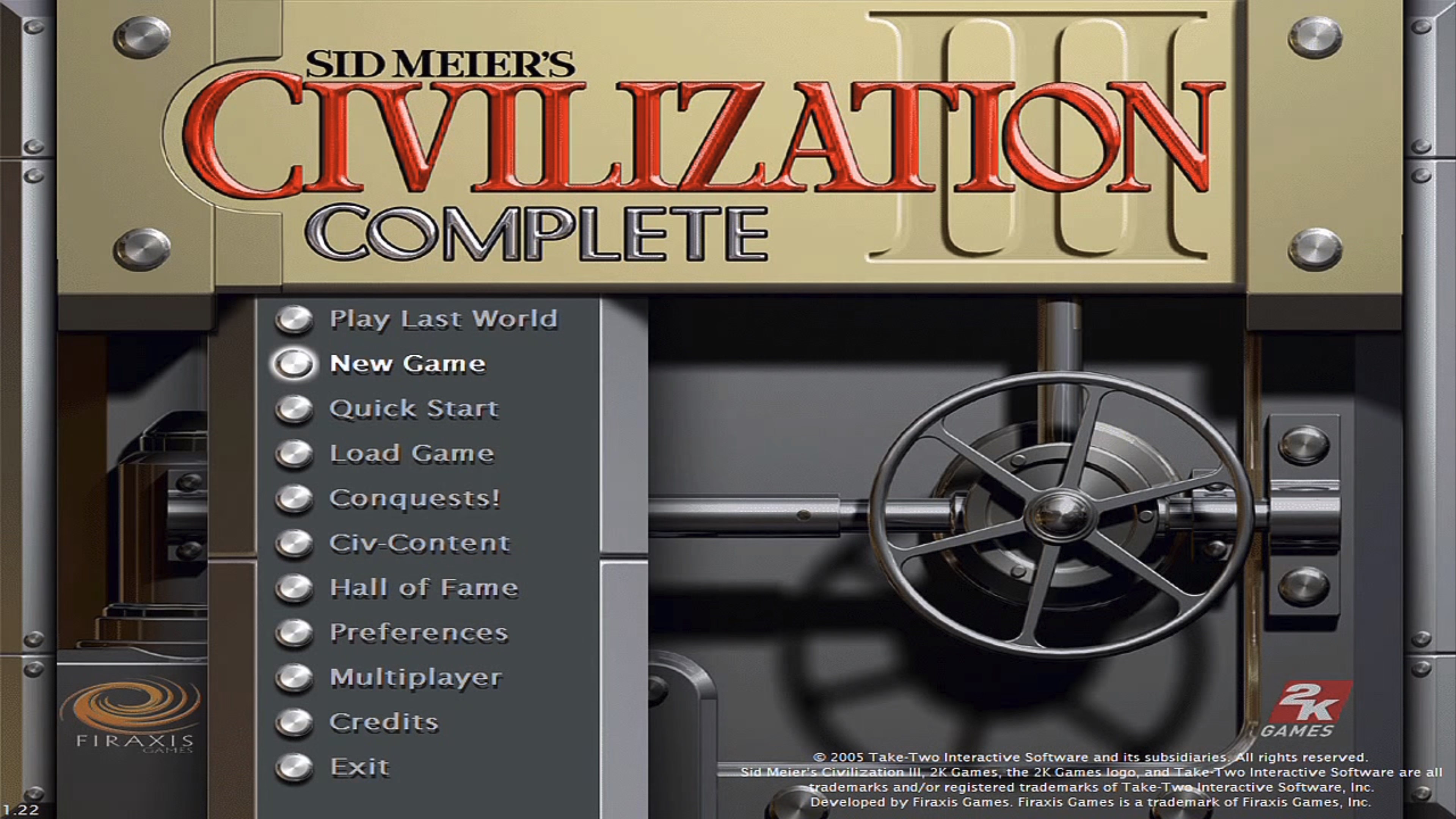
...to Civ 3's menu blending options with the game world…
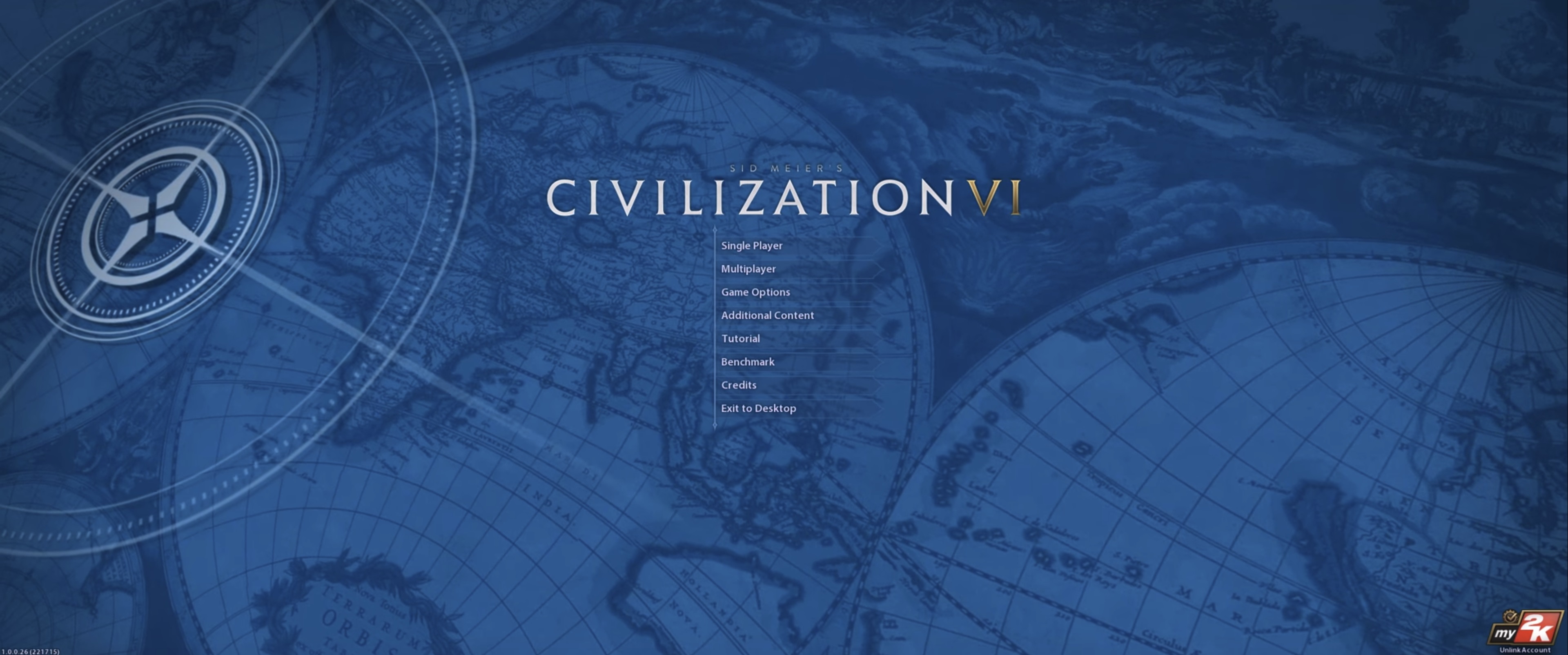
...to Civ 6's minimalist design and increased focus on visual appeal.
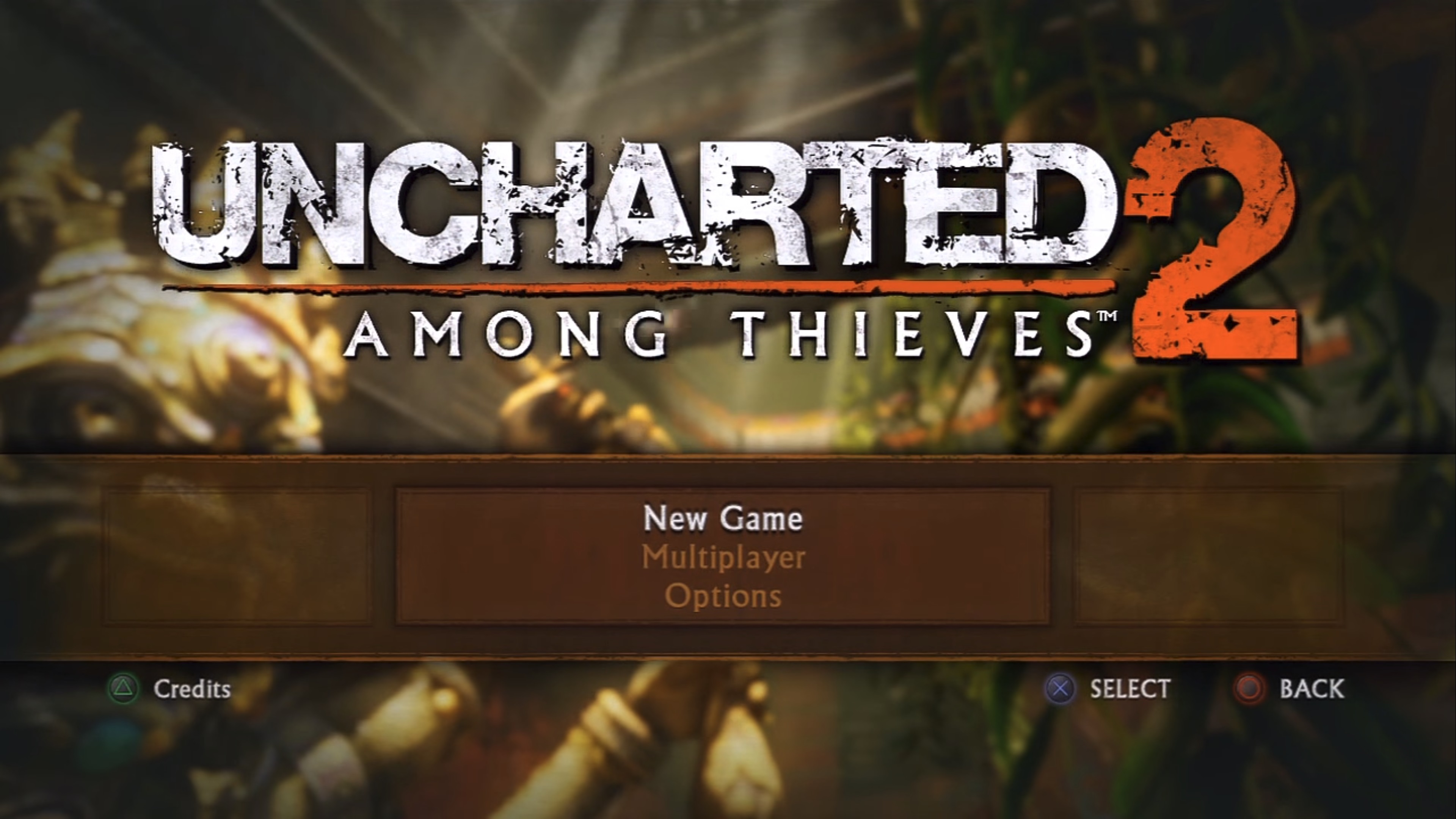
Even more recent franchises like Uncharted have undergone a visual evolution in their menus. Look at how much space the game's logo and menu take up in Uncharted 2: Among Thieves:
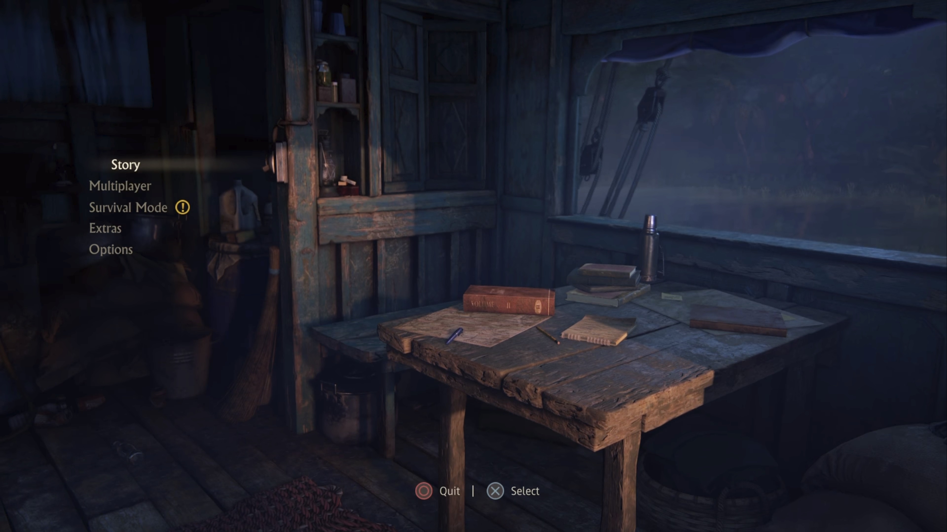
Compare that to the recent Uncharted: Lost Legacy, which shunts its options to the side with smaller fonts so players can once again focus on the visuals. The logo is completely absent as well.
Video games are reflective of the times in which they're made. Too often we boil this down to what kind of processing power was available and how many bits could be crunched. But the things we don't even stop to think about - like the design of a menu - can be just as indicative of an era. And 5, 10, 15, or more years down the road, maybe it'll help you take a trip down memory lane by reminding you of the things you forgot.
So next time you fire up an old favorite or a modern classic, give a moment to appreciate the little details. It might give you a new lens through which you can appreciate games.

Sam is a former News Editor here at GamesRadar+. His expert words have appeared on many of the web's well-known gaming sites, including Joystiq, Penny Arcade, Destructoid, and G4 Media, among others. Sam has a serious soft spot for MOBAs, MMOs, and emo music. Forever a farm boy, forever a '90s kid.

 Join The Community


