Why you can trust GamesRadar+

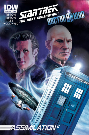
Issue #1
Written by: Scott Tipton, David Tipton, Tony Lee
Art and colors by: JK Woodward
Lettering by: Shawn Lee, Robbie Robbins
Published by: IDW
I love a good crossover. Done right you get to see both groups of characters in a new light, take a look at how they react outside their comfort zone and gain a new appreciation for each. Done wrong, you get a couple of groups of people wearing spandex together, they fight and then go home for tea and medals.
There’s no spandex in Doctor Who/Star Trek but I suspect there’s tea.
This first issue focuses on the Doctor, Amy and Rory and the two Tiptons and Lee clearly have massive fun writing the three of them. They hit the ground running – literally – and the rapid-fire banter between the trio is both absolutely on point and pure comedy gold. Matt Smith’s Doctor in particular has rarely been this well represented on the page: all cheerful optimism and polite refusal to accept anything’s going wrong, even in the middle of a chariot chase.
The locale’s fun too, as we get what amounts to the back-end of a huge-budget episode set in Egypt. There are chases, fights, a tomb to sneak around and a big reveal that feels a lot like one from the series. There’s also (encoded into the page this reveal occurs on) just a tiny hint of what’s to come. Pay close attention to the colour of the crystal the Doctor’s holding and the flash he sees when he touches it. Something isn’t right and even this early on, the Doctor can sense that.
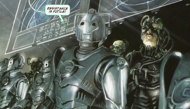
The Star Trek cast get short shrift this issue but I suspect much more of them is to come in issue two. The reveal on where they and the TARDIS crew meet is a beautifully-realised gag, which nicely contrasts with the havoc wreaked by the Borg and Cybermen in the opening scenes. It’s also, as someone pointed out to me, an extended joke on the “bigger on the inside” elements the two shows share.
JK Woodward’s art is a match for the script, the painted strokes giving the book a lush, detail heavy feel. He’s a little static at times but the likenesses are spot on, the last page especially, and the action is for the most part very fluid. Likewise, Shawn Lee and Robbie Robbins do great work with the lettering, adding extra impact to several scenes.
If there’s a problem here it’s that this issue is largely set-up, and some Trek fans may feel shortchanged. However, the deliberate pacing is, I think, going to pay dividends and this book lets set to not only showcase its two franchises but tell a good, fun story through doing that. Massive in scale and hugely fun, this is how a crossover should be done..
Alasdair Stuart


