
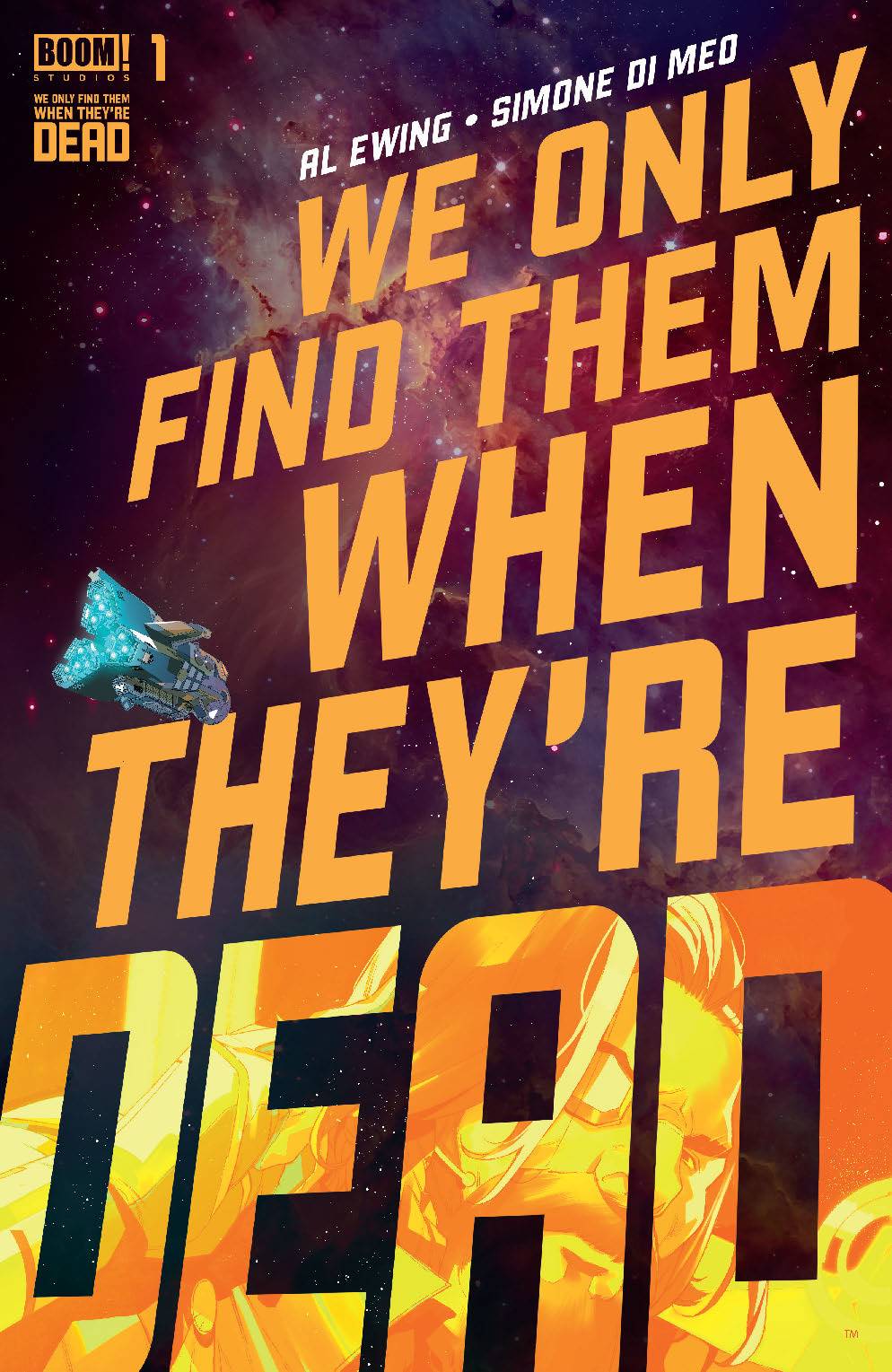
Artist Simone Di Meo dedicates We Only Find Them When They're Dead #1 to their mother "who taught [him] to look at the stars." The vast expanse of the cosmos is where the new Boom! Studios series focuses its gaze, with the cover itself making how small we are in the grand scheme of existence evident. The typeface of the series' title stretches across most of the image, the words themselves bigger than the spaceship that an artist would ordinarily make the focal point. Di Meo's work here and in the sequential images between the covers strike a fine balance better the wonder of looking out beyond Earth and the existential terror of considering our place in the universe that it stems from doing so.
Written by Al Ewing
Art by Simone Di Meo and Mariasara Miotti
Lettering by AndWorld Design
Published by Boom! Studios
'Rama Rating: 9 out of 10
Al Ewing has always been a versatile writer, capable of finding the ideal tone and style for each book, though it's only following the success of Immortal Hulk that his work has seen the sales success it deserves. Off that he's been able to relaunch Guardians of the Galaxy and co-write the big Marvel event of the season, Empyre. As such, it's the ideal time for him to launch a creator-owned series, reuniting with Di Meo – the pair collaborated on Immortal Hulk: The Best Defense. This opening salvo, however, has more in common with #25 of the main run, which initially seemed like it was telling a disconnected cosmic tale, only for how it established the wider scale of things to be put into context with the reveal of how Bruce Banner fits into it all. Here, he's just as keenly aware of the breadth of the story he wants to tell and how big the characters are in relation.
Last year's Ad Astra, James Gray's science-fiction stunner, is a recent property that also presented that dichotomy and it's striking to see a creative team capture it with the same clarity as the IMAX format did on the much smaller dimensions of the page. In that film, Brad Pitt's lead astronaut undertook a journey across the Solar System in the hopes of contacting the father he has not seen in years. It depicts a literal journey for him, to meet his maker. We Only Find Them When They're Dead's first issue is more theological as it's about actual gods; always beautiful, always dead. Mining crews harvest them for resources, making for quite the pessimistic sentiment behind the series – the very same Ad Astra makes by putting an Applebee's on the Moon – that even if humanity can come together to head for the stars, capitalism will be close behind.
His script focuses on the harvesting of a god in 2367, namely from the perspective of the Vihaan II's four-person crew. Each has a specific role: Ella Hauer is the coroner and uses a laser knife, her brother Jason keeps things running smoothly as the engineer, Alice Wirth, the quartermaster, manages the hull and Georges Malik pilots the ship in the captain's seat.
Di Meo, with colour assists from Mariasara Miotti, finds both the beauty and ugliness of the scavenging situation. Their pages are sparser in terms of their panel layouts while building-up to depicting a god. In introducing the team and their ship, they use just six panels across two pages, all widescreen visuals that ensure a tactile sense of location. Showing a god for the first time, however, needs more space. They do so with a two-page spread and suddenly the fleet of ships that seemed so densely populated just a few pages prior becomes minuscule in comparison.
In the harvesting that follows, body parts being carved up are abstracted into jagged panels on one spread overlapping with the underlying image of Ella going to work with her laser knife, while another uses twenty panels to depict a chunk of tissue's journey from face to the Vihaan II's hull. The precision involved here, going from grand vistas to the minutiae of the process demonstrates how the book's visual approach of depicting this grisly work has been carefully considered, becoming more and more in-depth as it becomes more and more gnarly.


Also contributing to this feeling is how Di Meo and Miotti's luminous and slick coloring gives a sheen to the events, even as they become more unglamorous. The god's glowing centerplate bathes exterior shots in a purple hue, a cool color just like the blue that dominates the inside of the Vihaan II. These also ensure a strong contrast with the yellow and red of two other ships that find themselves at odds when one tries to break the established rules of harvesting and the action that follows. As much as the narrative is about how we as a species haven't really changed in just under 350 years, the light emanating from the various pieces of technology does manage to show some advancements have been made along the way.
Much of the issue's text is dialogue, though AndWorld Design's lettering occasionally finds itself untethered from the captivity of a speech balloon. These are more matter-of-fact statements, the kind that introduces characters, their roles, and what year it is. On the spread of the deceased god, this type of lettering is the kind that informs us of the always beautiful, always dead paradigm. Set against the stars, these captions home in on the melancholic undertones of going out into space, a place of great possibility, only for it to reinforce the only thing certain in life.
We Only Find Them When They're Dead is such a clear and effective means of establishing a world's rules through just a single instance that by virtue, it also becomes immediately clear why someone would set out to find a living god. To prove that this is not all there is.
We Only Find Them When They're Dead #1 goes on sale September 2.


