
 Join The Community


The original graphic novel Dracula, Motherf**ker is about history, but shares a connection with the original prose novel as well as the notable adaptations and explorations since.
First published in 1897, Bram Stoker's Dracula is no stranger to adaptation.
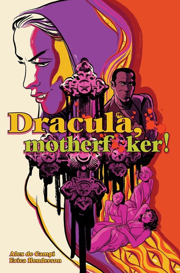
Written and lettered by Alex de Campi
Art by Erica Henderson
Published by Image Comics
'Rama Rating: 6 out of 10
From German Expressionist F.W. Murnau's Nosferatu – essentially a version with the serial numbers filed off – to Tod Browning's kicking off the Universal Monsters renaissance to Terrence Fisher's doing the same for the Hammer Horror series to Dario Argento's late-era 3D-shot film. Buffy got around to the most famous bloodsucker in its fifth season opener and just this year, a Netflix limited series from Steven Moffat and Mark Gatiss released, largely faithful to the original text's plotting until a third-act surprise. Werner Herzog even remade Murnau's – this time able to use the actual character names – with his documentarian's eye leading to an abundance of on-location shooting.

The most ravishing version of the story that this critic has seen, however, is Francis Ford Coppola's from 1992. People can mock Keanu Reeves' (perfectly suitable for the material) accent all they like, but no-one can deny how Coppola's aesthetic of choice makes for such visual opulence that it's as if he thought he'd never be allowed to make another film again.
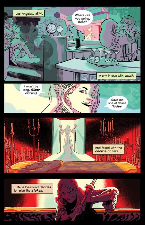
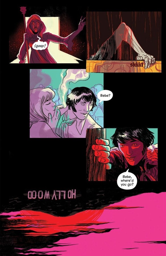
From Alex de Campi and Erica Henderson, Dracula Motherf**ker is perhaps closest to Coppola's in that Henderson's art and colours are a pure phantasmagoric spectacle. They start with a brief sojourn in Vienna, 1889 – a city obsessed with death – only for the duo to quickly transition to the Los Angeles of 1974, a city they present as the exact opposite. Instead, obsessed with youth. The upside-down Hollywood sign depicted early on is enough to visually clarify this inversion.
Bebe Beauland, an aging movie star, sets the plot in motion by deciding "to raise the stakes," though the central character is Quincy Harker. He's a photographer, taking pictures of the dead and selling to whichever publication will pay the most. When a body ends up in the LA River with bite marks on her neck, it's not long before he gets entangled with creatures of the night.
In the backmatter, de Campi and Henderson discuss the two big ideas of what they wanted to achieve with this book. De Campi wanted to deglamourize Dracula, make him an abstract horror of an aged abuser, and emphasize the brides as those brought under his spell only to realize exactly how much of a monster he really is. Henderson, meanwhile, treated her layouts as a series of two-page spreads rather than individual pages. Not everything the pair sets out to accomplish here with their take works.
Less than 60 pages, Dracula, Motherf**ker runs a clip, frenetic pace. While other versions delight in the build-up that comes from Jack Harker's arrival in Transylvania and the tension of teasing out Count Dracula's bloodthirst, the creative team eschews that and get right into the swing of things. In fact, Quincy's pictures of the deceased in the river and the first meeting with the supernatural happens on the same page.
As a result, the book essentially consists of two confrontations with little downtime in-between. The second of these does see the brides have a large presence within its narrative events, and the directness of the dialogue ensures the point is conveyed within the story and not just within de Campi's segment of the back matter, though there's just not a ton of space due to the story's structure to dig further in.
Though it should be said, their intentions regarding Dracula succeed. The pair's visualization of him as negative space – starting with the outline of a hand appearing on a shoulder – gradually creeping in and then dominating the page until someone fights back works quite well. His words exist within the void of his presence, bold and attention-grabbing, drawing your eye and others at risk into the abyss. Their version of the character may not be young, handsome, and mysterious, but this approach to his visualization still illustrates the dangerous seduction at the heart of the concept.
Most accomplished of all is Henderson's visual grammar. The wider space of the two-page spreads allows her to set the scene in a big, dynamic way and tell them on a wider canvas with greater clarity of tone and mood.
An early one sees the orange and purple look of the sun setting on the city give way to a starless sky, the only source of light being the luminescent glow of the streetlights, in the same image. It works because there's enough space to allow for a smoother transition of time over a direct cut between one panel and the next. From there, the darkness works to reinforce the loneliness that comes from the city at night and how that grants predators lurking in the shadows the confidence to strike.

That there is a degree of catharsis to the conclusion is enough to ensure that the book succeeds more than it doesn't with regards to its thematic aims. The aesthetic aims are achieved throughout, and Henderson's work manages to get even more impressive in the final quarter with an outpouring of color that enhances how expressionistic her characters already are in conveying their emotions. If nothing else, Dracula, Motherf**ker's successes and limitations equally convey how when it comes to adapting a story as old as Bram Stoker's original text, it's better to have a committed take to attempt over settling for what's been done before.
Dracula, Motherf**ker goes on sale October 7. Find out more about the OGN from the writer herself in our recent interview with Alex de Campi.
