
 Join The Community


Richard Starkings has seen and experienced a lot in comic books. Over the past four decades, the writer/editor/letterer has worked for virtually every major comic book company, and as part of his company Comicraft innovatived the art of lettering that touches on virtually every comic book for the past 20 years.
But, well.... this COVID-19 situation is a bit new. The Liverpool-born, Chattanooga-living man has some words for everyone in the industry right now, borrowed from the late Will Eisner.
"Congratulations, everyone — we’re the survivors!"

After speaking with Starkings earlier this month about the new volume of his creator-owned series Elephantmen, our conversation kept going. From how the British-born resident of Chattanooga, TN is fairing during this pandemic, the changes he's witnessing in the field of lettering, and the greatness that is Walker's Crisps.

Newsarama: Richard, how are you doing in all this pandemic stuff personally?
Richard Starkings: I have been very fortunate, I have been crazy busy, so every day has been pretty much the same as any other day working in my studio at home! The only real difference has been not being able to go to the gym or eat out… so I’ve been stuck at home eating too many packets of Walker’s Crisps and eating too much home cooking! I may have gained some girth.
Nrama: It could be a lot worse — we're a couple of privileged guys.
You've seen a lot in comics - how do you think the industry, and the lettering community, have adapted to it?
Starkings: Way back in the '90s when Will Eisner was the keynote speaker at PRO/CON he looked out at the professionals in the audience and said, very plainly; “Congratulations! You’re the survivors!”
We were in a big slump after the Image explosion of the early '90s and there was a lot of talk about the industry being in severe decline. At San Diego the following year, there were tumbleweeds rolling by to the sound of crickets at Comic Con! I remember thinking it would probably be one of the last San Diego shows!
How wrong could I have been!
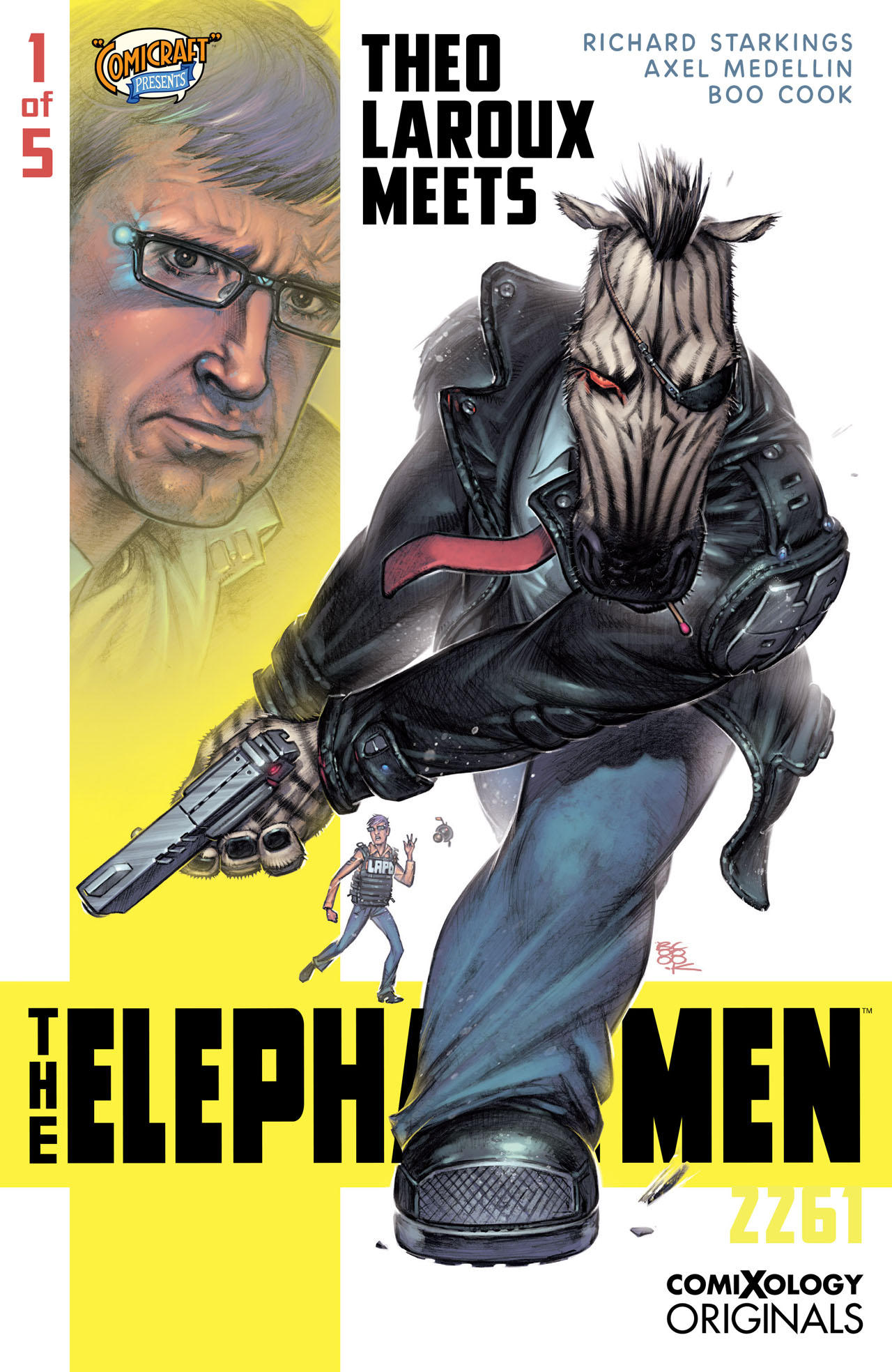
The industry has expanded in directions we could never have seen. I’ve backed at least two Kickstarter projects since we’ve been in lockdown, and Comicraft is gearing up to launch the new seasons of both Elephantmen and Ask for Mercy on comiXology! So, congratulations, everyone — we’re the survivors!
My local store, Infinity Flux — the best comic book and gaming store in the Chattanooga area — fought the lack of new comics by hosting twice-weekly Facebook Live shows that helped them reach comic book readers outside of Tennessee. They managed to move a massive amount of inventory and create new customers at the same time. That is the way to survive — using the resources that we have to reach new readers and old readers alike.

Nrama: I don't know about you, but I've been reading a lot more of my comics digitally than in print since March.
In general, how do you think lettering has adapted to the growing number of people reading comics digitally — and doing them at different sizes due to different devices, zooming, and all that?
Starkings: Making comics for readers to read on tablets and Kindles has helped me refresh my approach to telling stories. ComiXology’s guided view helps creators tell their stories with the kind of control you could only depend on with page turns or splash pages in print.
I don’t think it’s affected lettering as such — good lettering is always going to be about good placement and legibility. We have over 300 comic book lettering fonts in the comicbookfonts.com library now and I like to think that we have a style for every title.
Nrama: Comicraft broke out by pioneering the use of computers in lettering back in the early '90s. Has there been any major revelations in lettering in recent years, or is it more like small iterations with style, program updates, etc?
Starkings: We were indeed the pioneers — and now people think lettering has always been done on computers, or they think it is done by computers. Tsk! Comicraft is celebrating 30 years in 2022!
John “JG” Roshell, Comicraft’s Mister Fontastic and Secret Weapon has now created his own foundry, Swell Type, and manages the Comicraft font library in addition to his own. This move was inevitable because the business of making and selling fonts has grown so much it demands pretty much all of his time and energy. Being free of lettering and design means that he can concentrate on the font side of the business and I can concentrate on the making comics side! I think John could answer your questions way better than I could.
Nrama: Comicraft letters and offers publication and logo designs for all the major companies and also for your own projects. Are there any major shifts you'd like to see in terms of innovation in lettering? Maybe something you'd like to do but the people hiring letterers aren't being receptive to generally?
Starkings: Although style changes from decade to decade, I don’t think there are many innovations I’d like to see. It’s certainly much more competitive than it was when I broke into comics but I am all in favor of competition — it keeps us all on our toes. The work I do for my own books is very traditional, because I want the lettering to serve the story.
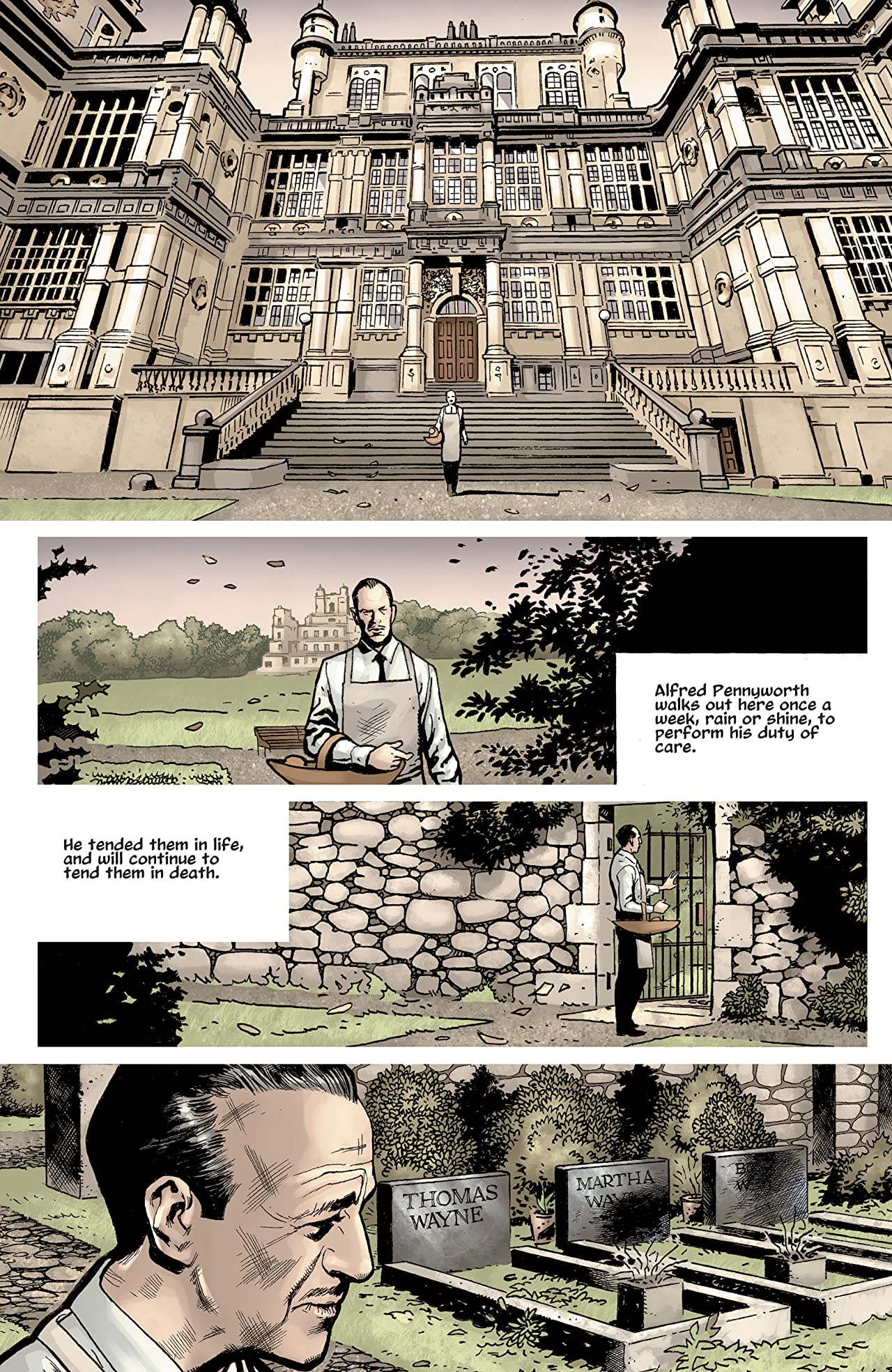
That said, I was not a big fan of the sentence case lettering that Marvel favored in the '00s, but Warren Ellis requested it for The Batman's Grave recently and I’ve found myself really enjoying it. The sentence case style helps create a quiet, understated sense of gravity that, to my mind, continues Alfred’s narrative from the beginning of the story. It’s not a first-person story but I can imagine that this is Alfred’s recollection of the events, seen through his jaded eyes. So Warren has turned something I had an immediate aversion to 20 years ago into a device that I applaud and understand, because it serves the story he is telling. That is the kind of innovation I can get behind.
Nrama: Last question, then... What gets you excited about lettering and logo design in comics these days? Either in what you see from others, or any projects you're asked to do.
Starkings: I think every lettering artist out there should read and study David Mazzuchelli’s Asterios Polyp and Craig Thompson’s Habibi. And every Posy Simmonds book. Those creators are masters of every aspect of their craft. We are merely the students.

