An extremely interesting history of game packaging
It's got pictures and stuff
Weekly digests, tales from the communities you love, and more
You are now subscribed
Your newsletter sign-up was successful
Want to add more newsletters?
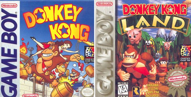
The black and white Game Boy was a prominent handheld machine for 10 years, yet kept its box art under strict control. The Game Boy logo was always in the same place, in the same font and the same color throughout its notable decade-long tenure. Made it extremely easy to find the Game Boy section at Wal-Mart.

Above: The only real differences were the Players Choice games, which switched the standard silver logo to gold

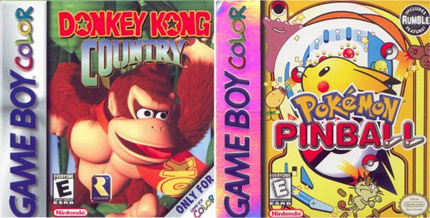
Above: Early Game Boy Color games occasionally had reflective surfaces (like Pokemon Pinball) but eventually dropped that idea and went for typical boxes

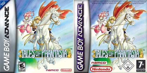
Above: Game Boy Advance continued the sideways logo trend, though the UK logos had a colorful outline instead of the metallic letters we saw in the US
The original Game Boy launched in 1989, and with it (we assume) came Nintendo’s realization that standardized boxes may actually help sales performance. After all, it’s a lot easier to tell what’s what when each game is clearly marked in a consistent manner. Nintendo would put this to good use during its next console era – the SNES.
Weekly digests, tales from the communities you love, and more
A fomer Executive Editor at GamesRadar, Brett also contributed content to many other Future gaming publications including Nintendo Power, PC Gamer and Official Xbox Magazine. Brett has worked at Capcom in several senior roles, is an experienced podcaster, and now works as a Senior Manager of Content Communications at PlayStation SIE.

