Best Shots Review - November: The Gun in the Puddle (9/10)
From Matt Fraction, Elsa Charretier, Matt Hollingsworth, and Kurt Ankeny
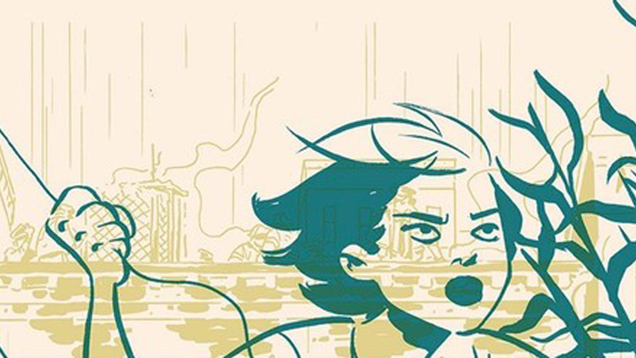
November: The Gun in the Puddle
Written by Matt Fraction
Art by Elsa Charretier and Matt Hollingsworth
Lettered by Kurt Ankeny
Published by Image Comics
‘Rama Rating: 9 out of 10
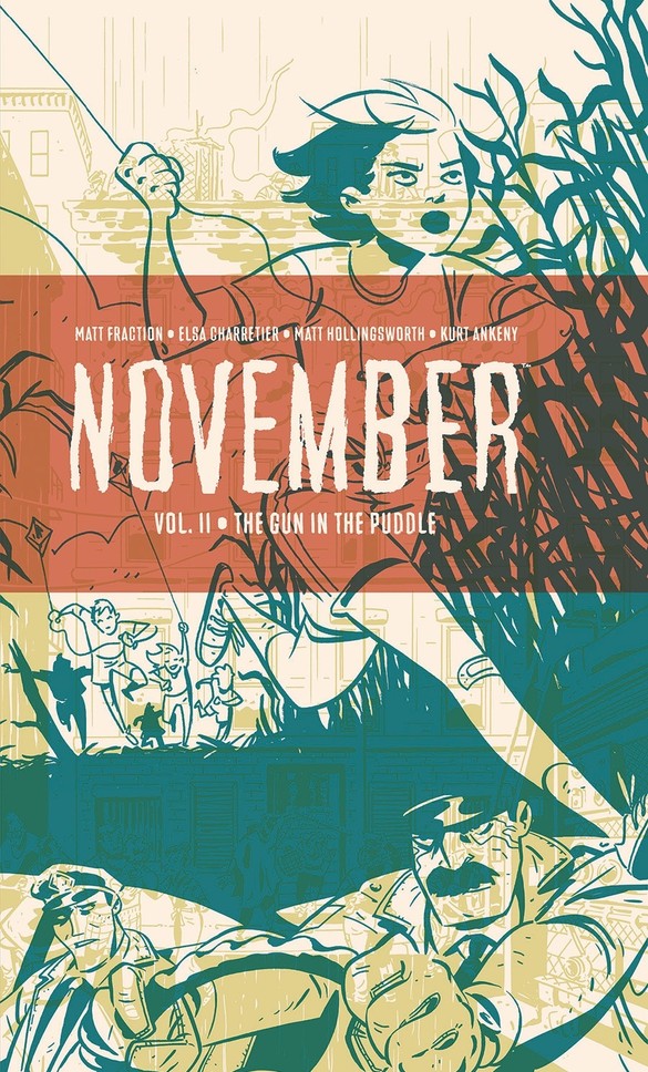
Emma-Rose yearns to be free. Free like her kite, soaring above. The other kids first worry it’s going too high, then become impressed by how far it’s able to go. For her, that it gets away is sad at first — like any time a toy breaks or gets lost while you’re young — then reinforces her desire to get away as it disappears into the night’s sky. “She feels tomorrow pull,” as Matt Fraction’s rhythmic script puts it.
This prologue to The Gun in the Puddle, the middle novella of the November trilogy, takes place a world away from the chaos and building dread of the central narrative. Between the melody of Fraction’s prose, the youthful energy of Elsa Charretier’s linework and the cool blues of Matt Hollingsworth’s colors, it’s a moment to breathe. The longer they let us linger in this memory, the more we know they’ll soon return to the night of bombs and raging fires that the first volume started to detail. We know the tragedy that Emma-Rose isn’t free just yet; her chance entanglement in whatever’s going on in the city in the present day makes that even harder.
All because she happened to stumble on that gun.
The previous volume’s formal approach continues with a fragmented narrative still divided into chapters, though Fraction’s scripting gradually draws them into a more cohesive chronology and their central characters closer. Case in point: the chapter after the prologue brings two of the story’s main trio together as they end up in the same location, while another chapter details the events that led to the firearm landing in the curbside puddle.
The narration of the prologue, which had the time for flowery turns of phrase like “Imminent, eminent” gives way to a more immediate internal monologue — “Oh God. Oh God. Is this a car?” — as Emma-Rose struggles to get her bearings. The blackness of the panel borders functions as negative space in the trunk’s low light, restricting her field of view even more. The 12-panel grid being used by Charretier is more jittery in where it casts its attention. Flashes of Emma-Rose, bound and gagged. A car rolling down the rain-soaked road. The deep blue that managed to seem so warm in the novella’s opening is like a lifetime away, but Emma-Rose has to hold on to those memories. That wish to be free is just as strong now, and exactly what she’ll need to channel to make it out.
There’s a two-fold confidence to how Fraction plots that’s on full display with the structure and approach to November. It isn’t solely that he knows how forthcoming to be in telling a non-chronological tale, he also has faith that his audience is willing to roll with, and piece it together over the course of the story. In a volume just shy of 80 pages, he can do this on an even larger scale. The format strikes a balance between the traditional serialization of monthly comics and the more complete sense that reading a full graphic novel provides. Here, three main characters having their stories told via three volumes allows for an organizing principle where each character can take the primary focus without sacrificing the others’ perspectives.
Get the best comic news, insights, opinions, analysis and more!
There is one element of the book’s construction that makes it harder to parse, however, and it’s the cursive lettering style that Kurt Ankeny uses for Kowalski’s inner monologue. Compared to the sharpness of Emma-Jean’s narration or the scratchiness of Dee’s, the flow of the story is interrupted by the need to slow down in order to try and decipher Kowalski’s thoughts. Everything else about the book’s design and aesthetic is so precise — such as the three women having distinct, individualistic color palettes to distinguish their chapters — that it makes it all the more unfortunate there’s one stand-out element which doesn’t click with the rest. Every other choice serves to get the reader caught up in the narrative, while this threatens to take you out.
As much as the multiple perspectives craft captivating glimpses of the city as everything goes to hell, what brings it all to life is the revelatory pairing of Charretier and Hollingsworth. The definition the two provide the characters is so sharp. Moments involving heavy shadow or shading manage to accentuate this even further, highlighting each character’s expressive facial features. The first direct looks at Dee’s face — which come much later in this book compared to the previous installment, where she was front and center — convey how weary Dee is with her job on the roof, and also underscores the seriousness of the situation she finds herself in with how quickly she moves later in the sequence. Seeing Charretier make something this pulp-inspired, heavy and dense in its panel layouts — a world away from the content and tone of Unstoppable Wasp — look easy is a clear sign of her talent.
Meanwhile, Hollingsworth’s colors recall Steven Soderbergh using color filters to distinguish between plotlines in Traffic. Though Soderbergh’s were happening in various locations across the states, Hollingsworth conveys the different perspectives on the events happening in the city. The intense yellow hue of Kowalski’s chapter compared to the more muted palette of Dee’s — where even the red used is dulled — is representative of how the former is having quite an intense time, while the latter has become accustomed to what her life is.
Through this, it’s easy to see how all three characters are trapped in some fashion, and as this fateful night unfolds, they’re all struggling to see a way out. But that desire to be free, feeling tomorrow pull is how they keep going, to try and get loose. To be free like that kite on the wind.
Matt Sibley is a comics critic with Best Shots at Newsarama, who has contributed to the site for many years. Since 2016 in fact.
