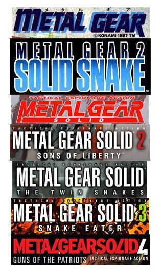
How's it changed? Aside from the debut logo, which is reminiscent of a 1980's, Greek-funded, straight-to-video action movie starring Rutger Hauer and Nick Cassavetes, Metal Gear's logos have always been astutely design conscious.
Notable is the cryptic use of fours in the most recent version which wereinverted to form three sevens in the pre-launch campaignsparking off all sorts of nonsense speculation about release dates.
Is it better today than before? Yes, but the original says 'slightly homoerotic military action' better than the current one, somehow.


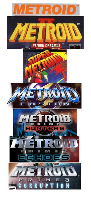
General theme? Sci-fi and shit, robots, the Solar System
How's it changed? Starting off fairly schizophrenically with the original vanilla NES typeface segueing into to two wildly different B-movie efforts. Later versions have stayed faithful to the original tapering font face and added a dash of metal and coloured outer glow.
Is it better today than before? Definitely an improvement on the sterile NES version but we think it peaked at the shameslessly OTT Super Metroid.

Next up: Street Fighter and SmackDown
