1994 - Scarlet Spider

One of the most notorious eras of Spider-comics came with its very own redesign. Whilst not as long-lasting as any of the above iterations, I can’t conduct any comprehensive look at Spidey’s costume history without a quick look at The Scarlet Spider. As much as I want to hide our eyes behind my hands as I do so.
Created as part of Marvel’s convoluted The Clone Saga crossover, this was Spider-Man clone Ben Reilly’s (don’t ask) outfit. Looking at it, it’s very clear Ben didn’t inherit Peter Parker’s sartorial taste during the splicing process. It’s basically what it would look like if you went to a costume party dressed as the ‘90s. Combining a hooded sweatshirt and bodysuit, Scarlet Spider’s costume was more suited to aerobics than super-heroics, and has been pretty much forgotten by everyone who doesn’t have a sense of nostalgia for bad comics.
Still, it’s the most radical costume change since the Symbiote, a gateway for more successful branded spin-offs, and Ben Reilly was a major part of the next most significant costume change... unfortunately.
1996 - Spectacular Spider-Man


After revealing that Ben Reilly was the real Peter Parker all along (before eventually revealing the original Peter Parker was in fact, Peter Parker - funny that!) Spider-Man had another short-lived wardrobe change, with Reilly designing his own version of the costume - taking time to include a joke about the character considering everything from an additional cape, to a Spider-Woman style half-mask that would allow him to similarly set his hair free.
Looking at Reilly’s Spider costume, it’s hard to disagree with McFarlane’s point about how influential his work was on later designs. It has the black and blue mix of the modern look, the large eyes, and the signature spaghetti webs. The spider logo was significantly extended, much like Venom’s, covering the front of Spider-Man’s body. It had one key difference from everything that came before it, however. It was by far the bluest version of Spidey’s costume, with very little red and limited web-detailing.
2000 - Ultimate Spider-Man

By 2000, complicated plots such as the Clone Saga seemed to have alienated Spider-Man fans, the character had aged away from the target audience, and the book was in need of a relaunch. In one of the most brilliant moves in the history of the industry, Marvel chose not just to reboot the book, but an entire line, creating Ultimate Comics, and making Spider-Man the frontline character of this new universe, which was completely free from existing continuity.
Working with writer Brian Michael Bendis, artist Mark Bagley took Peter back to his teenage origins, creating a costume to suit the character’s skinnier frame, taking the look right back to Steve Ditko’s design - but keeping McFarlane’s huge, expressive eyes. The look seemed cinema-ready, but it would be years before Ultimate Spider-Man would come close to being recreated on the big screen.
2002 - Sam Raimi's Spider-Man
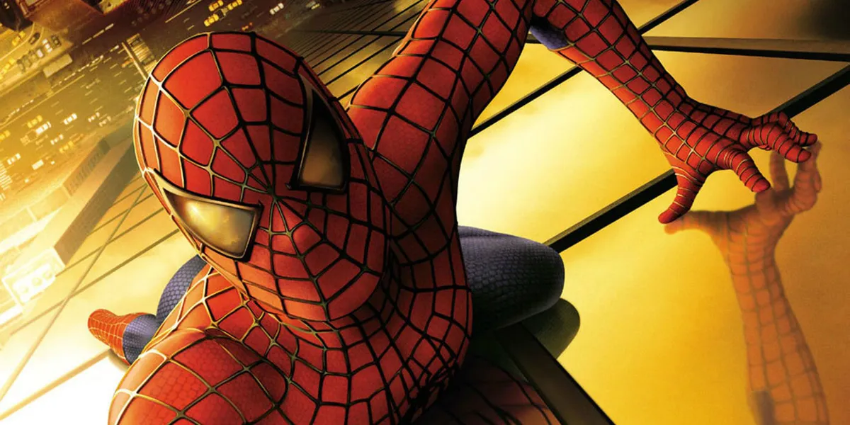
After decades of failed attempts by other directors (including James Cameron in the mid-’90s) Sam Raimi finally became the first auteur to bring Spider-Man to the big screen in 2002. Spider-Man had gone live-action before, of course, in a TV series and a couple of cheesy TV movies in the 1970s, but this was the first big budget blockbuster. And it was brilliant - clearly a huge influence on Marvel’s MCU in its dedication to recreating the comics.
Raimi obviously grew up on Spider-Man, with the majority of his chosen heroes and villains coming from the Steve Ditko / Romita Sr eras. So, it’s unsurprising his movie costume most resembles the character’s original / classic look - albeit with some important changes. Tobey Maguire’s outfit has the darker colour combination of the original design, with the musculature of the classic look. However, the web pattern and spider logo were completely original. For the first time, they were no longer part of the bodysuit, instead they were raised - presumably because it looked better on camera.
The webbing itself had an unusual silvery, reflective look. The front and back of the suit still had spider logos, now larger and realistically rendered, with long legs and mandibles. Despite those key differences, the costume is recognisably faithful, arguably more so than in any previous comic-book movie (both Batman and X-Men went for black leather outfits, significantly different to the comics they came from). It remained unchanged for the hugely successful sequel Spider-Man 2, and the less well-received Spider-Man 3.
2012 - The Amazing Spider-Man


Sadly, Spider-Man 3 was a critical and commercial failure, and Raimi immediately left the franchise. In 2012, following the success of Marvel’s Cinematic Universe, Sony decided to completely reboot its most iconic hero. Hiring the appropriately named Marc Webb to direct, it provided fans with another completely new cinematic look for the character.
Oddly, with its lengthened Spider-logo, the dominance of blue, and the reduction of the web patterning, the comic-book design Andrew Garfield’s costume most resembles is Spectacular Spider-Man’s much maligned Ben Reilly look from 1996. That’s despite the fact Garfield’s youthful frame is clearly intended to take the character back to its earliest roots. The raised web pattern has been inverted, and taken back to black. Additional ovular divots are scattered across the costume which, when added to the general rubbery synthetic look, gives this Spider-Man the rather bizarre appearance of a basketball.
2014 - The Amazing Spider-Man 2

Whereas Maguire’s Spider-costume remained consistent across his trilogy, Andrew Garfield pulled on a markedly different costume for his own Spider-sequel, just two years after the original hit cinemas. The blue’s still dominant, and the logo stays the same, but in every other respect The Amazing Spider-Man 2’s costume is radically changed. The webbing and logo are raised, once-again resembling Maguire’s costume. The suit has subtle hexagonal pattern detailing across it, and the ovular divots are gone.
The eyes are huge, which - combined with Garfield’s still skinny frame - bring it closest to the Ultimate look than anything in the mainstream comic-line. Sadly, it’s not as precise as the Ultimate look, and Garfield’s 2014 costume contains elements from the ‘60s, ‘70s, ‘80s, ‘90s and the 2000s, making it anything but elegant. Still, at least it didn’t look like a basketball anymore.
2016 - Captain America: Civil War

Like the costume it contained, Amazing Spider-Man 2 was a mess, a mishmash of influences, characters and tones. It was the least commercially successful Spider-movie yet, and put Sony into a very difficult position. There had been Internet backlash when Webb’s original film was announced, with many fans considering it too soon to reboot. If that reboot had been criticised, how would yet another be received?
But complex copyright laws meant Sony had to bring the character back sooner rather than later, so it faced a dilemma. To its credit, Sony went with the only logical solution - the only choice that would enthuse fans instead of annoying them. It made a deal with Marvel, leaving the bulk of the reboot in the comic company’s hands, trusting it to deliver what the fans would want. That trust included the responsibility of a monumental costume change.
The new design made its debut in Marvel’s Captain America: Civil War. In the Civil War comics, Tony Stark gives Peter Parker a new costume, named Iron Spider, that closely resembles the Iron Man armour, with similar colour-design / weapons capabilities. Obviously that would be a pretty confusing / terrible idea for Peter’s MCU debut and, whilst directors the Russo brothers retained the concept of Stark designing and gifting Spider-Man his costume (complete with technologically advanced eye-goggles that replicated the adjustable eyes of the comics, allowing the mask to be more emotionally expressive), they ditched the Iron Spider concept and instead took the costume, once again, back to its roots.
Mimicking the leap between Ditko’s to Romita Sr’s design in the earliest days of the character, Marvel lightened the bodysuit, and removed any extraneous detailing. Interestingly, the spider-logo on the back of the suit resembles Ditko’s design, with the front logo close to Romita Sr. It’s also reminiscent of the first live action version of the character, the ‘70s outfit worn by Nicholas Hammond, which was itself influenced by the ‘60s cartoon series.

Mark Millar, who wrote the original Civil War comic, agrees. “I love it because it looks like the ‘60s Spider-Man TV costume, which was repeated here in Scotland ten years later. My first introduction to Spider-Man as a tot and it made me pick up the comic.”
This is a costume design full of love for the character’s origins, but that doesn’t mean it doesn’t have its own personality. The blue / red separation elements on the boots, arms and back are unlike anything we’ve seen before, and will certainly make the toy version easier to spot on store shelves (there I go being cynical again).
"Readers identify not just with Peter Parker, who’s the most human out of all the well-known Marvel heroes, but with the fact they could kind of make that costume."
Mark Millar - writer of Civil War comics
But will this version last into Spidey’s next, big-screen outing, after the recently released Spider-Man: Homecoming? Don’t bet on it. Between the narrative justification of Tony’s continual upgrades, and the simple fact that the self-contained MCU versions of the Marvel roster have themselves changed drastically over the years - just compare early, Avengers Cap to the Civil War version - it’s more than likely that this edition of the Spider suit will be the foundation of a whole new wave of evolution.
But why is Spidey’s costume so popular at its core? Why, through all these changes in era, context, and medium, do we keep coming back to certain tried-and-true elements and interpretations? Mark Millar knows. “I have two theories about why Spider-Man’s costume works. The first is that you can make it. Readers identify not just with Peter Parker, who’s the most human out of all the well-known Marvel heroes, but with the fact they could kind of make that costume. It’s just awkward enough to be real.
“Secondly, it has huge eyes. Show a wee baby a Spider-Man mask and they smile. The big eyes makes it look like a Pokemon character. Babies like Spider-Man because we’re hard-wired to see huge eyes as unthreatening, narrow eyes to be menacing. I don’t expect it was planned that way, but it absolutely pleases all young kids to see a Spider-Man mask.”
So perhaps there’s a very good reason he’s known as your “friendly, neighbourhood Spider-Man” after all. Maybe, by accident or design, Spider-Man’s fundamentals are a perfect combination of personality and presentation - surely the dream in designing any comic book character. Maybe he resonates so instinctively that we’re predisposed on an evolutionary level to like him, whatever the unique tweaks and curious changes that come with any particular version. Though of course, it helps that he’s also just really, really cool.
Either way though, it all adds up to a hero with a unique look, both immediately recognisable and relatable. And crucially, the strength of that essence means that whatever evolutions and alterations come his way, he’ll always remain brilliantly, unswervingly Spider-Man. Long may he continue change, while remaining - reassuringly - exactly the same.
Don't miss our Spider Man Homecoming review and 6 questions we have after watching Spider Man Homecoming with a spoiler warning


