The best box art of 2015
16. Super Mario Maker

How do you convince someone - at a glance - that Super Mario Maker will be fun? This cover answers this question shockingly well. The disembodied hand and grid backdrop suggest this is some sort of workshop, while the oversize Blooper and its pixelated buddies let the viewer know this is going to get silly. But the real stroke of genius is making the lower half a solid color, thereby preventing the viewer from being overwhelmed by visual information.
15. Life is Strange
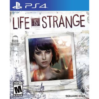
Your teenage years typically revolve around the self, as you figure out who you are and where you fit in. Life is Strange considers these questions of identity, and its cover puts similar emphasis on the self: the splash of color from the polaroid of the game's lead, Max, and the imagery of a lone figure standing atop the edge of a cliff. This photo is then framed by two contrasting scenes, both thematically appropriate: the tranquility of the lighthouse and forest surrounding Arcadia Bay, and the unpredictable chaos of storms and tornadoes looming on the opposite side.
14. Project CARS

No one would've batted an eye if Project CARS - or any racing game, for that matter - put some glamor shot of a luxury sports car or an action scene of speeding competitors on the cover. But no: Project CARS goes against the grain, eschewing sweet rides entirely for a more abstract, eye-catching composition. The rainbow lines emanating from this shadowy everydriver evoke the same artisty as the unmistakable Every Extend Extra box art. And the dash of deep red and bright orange across the cover somehow conveys a sense of speed through color alone.
13. Resident Evil: Revelations 2
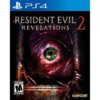
Deep reds and purples give this cover a warm - if not unsettling - aesthetic to the cover of Resident Evil: Revelations 2, with the emerald green eye serving as the proverbial rug that really ties the room together. Danger is felt in the twisted barbed wire snaking along the bottom and rusted prison bars framing the scene. There's a nice bit of ambiguity in whether the eye is looking out from its cell, or in on the viewer.
12. Final Fantasy X/X-2 HD Remaster
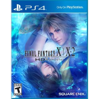
Here we have a stunning piece of Final Fantasy X artwork, and the designers were wise to let it breathe against an otherwise uncluttered canvas. Swirling blues and dancing pins of light along the periphery harken back to our leading couple's iconic scene together in the Macalania lake. Their placement suggests a deeper connection, while distinguishing them as protagonists of their own games.
11. Rise of the Tomb Raider

This minimalist cover design smartly sets Lara alone against the elements. Stone columns on either side naturally frame the image, subtly reinforcing this is a portal to another Lara Croft adventure. You'll also notice there are no enemies or other humans on the cover of Rise of the Tomb Raider. This heightens the sense of danger while also downplaying the whole manslaughter angle which draws this series such ire.
10. Tearaway Unfolded: Crafted Edition

You guys, the Tearaway logo is itself torn away from the backdrop. And, as if that wasn't enough excitement, the Unfolded subtitle is - wait for it - unfolded like a piece of paper. This may sound sarcastic, but I sincerely appreciate the visual humor in this logo. Of course the adorable paper hero and wonderful background framing her are the real stars here, but I have to give it up for Tearaway Unfolded's logo.
Sign up to the GamesRadar+ Newsletter
Weekly digests, tales from the communities you love, and more
9. Rainbow Six: Siege
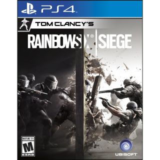
A dude exploding through a wall sums up this game to a T. Other boxes wish they could spell out their game with such clarity. Right away, the white and black backdrop on the cover of Rainbow Six: Siege tell you this is going to be some sort of team-based experience, all those guns reveal it's a shooter, and the exploding wall is the promise of wrecking shit up. Add a title, and what more do you need to know?
8. Bloodborne
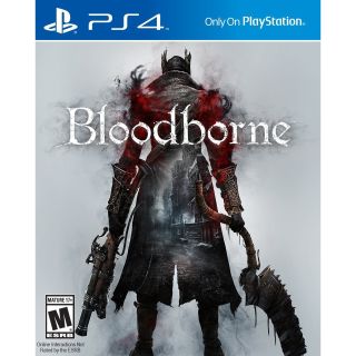
Here's an interesting inversion of typical box art conventions. Instead of placing the cityscape around our hero, it is placed within, implying the hero is some sort of portal through which we experience a noticeably bleak and hostile world. The fraying around the shoulders and red plumes of smoke appear almost like wings, giving the character an angelic (or demonic) appearance, further heightening the riddle of Bloodborne's setting.
7. Star Wars Battlefront
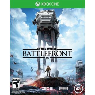
There's some excellent David and Goliath imagery going on with the Star Wars Battlefront cover. The absences of any logos or text along the top half of the image let you take in the size and grandeur of the AT-AT Walker, itself an iconic vehicle design that just screams Star Wars. At the bottom, our tiny, defiant rebel soldier stands ready with fist clenched and blaster drawn. The ruined Snowspeeder hints at the battle thus far, and the incoming Stormtroopers tells us there's still plenty more to come.
Lucas Sullivan is the former US Managing Editor of GamesRadar+. Lucas spent seven years working for GR, starting as an Associate Editor in 2012 before climbing the ranks. He left us in 2019 to pursue a career path on the other side of the fence, joining 2K Games as a Global Content Manager. Lucas doesn't get to write about games like Borderlands and Mafia anymore, but he does get to help make and market them.
Most Popular


