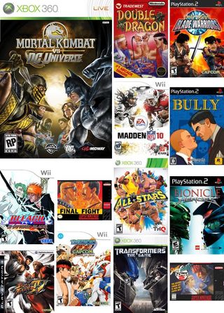
4. Face off

Above: Don’t blink
In a world between good and evil, light and dark, the oppressor and the oppressee, man and machine, alien and human, there is an epic battle raging. It is known as The Staring Contest. The staring contest where the blinker pays the ultimate price.
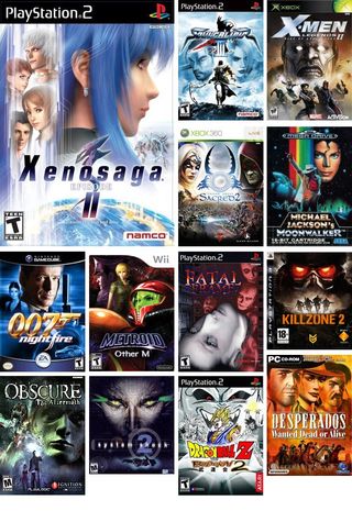
5. Giant heads

Above: Somewhere in the universe there is a planet filled with headless oversized bodies
A designer sits at her computer frantically compositing character art for a cover that was due yesterday. Using her fine-tuned sense of balance and artful addition of negative space, she finally sits back and smiles in her chair. It is done and it is beautiful. Printing the image out and marching purposely into the head honcho’s office she tacks it to the wall and proclaims, “Feast your eyes on this!” while trying to fix her expression to something looking like modesty with a dash of smug self-satisfaction.
Head honcho glances at the image, squints a bit and says it looks too empty. “What’s with all that space up top?” An imaginary light bulb pops up above his head and he quickly Googles an image of any movie poster seen in the last ten years. “I know! Why don’t you put the main characters heads really big up there like this? You got the space, right?”
The designer visibly wilts, removes the masterpiece from her boss’s wall and stalks off. As for us? We’re left with a plethora of oversized heads gracing countless covers for years to come.
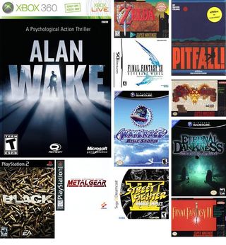
6. Giant logo

Above: Make the logo bigger
“Hey guys I don’t know what to do with this cover and it’s due now and our designer’s sick and oh my god it’s due right now where’s the logo at I’ll just throw something together really quick in Microsoft Word!”

